Play game
Resignation's itch.io pageResults
| Criteria | Rank | Score* | Raw Score |
| Audio | #475 | 3.071 | 3.071 |
| Innovation | #512 | 3.000 | 3.000 |
| Theme | #550 | 3.071 | 3.071 |
| Game Design | #597 | 3.071 | 3.071 |
| Overall | #638 | 2.964 | 2.964 |
| Fun | #685 | 2.857 | 2.857 |
| Graphics | #874 | 2.714 | 2.714 |
Ranked from 14 ratings. Score is adjusted from raw score by the median number of ratings per game in the jam.
How does you game fit the theme?
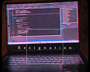
You play as an office worker experiencing mental burnout and emotional fatigue to the point that he starts perceiving the world in a very warped and dangerous way.
Did you write all the code and made all the assets from scratch?
Yes
Leave a comment
Log in with itch.io to leave a comment.



Comments
I played this for a video, it's now up!!
This game I played this game for a video on the Superchocolatemilkshake channel: https://www.youtube.com/c/SUCHMISHChannel
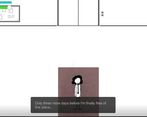
Let's just say that I was mostly confused with my experience. I think a bit more clarity is needed to help improve the game since I did have a hard time wrapping my head around the controls and trying to get the game to work. This could also help the player by giving them some direction of where to go and what to do when something comes up. The graphics are a bit minimalistic, but I think a little more detail would go a long way. The main screen and the elements that look like you took photos/videos of seem to work out really well (even if a little jarring compared to the rest of the game's graphics). While I don't think what you have here doesn't fit the "It's Not Real" narrative, I do like the story though.
Had fun with this game. Nice little story. Well done! Hope you will check out my game as well! :)
Interesting game, can you please rate my game too?
Nice concept. Also, loved the minimalistic art style of the game!
Enjoyable game, middle was a bit frustrating; having to listen to the dial up noise at least 6 times, until I learned I could cheese that section by going in and out of doors rapidly (which did not work well at the end). Speaking of, the game had a good build up and a melancholic yet interesting end.
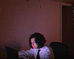
The graphics of the gameplay were... minimalistic; which I suppose could have been a choice, but the additional footage really made a difference to me.
All in all it definitely had this old fashioned Newgrounds feeling, which just brings up nostalgia for me.
Thanks for the feedback. I've heard that the second day was a bit difficult for some people, which I understand would be frustrating due to having to listen to the dial up tone that often (it was a funny joke the first time, but having play tested the game many times I know how irritating it gets having to hear it more than twice). I was hoping the following monster chase wouldn't be as big a stumbling point as it was, so I apologize for that. And yeah, that cheese is one of two viable methods during the day 2 chase sequence, the other is just timing out the nightmare mode by never leaving the room once it starts since the monster won't start spawning till after you open a door when the nightmare starts. The end monster works differently because unlike day 2, which is actually a bunch of monsters each assigned to a door that turn on and off on a delay as you go through them, the final monster is always the same entity, so you can't turn him off using that method like you could earlier. The lack of complex gameplay was meant to go in theme with the mundane nature of the setting, but I hope it didn't feel too boring because of it. I am glad that you liked the cinematic additions and that we could at least inspire some nostalgic feeling. Thanks for playing :)
Love the game, it's a really nice take into the theme. Good job.
Thank you! I'm glad you enjoyed it :)