Play INSOMNIA
INSOMNIUM's itch.io pageResults
| Criteria | Rank | Score* | Raw Score |
| Theme | #167 | 3.769 | 3.769 |
| Graphics | #326 | 3.654 | 3.654 |
| Overall | #396 | 3.276 | 3.276 |
| Audio | #417 | 3.154 | 3.154 |
| Innovation | #512 | 3.000 | 3.000 |
| Game Design | #576 | 3.115 | 3.115 |
| Fun | #600 | 2.962 | 2.962 |
Ranked from 26 ratings. Score is adjusted from raw score by the median number of ratings per game in the jam.
How does you game fit the theme?
The main character is in the dream and everything what happens to him is his nightmare. You have to avoid obstacles both, in the real world and in the dream.
P.S. It is my first game and game jam ever.
Did you write all the code and made all the assets from scratch?
Yes. All code is written by me and all assets are just simple shapes from Unity.
Leave a comment
Log in with itch.io to leave a comment.


Comments
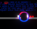
Congrats on finishing your first game jam game! I do have some critiques, but I hope you take them as constructive rather than an attack on your game. As a platformer I will say it was ok, but it fell into a lot of the traps that plague most beginner platformers that utilize physics, particularly no rotation lock on the player or movable objects, which caused awkward rolling off of platforms and getting orange blocks onto buttons really inconsistent and frustrating, inertia causing movement both for you and orange blocks to be really floaty, as well as friction causing you to get stuck on walls when moving forward while in the air. I also felt that while the idea of seeing the "real world" causing madness was a decent idea in theory, in practice it often forced a lot of standing still waiting for your sanity to regenerate, which was rather tedious, especially since the ring that showed the real platforms was so small that you usually couldn't really get a good understanding of the environment with a rapid activation. Usually in a lot of games (aside from maybe stealth games) mechanics that enforce frequent waiting periods are often discouraged. The last thing I wanted to critique was the font used. It does have a cool sci-fy, alien look to it, but functionally its just a little hard to read. It's nothing big, but it does slow down reading a bit enough for me to make note of it. I did like the bgm, and I think you could work on the things I mentioned to make much more polished things in the future. Best of luck on future endeavors!
Hey!
Cool game, with interesting visual effects. Congrats!
If you can, take a look at our game as well. I'd be glad to get your feedback.
Show post...
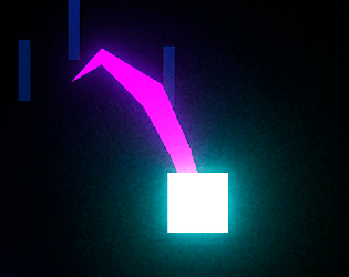
Cool game, great effort as your first game, the graphics are although simple yet they look so attractive and cute, very well done! Rated ;)
can u check out my game too? it'd be a huge help ;) https://itch.io/jam/brackeys-7/rate/1418965
First of all, congratulations!! definitely an amazing achievement for the first game. The graphics although simple, are well done and fit the game well. Main mechanic is interesting and fun to use. The only small thing is, I kinda assumed it would be holding the mouse button to reveal reality instead of having to press twice. However this is just my opinion, and there's no right way, I just think it might feel more natural. Also there was no audible indicator when you switch between real and dream, which made me unsure if I turned it off or not. It could also be nice to have an audible representation of the timer, so that you don't have to constantly look at the corner of the screen (e.x. increase pitch of a sound as the timer approaches 0, or make a repeating sound repeat faster). As others have already mentioned, it is a little annoying to put the box on the button. It should either be a flush with the ground, or a trigger that doesn't really collide with the box, just goes down when the box is on top.
The only sort of bug I encountered is that the enemy doesn't show on the "real" circle, but you still get hurt by it, so I think it should.
In conclusion, a fun game with a nice concept, keep it up!
Also, if you have time, I would love to hear your thoughts on our game as well :D
very cool post-processing. btw if you don't mind can you rate back my game thanks
Really fun! Good graphics, good story
Really Cool Game!! The graphics are amazing and go really well with the music!
Very cool graphics, awesome ambiance, fun gameplay. Really liked it :)
Rated !!! can you help me rate mine too?, Thanks!
here's mine: https://itch.io/jam/brackeys-7/rate/1415313
Interesting game and a great effort for your first game jam!
nice game. i wonder what the square's wife is
I really like the atmosphere! the ambient music and the bright lights contrasting the dark background looks very nice!
Nice game! I like the revealing reality mechanics with the cooldown. Makes for nice stop and go game play. Also nice atmosphere
Good work!!! I realy enjoyed the graphics processing.
Great game! I did not know what to do first but after playing around with some buttons I understood clearly! Medium hard game, nice. Not to much bloom either, well balanced in my opinion. Great work, keep it up!
Great platform game. I noticed that the energy regenerates, I think this can be abused by players if they just wait until it is recharged to move again. I would suggest that it doesn't regenerate but you can collect them by moving through the levels. Overall I enjoyed the game, excellent work!
I liked the aesthetic and the theme is well executed, I feel. If this is your first game, as you said, I'd say it's a very strong entry into the world of game dev!
The controls are good, but the slow sticking on walls is not something I appreciated. It would make sense if your character could wall jump, which I don't believe is possible in this game, but without the wall jump this sticking just gets in my way. I'd rather have the character slide against the wall without slowing down.
I did not like how the pressure buttons were implemented. I'd just make them activate whenever the player/box is above them, without them being solid, otherwise pushing the box on top of the buttons gets a little finicky.
This is merely my opinion: The "void" level I think is a bit too big of a difficulty spike! Having to manage the spikes, platforms, your bar and the void expanding was not fun for me. But some may disagree. And the maze level afterwards felt a little boring, but I just tend to dislike maze levels in general so it's just my opinion.
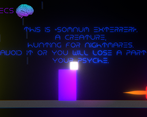
I'd also make the text parts either faster, or have a key to make all the text show. I like to read everything, so I wouldn't skip it, but it is a bit too slow for me and so I have to wait for the text to appear.
That final part with the big red square was a clever twist. And it is a good incentive to make the player go through everything again to try to see if there is an alternate ending! Which I did not do, at least not yet haha. Is there anything you can do in the red room at the end except the obvious? (Hard to talk about this without spoiling!)
I don't know if this was intentional, but I thought that the "begin level" and "end level" walls not being real was a really clever detail. Also the text in the final red room!
Great game, I enjoyed it a lot.
Thank you so much for your review, it is very informative and helpful.
Cool game! I like the mechanic where you can see the real world when clicking