Play game
Tower Hell's itch.io pageResults
| Criteria | Rank | Score* | Raw Score |
| Audio | #82 | 3.012 | 3.300 |
| Theme | #119 | 2.670 | 2.800 |
| Overall | #157 | 2.373 | 2.600 |
| Fun | #165 | 2.191 | 2.400 |
| Visual | #182 | 2.100 | 2.300 |
Ranked from 10 ratings. Score is adjusted from raw score by the median number of ratings per game in the jam.
Did you use any third-party assets or skeleton code?
Tôi đã làm mọi thứ trong thời gian kẹt xe
Leave a comment
Log in with itch.io to leave a comment.


Comments
the game does not really fit the bullet hell genre,
but basically the game is very cool and the idea is unique
unique concept and pretty fun to play!
I love how i can push enemies to seperate them , i don't know if it is intended. I think game need some more polish ( like little bug fixing enemies when they go for the shortcut or score) but i enjoy the game!
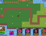
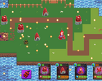
Aside from the blurry main character, the character art is very nice looking. The mismatch of assets, however, does very jarring and detracts from the pleasant visuals of the characters.
There was a bug with the enemies sometimes walking off their path and just going in a straight line to the goal.
The gameplay is cool. I like the twist on a bullet hell jam. I feel the overall gameplay was decently executed.
Overall, even though the art was inconsistent, the gameplay was still decently fun.
I'd say the graphics don't all look consistent and there are definitely some bugs that need to be worked out. Still a cool idea, i hope you expand on it more in the future.
This feels like a really good idea and could be amazing with some polish! I love how you kind of set your own difficulty. However, the balance between bullet-hell difficulty and tower defense just doesn't feel very right or fun in this iteration. Also a lot of design is clunky with certain visual elements clashing against each other. Also needs a lot more content. If you plan to keep working on this, I think it could be something really cool!
Also I'm not too sure how Limitation plays into the theme? I could see some wonky answers but IMO it doesn't feel too close to the theme
Thanks your opinion