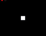
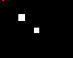
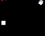
Play gameboy
AvoidMe's itch.io pageResults
| Criteria | Rank | Score* | Raw Score |
| Fun | #23 | 2.100 | 2.100 |
| Humor | #27 | 1.400 | 1.400 |
| Innovation | #29 | 1.700 | 1.700 |
| Theme | #30 | 2.000 | 2.000 |
| Audio | #31 | 1.200 | 1.200 |
| Overall | #33 | 1.700 | 1.700 |
| Graphics | #33 | 1.300 | 1.300 |
| Mood | #35 | 1.200 | 1.200 |
Ranked from 10 ratings. Score is adjusted from raw score by the median number of ratings per game in the jam.
Leave a comment
Log in with itch.io to leave a comment.


Comments
as stated in many of the other comments, the game is small and bland. for a one hour game, it is decent, but for a 48 hour jam, it's not enough.
this game doesn't really fit the theme very well, and the gameplay is rather simple and bland, which isn't exactly helped by the lack of sound and uninteresting visuals, although I guess it does kinda make sense considering how it was made in only one hour like you said.
Is OK for a 1-hour game, but it could be balanced better. As is, too few enemies appear to make the game exciting. Do you also participate in the 1-hour game jam?
i was more to the end of this jam i guess well not really i just had limited time for myself because i have other things to do
I don't see how the theme is used in this game...
Just having a small window isn't enough...
I know you only had 1 hour, but you could make a lot more within that time than what you're showing here. Try adding a light circle around the player, or have the enemies fade in as they get closer to you. Maybe have them increase their speed the longer you are alive, and your time becomes a highscore system. I think all of that is possible within one hour.
Good luck next time!
i was planning to have seconds but the seconds and it was implemented at one point but i did remove it also i tried to make it limited view by not showing where the enemy will appear after thinking about it i realized that yeah thats not really a thing
Why did you remove the timer? That gives the player motivation for something to beat.
Also, you could just have a circle that reveals the area around the player, but completely hides the rest.
I just feel like there's room for improvement... Hope to see it evolve into something great!
ok ill work on it this arvo! thanks for the motivation!
now thinking in the future i have other exciting games to work on
This game is super small (in size, gameplay and everything else) .I like the idea and implementation, but for a 48h Jam it's clearly not enough. Next time you should invest more time in the Jam ;).
well yeah i did only have like an hour in my own time i was planning to have a timer to act as high score but i couldnt implement it right enough to fit so i removed it completely i tried to increase the res but then it just looked like a modern game with straight sharp looking edges on the cube i tried to aim for jaggeder edges but thinking of it now i could of pulled the same effect off with another method. thanks for your review!
This an super simplistic game, but was okay fun to play.
thank you!