Play game
BattleSquad's itch.io pageResults
| Criteria | Rank | Score* | Raw Score |
| Art / Graphics | #66 | 2.315 | 2.500 |
| Overall Fun | #67 | 1.852 | 2.000 |
| Sound/Music | #69 | 1.389 | 1.500 |
| Controls / UI | #70 | 1.080 | 1.167 |
Ranked from 6 ratings. Score is adjusted from raw score by the median number of ratings per game in the jam.
Leave a comment
Log in with itch.io to leave a comment.


Comments
I am going through all submissions to make all developers aware of an important Google form I've made.
I'm joining the IQ folks to help organize smaller events in between the main FQ event in order to help prevent us from getting too many games in main events. Right now, I have a planned structure for these events but I would like to hear from everyone who was in this event in order to tune things better. The survey is a bit long, but it covers as much as I could think of. If you can take the time to do the survey by June 1st, I would immensely appreciate it!
You can find the form here: https://forms.gle/P9LPYwERhJtpZzteA
Hello from tonight's stream!
I felt very unsure of how to play this game. While I did figure out about changing weapons and how they work with AP, I had no indication of what was working. Things happen instantaneously without any idea of how things are working. Besides needing something to tell the player what does what, there should be indications of damage done so the player knows what's going on. This is a good prototype, but it needs a lot more work before it gets to what I would consider an alpha build.
So, your game does have potential. I'm a huge fan of turn-based tactical games. XCom, Gears: Tactics, Dungeons of Naheulbek, Road to Eden, Wasteland 2 & 3... are all some of my favorite games. Here's my feedback, though...
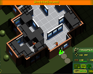
1. Art/Graphics: Characters look fine, but it would be nice if soldiers and enemies had a bit more variety. This is likely a very early build, but maybe give some soldiers different colors, hats, hair, etc. Everyone looks the same. BUT... level design, building layout, and the outside looks well put together!
2. Controls/UI: Your game is lacking in this department. When you move the camera around with WASD... it gets stuck... or lags. Plus, there's no key to swap between soldiers quickly, and I noticed I had to click on the enemies multiple times before my soldier would even fire at them. So, it felt very unresponsive.
3. Sound/Music: Sound effects need some work. Not a fan of the bouncy sounds when you move characters. Maybe have footsteps here instead. Also... no music. It's very quiet. Also... the audio is very loud. When I moved my first soldier, I had to turn my headphones down quite a bit.
4. Overall Fun: Again... some good potential here. You just have a lot of work ahead of you, but you can make this game great. Right now... the buggy controls, no tutorial, small UI, and the fact that enemy turns play out so quickly... it just felt rushed and unfinished.
SUGGESTIONS:
1. Slow enemy turns down. It happens so fast. It was over, and I didn't even realize a soldier died until I moved the camera around on my turn.
2. Enemies have way too much health. I had one enemy surrounded by 4 of my soldiers... they all shot him a couple of rounds... still not dead. Not sure if this is a bug... or if the enemies are hulked-out super soldiers.
3. More variety in enemy and soldier appearances.
4. Music. Something intense and upbeat for combat.
5. Rework the sound effects. The dings and dongs aren't very fitting IMO. Unless you're going for the retro sounds of a classic Atari or NES game...
6. Gun fire SE's footsteps, maybe some environmental ambient sounds... the world around you needs to feel more alive.
I'm sure this is still really early in development, and you plan to fix most of this, but I hope the feedback you're receiving from everyone is helpful! I gave you a follow and will keep an eye on this one! :-)
Its pretty rough and buggy, but I don't dislike the artstyle much and I could see it developing into a more full experience. The biggest problems are how quickly the camera moves between soldiers which is disorienting, the bad web scaling, and the lack of any explanations of how anaything works past moving soldiers.
There is some potential here, but it needs some work. Especially in the controls and UI.
The mouse controls felt a little odd. Having to click on the tiles instead of the characters lead to a lot of misclicks and unintended actions. Being able to select characters by clicking on their models would be a big improvement, especially when trying to attack enemies.
Moving the camera with middle mouse button worked okay, but I think it would be better to use the right mouse button. It doesn't seem to be assigned to anything else at the moment. It's more natural and easier to do than holding down the scroll wheel.
The equipment UI felt strange to use. I had to click on attack options multiple times to select the correct one. I'm not sure if I was accidentally selecting and deselecting things. Perhaps making the button change colors or stick out/push in would help.
The Trooper's remaining AP is easy to miss. I didn't notice it until I was messing around with the equipment UI trying to select an attack option. Removing the movement icon next to it and just having "AP x[number]" would be preferable.
Line-of-sight for attacks seems a little off. I put a Trooper on a window, but couldn't attack the enemy standing slightly to the side. I'm not sure if I did something wrong or not, as characters could clearly shoot diagonally outside the house.
Enemies feel like they have way too much health. It took four 3-round bursts to down a single enemy; that's the entire turn of the Trooper. I stopped using single shots after I learned that. Adding enemy health bars would also be a welcome change.
Enemies teleporting around made it kind of difficult to keep track of their actions. I understand it's an early build and running animations are not done yet, but I would move it higher in the priority list. Even having them slide around would give the player a proper idea of what's happening.
Sounds were a little loud, and there seems to be a bug that causes the Trooper movement sound to get louder each time. It would appear to be playing the same sound several times at once. Otherwise, having different sound for different things was a very good idea and improved the experience a lot.
The low-poly art style looks good, but the fog-of-war needs some work. It wasn't always clear where I could see inside a house, and moving around only made it more confusing. Having noticeably darker tiles might work better than 3D blocks. The characters and enviroment itself looked fine.
Finally, I think there needs to be a visible enemy counter. Either it could be present at all times, or when there's 2 or 3 enemies left on the map. I walked around for a good 5 minutes, unsure if there was an enemy left alive or if I broke the game somehow. Eventually the last enemy walked into my full squad and paid the price, ending the mission.
With some more time and changes, this could be a nice turn-based tactics game!
I played a small mission. I played the webGL version fullscreen. Scrolling with the middle-mouse button seemed easier than using wasd, but the scroll speed was a little slower than I liked. Maybe increase the amount of scrolling?
I was moving my soldiers around, and an enemy popped up through a door on their turn. 3 of my soldiers fired at it with 100% hit, but that soldier didn't die. The next enemy turn, it killed my soldier with maybe 1 shot? Not sure why I couldn't kill them.
The next turn, I tried firing at that soldier again, but it still didn't die :(