Play game
MF-01 Aerostrike's itch.io pageResults
| Criteria | Rank | Score* | Raw Score |
| Controls / UI | #2 | 4.667 | 4.667 |
| Overall Fun | #7 | 4.556 | 4.556 |
| Sound/Music | #22 | 4.111 | 4.111 |
| Art / Graphics | #24 | 4.222 | 4.222 |
Ranked from 9 ratings. Score is adjusted from raw score by the median number of ratings per game in the jam.
Leave a comment
Log in with itch.io to leave a comment.



Comments
I am going through all submissions to make all developers aware of an important Google form I've made.
I'm joining the IQ folks to help organize smaller events in between the main FQ event in order to help prevent us from getting too many games in main events. Right now, I have a planned structure for these events but I would like to hear from everyone who was in this event in order to tune things better. The survey is a bit long, but it covers as much as I could think of. If you can take the time to do the survey by June 1st, I would immensely appreciate it!
You can find the form here: https://forms.gle/P9LPYwERhJtpZzteA
I think you already posted the form here before.
Oh shoot, whoops. I deleted that other one. XD
A great shooter with amazing potential and an old-school feel. I played the DEMO, not the campaign so I won't discuss the story.
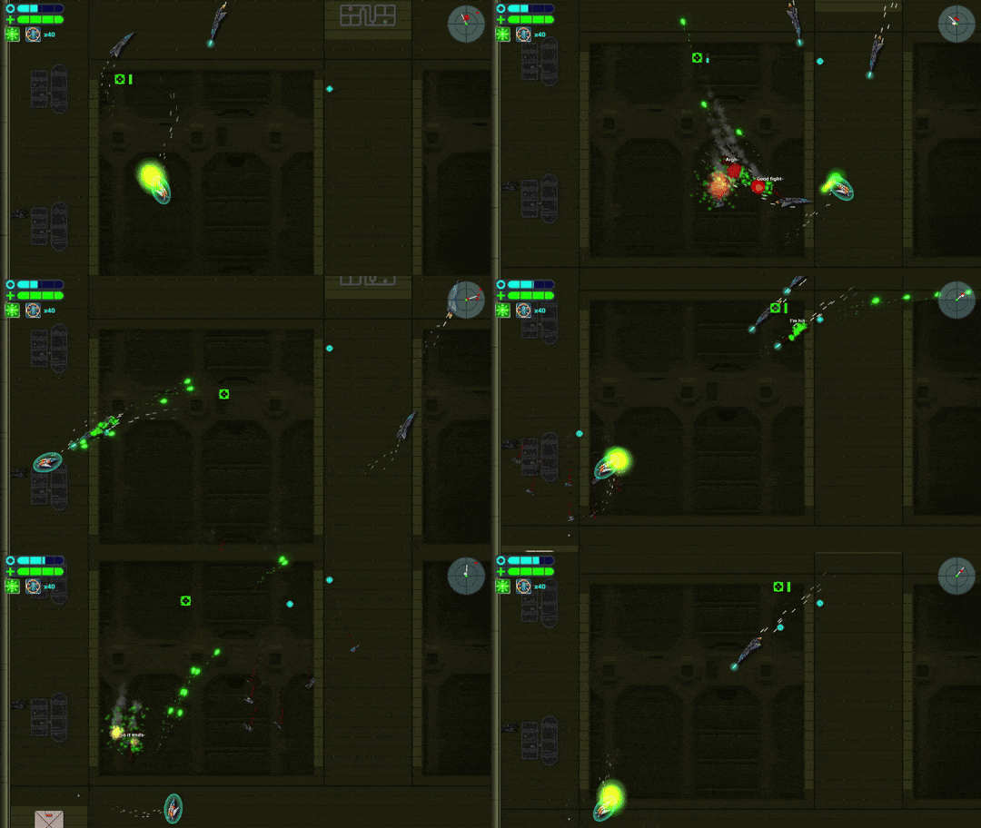
Art Direction: I like the main ship as the enemies' design, all the effects are nice to look at and easy to read. I don't really like the environment as it feels a bit empty, but it also let you focus more on the action.
Controls/UI: really tight, the ship is easily maneuvered and responsive. UI is fine, readable but a bit lacking in details. Also, I think that a different color during the main dialogue for whoever is talking would be a nice touch.
Audio: music and sound design are great, with nice little details here and there. The player's weapon is a bit too loud and can cover enemies spawning sound or their weapon.
Game loop: the exploration is really fun, with lots of abilities to discover and the fights are fun and varied, with different approaches to them. Each enemy type is unique and with a solid design.
Overall a great game with near-perfect controls and an addicting game loop. Also, I really loved the little quips and remarks the enemies ships do while patrolling, fighting, or dying.
Great job!
Thanks for the feedback!
I am looking at options to add some detail to the background walls without making it too distracting to the player, or troublesome to implement. I can try a do another audio balancing sometime in the future as well. Were there any particular sounds that felt a little too loud, aside of the player weapons?
I had a ton of fun playing the campaign mode on the easy difficulty. The buildup of challenges was great, the pace didn't feel too fast (which was good), and I liked the story as it unfolded.
The variety of enemies was good too -- the small drone things that fire quickly are a pain! And the mine with swirly attacks is nicely balanced with slow movement.
In terms of the story (no idea if this ends up being the case), it would be pretty cool if the AI guiding the player ends up being evil, and the enemies were actually the guards of the facility doing their job. I also really liked the the antagonist was a woman :) Yay for representation!
Keep up the great work!
Edit: VOD link: https://www.twitch.tv/videos/1825791099?t=00h02m56s
Thanks for the comments!
The story of the game is already written, so I guess you'll have to play through the Campaign to figure it out. There's quite a few characters between the Campaign and Rebel Ops, but Hel for sure was one of my favorites to write dialogue for.
I really, really, really enjoyed your game! It was a lot of fun. Great combat, and I enjoyed developing different strategies to avoid enemy fire... weaving around them, using cover, etc. Here's my feedback...
1. I got the 23mm Cannon first. A tutorial came up telling me to press X - Y to switch weapons, but I only had that. It was confusing at first because I thought I was doing something wrong by not being able to switch weapons. It wasn't until I got the Energy Cannon that I could finally do it. Perhaps the tutorial only pops when you get a second weapon?
2. Level design is laid out great but some additional decor would help. Right now, the walls and blocks are a bit plain. Maybe add in some wires, textures, and even broken edges and dents in the walls. Everything is super straight, clean-cut, and blocky.
3. The ability to adjust individual sound types: music, ambient sounds, and sound effects. I love how the music picks up during battle, but the sound of the fighting drowns out the music (gunfire, explosions, etc). I'd love to hear the music more.
That's it, though. The ship and enemy artwork is really good, I love twin-stick shooters, and the ability to swap weapons (once you get multiple) is nice. I love how the energy cannon destroys shields faster... forcing you to swap weapons frequently. You gave each weapon a purpose. I like that. The rocket was a nice weapon/addition as well! I'm giving this a follow and look forward to the full game!
Thanks for the feedback!
PS: The full game is already released here on itch, and I'm actively working to get it out on Steam as well. You can find it as MF-01 Aerostrike over there.
Oh, I'll check the full game out. My suggestions aren't super important, honestly. Overall I'd give your game 5 stars :-) Really enjoyed it! I missed the volume control. I'll check that out, as well. I forgot to mention... I love all the options for difficulty and game modes, too!
The game is really fun, frantic and energetic. Shooting and the sound effects are incredibly satisying with how many bullets are fired in quick succession, combined with the fast enemies and open combat arenas with non linear progression makes the pace pretty quick.
Overall, I really like it, but there are a couple things I would recommend.
- Add more sound effects, I think the current ones are perfect, but even more would make it even better (sounds for enemies spawning, making voice lines that can play during combat, more mechanical sounds for the ships, sound for explosions, etc...)
- Idk if its a bug? but after a while there was no music in combat, which made it feel a little less hype, I think adding some electronic or rock music would be great.
- Make the player's shield green, sometimes I get lost and because enemy shields are the same color it takes a couple extra seconds to find it.
Thanks for the feedback!
The pace of the game and the enourmous ammount of bullets all over the place is really good. I used to play a lot of this type of games before, so more bullets, more colors, explosions and skins will alway be better haha. It's never enough. But is a really fun experience. Is one of those games you play when you need a bump. My reaction time is not as it used to be, i realize now lol. Keep making the best with this one!
Thank you for the comments! I'm glad you enjoyed the game.
Adding the improved weapon models after it was suggested last week really did help the spectacle of combat. I might try and add some more detail to explosive projectiles at some point too.
I gave it my go finally, I know this is a very polished game at this moment, any comment I make would be ideas to help you "stand out" from the rest of bullet hell type games.
1. There are a lot of bullet hell games with spaceships, if you vary from that, you can fair well, I would suggest add more to the concept of the potato ship, add enemy skins that also are food, when indiegames don't take themselves too seriously, they tend to sell well with the audience. Maybe consider it for an alternative version. Same mechanics, different look, it can appeal to a different audience from the original target.
2. Bullets hell games tend to stand out when the bullets look like "fireworks" visually as in the colors patterns being shot at look pretty on a screenshot, consider that as a possibility to add to your game, right now they work really well as gameplay, but doesn't seem to have the firework qualities yet.
I didn't get very far so I am not sure how many different stages and backgrounds you got, I would say for first few stages, consider making the backgrounds your most pleasant and your best, so you can intrigue players to stick around and want to explore your world even more. I think your story is flexible enough to switch things around.
You are around for the stream but here's the VOD: https://www.twitch.tv/videos/1817769943
Thanks for the feedback, and thanks for the VOD link!
I'm not sure about a full Potato rebranding, but I can give it some thought. It is true that the Potatostrike alone has gained far more attention than the game ever did on its own, so it's worth looking into it. However, even just adding a full Potato mode will take a moderate amount of time, as I'd have to make unique models for all enemy ships in the game, and there's over 30 of them at this point.
I can look into replacing the projectile models for something more visually pleasing. I've actually looked into this a few times in the past, but never quite committed to doing it for a multitude of reasons. I'll try to have it ready for the next patch, 1.3.9, but it will most likely have to wait for the following one. Here's an early look of what I've got so far during testing:
The Campaign is not divided into stages, but the world has a total of 8 Areas you can explore. There's a total of 8 fully unique backgrounds, and 9 variations of those backgrounds. Each background is tinted with coding to fit the area you're in, and most variations add a large number to the background, indicating which area you're in. For example, Area 1 would be tinted green and display 0-1 on some rooms.
This was done mostly due to budget constraints; pixel artists often charge by size, and backgrounds by design are pretty large images. I've wanted to get new backgrounds for some time now, I even have contacted an artist on Mastodon about it, but without a way to cover the expenses there's not much I can do, unfortunately.
Potatostrike is definitely going to be a commitment, but I think the potential to do well might be high. Glad you are considering it.
As for BG, I think you have some bg that can move up to earlier that already exist like the pan with the mountain in the later side of the campaign.
Projectile fireworks, a good visual example would be Touhou series, the whole screen is just fireworks over and over, different shapes and color combos, lots of circular forms. I heard other devs have better luck with fiverr for art commissions if you ever need to try for that.
Right now the game takes place in an underground base. When you see the mountains, that's on one of the few corridors that actually have a view of the outside.
Unfortunately I can't move that corridor earlier in the game without redesigning major parts of the map. Especially the first area of the game, which houses the tutorial. Alternatively, I might have to break the established shape of the base to excuse an outdoors corridor several kilometers underground. I did think of improving the background of the starting room, but I would need more funds to do that change.
As far as enemy attacks go, there are a few enemies that do actually have some more distinct patterns or behaviors. The Spinner fires projectiles in a spiral, the Javelin fires projectiles that bounce off walls, the Knight fires projectiles that explode into smaller pellets, and the Stinger just rams into enemies with their Energy Spike. Most appear later in the game since they're more difficult to fight.
I actually do know Fiverr, it's where I found the artists that did the Title Screen art, the Ending Screen art, and most of the ship models. It's a fairly good platform, and I was planning to use it for the Steam achievement icons.
Great to see what you got already, I think just switch the colors of the bullets would do to add that fireworks effect if it's an easy enough tweak. Yeah no point to break the game over something like a minor improvements. If you can get pink, blue or pink green on screen it can work like fire works, with it so busy though u might want to stick to just 2 different colors of bullets from enemies, plus the players white bullet. Best wishes!
Very fun metroidvania bullet hell. Good enemy variety. I really like the ability to move between rooms on each level. Good weapon variety and unlockables. There is replayability due to secrets on the map during the level. I heard a sound alert for a double kill, which unlocked a paint job for the ship, but I didn't like how I didn't understand what that sound meant in real-time due to no reward notification pop up. Controls were very consistent and I had no issues, personally. Love the art style. It fits with your musical tone as well!
Thanks for the feedback! I have a few ideas for a challenge reward notification, I'll try them out and see which works best.