Play game
Lost Balance's itch.io pageResults
| Criteria | Rank | Score* | Raw Score |
| Sound/Music | #38 | 3.167 | 3.167 |
| Controls / UI | #43 | 3.167 | 3.167 |
| Art / Graphics | #59 | 2.833 | 2.833 |
| Overall Fun | #60 | 2.833 | 2.833 |
Ranked from 6 ratings. Score is adjusted from raw score by the median number of ratings per game in the jam.
Leave a comment
Log in with itch.io to leave a comment.




Comments
Hi, I gave it a try to the game and it’s a great game to play and have an interesting story. I found some things to improve in future updates:
The game have a good base and surely with some improvements it will be a great game!! Good luck working on it!! I hope it goes well!!
Hello! Welcome to Feedback Quest 6! My name's Hythrain, and I'm one of the hosts and streamers for this event! This feedback is being written live on my stream.
I'm a lover of turn based RPGs, even when they feel so generically RPG Maker. So I had fun playing this. However, I also felt like because it's RPG Maker, I should let myself get more specific with things. You also plan on "remaking" this, so I'm more invested in helping you make it better it all regards. Some of this may seem as nitpicking, but I promise it helps to fix things up.
First, I want to know what you're doing to differentiate yourself from other RPG Maker games in terms of gameplay. A prime example of what I mean is in this event: Moonfell. It uses its own distinct art style and makes a UI that doesn't feel like RPG Maker, though you can tell it has RPG Maker roots when you look very closely. It does its own thing to stand out as unique. Its developer also has another RPG Maker game that ALSO feels unique and not at all like RPG Maker. So what are you doing to be unique? If nothing, you need to think in terms of gameplay as well as story for your remake.
Here are a few things I noticed during my playthrough that should also be avoided or addressed in a remake that (I hope) aren't repeats of Moogle's.
1. Eliza gets her next turn much faster when using attack at level one, to the point where she's better off not using magic at all for the first few levels. If someone is intended as a mage, they should benefit by acting as a mage.
2. There are a lot of sounds going on in the first area, with fire burning and sword clashing on top of the music. I would absolutely say you should remove at least one, if not both of those additional sounds as they're just not necessary. If you do add it, make sure it's not too loud either. ideally, you should be able to hear music first and then the sound effects for those consistent ones. If it's one time and short, then it can be louder.
3. One of the first chest items you can get is a Small Sword. It's weaker than the starting weapon for all characters. Just... why? Chests should always be upgrades, unless you've been able to buy better. Speaking of, limit what the first stores can sell instead of giving them everything. This will make more sense later.
4. I was confused when I got my first random battle, since it seemed to be a set battle game. Outside of the world map, it didn't make sense to me to do both outside of boss fights. I'd say you should remove the random battles from in-area places, keeping instead only set battles. You could do random battles on the world map if you really want to, but if you don't then you can more easily control experience gain and thus always have an idea what level the player should be at. This lets you plan boss encounters around whatever skills the characters will have at minimum by then.
5. So while I love when something is more clearly told in the environment, the massive swing between finding the secret staircase and being told the exact ways to go in the maze to save you time just felt widely different. You need to find a balance in this. On one hand, you want something to stand out enough for the player to know it's what they're looking for, which nothing really did for the stairs. For a prime example, you can check LTTP just before the Agahnim. On the other hand, you don't need such an obvious tell as arrows that point the efficient way right when you need them. Instead, what you could do is something more subtle like showing a certain number of tiles in a way that indicates if it's first or second. If this doesn't make sense, let me know and I'll happily make an example image.
6. So when I was trying to buy items from the shops after getting out of the cave (which was also the first time I had bought anything), there were a LOT of different items. There were two swords that had no description to them, but based on power and money scaling they looked to only be upgrades of the previous swords. However, it turned out they were 2H swords. This leads me to a bigger issue of every character being able to equip a lot of similar gear with no uniqueness to them. Not only does this make decisions less meaningful, but it means when you offer a TON of gear options it gets very confusing. Think of it like this: you don't need to have weaker versions of weapons if the player is likely just going to go for the strongest thing. Similarly, when you limit gear you only need to put up what should be the minimum gear baseline for the next area. That way, items moving forward also remain upgrades that may or may not be beaten by items the next time you get the chance to upgrade. This is why I suggested limiting what the first stores can sell.
So those were the things that felt important to address. These will make your area design and your gameplay just a bit more unique. Now this is only just for the gameplay. I also wanted to speak about story, as a hopeful writer myself and absolutely want to help.
At no point did any of the dialogue give any sense of character personality. Like, if you had told me the personalities and behaviours of each character, I would not be able to identify any of that in the dialogue. Every statement and question was very much next on the "let's keep pushing the story" side, which never allows for personality. I think the only thing that ever gave me that sense was when the Queen of Termerkia said their daughter should stay, since it'd be a learning experience. This one line gives a LOT of personality, but whether it's intended or not is another question. It makes her seem as a strict and pissed off type, who has a bit of cruelty to her. If that's your intent, cool. If not, welp, ya done goofed. Overall, because of this matter-of-fact style of talking, it also means the story gets rushed. There's no room for discussion or questioning of things that ultimately don't matter for the sake of the story but should be to be realistic like who the heck is Terence and why was he listening in and trusted so immediately?
As such, if you want me to I would be happy to help you flesh the story more into something far stronger. It'll still be you writing it, but I'll help you work in the personality more. This will make your story stick out more, as well.
Delayed reply, but no excuses.
Firstly, I want to thank you for hosting the gamejam, and for playing/reviewing my game.
If you have a VOD, as I missed the stream... It will be very appreciated if you can link it to a reply.
I'm going to answer your question(s)/provide context.
Yes, I do plan to remake the game, it never reached what I envisioned for it. The problem was my skill-set and experience with the engine.
But it's already been 4 years, and that's more than long enough to improve on all fronts.
And yes, lol. The difference between "playing a game" and "reviewing a game" is one you play to have fun, the latter you play to find problems.
0. I'm glad you did enjoy the game to a degree, and thank you for the offer. If I ever do need it, I will remember to reach out.
0/2. So, when originally making the game, I did not know what a "generic RPG Maker" was. Everything was "new" and "it's own style" when making it. Until I really got into the culture and can now agree that my game is indeed as generic as it can be (without the story).
0/3. I have everything (mostly) figured out, this update isn't good enough to show my "full power". Fixing a 4-year-old game was way harder than I thought, lol? Can't really know what will break if I touch something, the problem with working on an already "solidified" game.
1. I've never really hard-tested the basic-attack, so I don't have much to say. But it's probably connected to the plugins I'm using, which use Agility for turn-order, and if I remember right. Attack is usually treated as a "fast attack" in vanilla RPG Maker thus giving it a boost of some sort. This problem would lie with unbalanced Agility, something never properly balanced in this game.
2. I do agree with you with the audio-direction. Basic audio-design, lol? I've tried adding proximity to the fire sounds which really fixed that and made the game sound 100x better, but that destroyed the game in framerate, so I decided on the little time I had to just revert back and keep both sounds as they were.
3. "Chests should always be upgrades" is something I've heard quite a bit throughout the feedback period of this game. There are two reasons why the original didn't do it: I didn't want to make the player OP, and I didn't want to make 100 unique items.
The reason why the update did not fix this was: I did not have time, 2 months was surprisingly not enough to finish the update. And I switched the characters starting items to things that "fit them better" but did not rebalance the chests. So, I kind of made things worse in that regard.
3/2. I can't agree with the shop more than I already do, lol. But I slightly disagree, it would be good to keep a small range of "tiers" in case the player wanted to grind or not before the shop.
But I agree that the first shop, has way too much in stock. But the problem is, there's only like 3 shops? In the current game.
4. Random battles are used so when you "touch" an enemy, it uses that to randomly pick a "troop" for you to fight. Problem is, I found no way to disable this. So, I just made it "very rare" for it to happen, by maxing out the maximum steps needed to trigger one (7000 steps), but Vanilla system does it as 1-7000 steps can trigger one, so the maximum was a band-aid on a bullet-wound.
4 years later though, I have a fix. But had too little time to implement it for the update.
But I do agree with you with how it should have been designed.
5. The maze is an abomination. I wanted to rebuild it, but time constraints... The "arrows" was added because people I know got stuck in the maze... A stupid fix, really.
Why did the maze exist in the first place? The original game, I gave myself a strict deadline. And I "had to" follow it. Even if that meant having this abomination exist.
6. I was sure I gave every weapon a description, but maybe when I got into "grinding mode" I skipped over some without thinking.
I both agree and disagree with you. I believe there should be at least 3-tiers available for purchase (all being an upgrade of some sort), so players who did want to hoard gold before the first shop, would have a little more options.
6/2. The story is what is called "lightning-fast" at its current state. The good? It's not dragged out at all (except a few scenes I can think off...) while the bad, no character development, nothing...
The Queen has then come off as the way I wanted then, so I'm glad I did something right.
"Need to be intimidating, and authoritve as a political leader." is what I imagined her to think.
---
So, I do want to know if a VOD is available, if not. I would like to know where you stopped, I want to know what reaction my "plot twist" gave people, if they get that far.
Thank you again for the review, I hope my reply was informative and helped provide context and/or answer questions.
My wishes for a good day to you.
So first, it's cool man. Like, the VOD for your part won't be up for, like, 3 more days even. I'm not worried.
Second, I was not expecting you to give so much. I was never worried about context, but I do understand how time constraints can lead to shortcuts. My goal in mentioning the oddities is to ensure they are issues of time constraint, because so long as you acknowledge them then it's all good.
That said, in the end the one thing I wanted to know wasn't truly answered. XD What do you plan to do to stand out? This is the most important part, since as you go forward you need to have this already in your head so you're working to that goal.
Lastly, I want to cover something with you to explain my reasoning on one thing...
So as someone who knows me quite well, this is the bane of my existence with RPGs for two reasons:
1. If a game has random battles, I will grind currency until I get the top equipment.
2. If a game has fixed battles, I will hoard until I deck my team the top option then hoard again until I can afford the next top option set.
And I can't fix this problem. I try not to and my brain doesn't let me. I don't feel okay doing it. Reason why is because I'm neurodivergent (depression, anxiety, ADHD, likely autism) and I'm very rigid with things like this.
So for me, it makes RPGs more of a grind for me than they should be. The more that I feel the grind, the more I dislike the game. Right now, there is no grind. The shop-related issues I had were a result of missing descriptions primarily, but I had the money to get what I wanted from it.
Lastly, what's the difference? Like, all you're going to do each new "tier" is shift things up one or two levels, making the old top item now the mid or low tier. It's the same idea, only allowing someone to hoard for some unknown reason instead of just being "Okay, here's the new minimum level. Everything ahead will be stronger."
Looking back, I think I've misread your thoughts on shops. I
think Iunderstand what you were trying to say now.I know that I haven't exactly answered your question, but I can't/don't want to go to any specifics.
Too early, and I don't know what works and what doesn't (technically), don't want to make promises I won't keep.
But to vaguely answer it, a combat system I made up on my own, trauma(wounds) system, etc, etc.
Basically, I'm "abandoning" this and making an entirely new game with the same concept of lore.
Well, I'm glad there was no need for "a grind". But many have told me that the current game has "too many enemies".
Mainly because the current game-loop is run-fight-trigger_cutscene, and the story/combat isn't good enough to make up for it.
I mainly updated this game, so I had an excuse to have it in this jam. To gain feedback. Now that I have gained said feedback, I'm satisfied and can move on to remaking the entire thing.
I don't regret not touching it for 4 years or releasing a semi-broken update now. Because I've gained necessary experience and feedback.
I suppose what would be best, is to finish the current update so it won't be left half-finished and fix the major issues found with it.
Then I want to move to a new project, I'm burned out with this one. lol?
Well, thank you again for the feedback. It's been thought-provoking and quite useful because of it.
Hi! My apologies in advance for the novel to follow. I wanted to provide as much detail as possible regarding my experience in the hopes of providing actionable feedback. I'm hoping it comes across as such, rather than an attempt to roast the game.
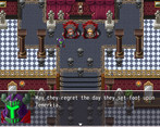
I'd like to see the intro display something other than a black screen with the dialog boxes. Seems like a lost opportunity.
Is there any way to convey the characters' classes/roles other than that kind of chunky tutorial text? Something that also demonstrates their personalities might be better. (EDIT: I don't have any sense of what makes these characters tick, even as far as the maze section)
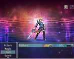
"This should be easy". Enemy proceeds to deal 2/3 of Eliza's HP in damage in one turn. If the third attack had gone her direction I would have lost a character instantly, which seems weird for an opening battle. I didn't use Taunt because the characters said it would be easy, and the hint text said that skill was for harder battles, so it kind of felt like a gotcha to be honest. Maybe you have something in place to where Eliza can't die in the fight and it's just cinematic, but it doesn't establish a great feel right off the bat.
The tutorial text assumes keyboard rather than controller. Would be an easy fix to just mention which buttons are mapped on your average X Box or generic gamepad. Though, I think it would be better still to use a key rebind plugin and direct the player there to configure their own control scheme.
The second wave of guards doesn't have that crazy triple attack skill, or maybe it was just bad RNG on the intro battle. I'd still suggest making the intro fight not have a chance to kill Eliza out of nowhere, if it doesn't already.
I don't like stuff with such a low % chance of working, but it's OK-ish for damage skills which just happen to have secondary effects. Cure, on the other hand, should never have a % chance to work. That feels extremely bad, and I would never waste 10 MP and potentially a turn on that. (EDIT: I never really found a need to remove States, which isn't a sign that they are well designed)
NOTE: can you put in the skill descriptions which ones are instant-cast? It feels like Heal and Taunt don't take an action, but I have no way to confirm that's actually how it works other than observation.
Curiosity: why does magic do fixed damage, but physical scales with ATK? Fire and Light are already super weak versus literally anything Ryoma can do, since he now has THREE skills which deal multiple hits, each of which deals in excess of 100 damage. BTW, he learned Dual Attack at level 4, but he already had the skill at level 1. Was he not supposed to have this starting off?
These battles pose literally no threat now since I level up every time and the DEF scaling seems to make enemy attacks do negligible damage.
Got Fire 2 already. The % chance is high enough to maybe proc sometimes, great. Its damage is already lower than Ryoma's Dual Attack, though, and I just learned it. Plus Fire1 is completely useless, since I don't have to worry about MP conservation given how this leveling system works. Incidentally, I don't level up every encounter now (which is good), but there isn't a sense of danger or attrition to any of the battles. I also get one or more potions from every fight.
Enemy detection is kind of wonky. Sometimes they make an alert emote but don't approach or speed up.
I found a Buckler, cool. Wait why does it REDUCE my Guard Effect from 100% to 5%?! I think it was supposed to increase it to 105%, perhaps? Well, Imma equip it anyways because the DEF bonus warrants it.
Please consider using a plugin that makes it so moving events stop moving when an event / dialog box is playing. I just got stopped by a random "I think this is where the secret passage is" text box, which felt weird because he just said he didn't know where the passage was 30 seconds ago, then 3 guards mobbed me. Very tedious, because at this point enemies are just bags of hit points and treasure.
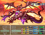
The Eliza solo fight was the closest thing to a strategic battle I've had this far. Felt pretty good to exploit the slime's weakness right away, but the rest of the battle was sketchy because it felt like if both soldiers used their OP skills on the same turn I would just be dead. So, used Sweep to stun one guy, used Heal every turn to top off, and used Dual Attack to chop down the enemies. At this point it dawned on me that TP recovers so quickly from damage taken that I have practically unlimited. I'd strongly suggest reducing the TP gain rate.
Ran into the secret passage (the black screen eventing once again felt lazy tbh) and then wandered around the maze for a bit looking for levers. Nothing new or exciting at this point, and unfortunately I am not invested at all in the story because it's so generic and there are no character moments. Actually, at this point it's barely a story, it's a series of plot events. And the gameplay is not compelling either.
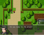
I don't want to harp on the mapping too much because it looks like a previous reviewer covered that, but I will concur that it needs a lot of work. Not just mapping however; the level design itself is subpar. I think you could do more interesting things with having to be stealthy and not just farm all the battles in these huge rooms, though that would require fixing whatever mechanism is driving the enemy alerts.
I know this is a big update to an existing game and it seems like a lot of effort has been spent in establishing scope and setting up later characters and story arcs, but with an introduction this clunky I feel like a lot of players will tap out before you get there. My advice would be to refocus that effort into quality rather than scale. If the game was polished I could somewhat forgive a lot of the less-than-original mechanics and tropes and the vanilla gameplay, but the combination of poor balancing, obvious database mistakes, and generally questionable systems design make it very tough to trudge through.
I hope this info is useful and that you find success in continuing to improve your project.
Firstly, I want to thank you for playing the game and taking the time to write the long review.
The review has not come across as a roast, even though it is on the negative side it is still valuable and only stated facts that I agree on.
The current update 1.3.X was worked on for approximately 2 months on a 4-year-old game, the longer I try on this game the more I realize it would be much easier to start from scratch then work on something already "solidified".
Now to answer your questions/provide context:
1. I do agree that the intro has lost an opportunity, I do know how to draw but time was the issue. Also, in regard to my art-style it would be best to redraw all the assets, since the game currently is using default/free-assets.
2. Yes, there are many ways. But I never touched on them yet. People change a lot in 4 years, so unlike when I first made this game. I know how the engine works, and how to get what I want. The second half of what you said is very valuable, coming from someone who never experienced the world/story before, the game does move very quickly which ends up leaving for no room for the characters themselves. This can only be fixed by rewriting everything, which I will come back to later.
3. That is a problem, in the original the enemies' hits do so little that phrase would be valid. But in the current, everything was rebalanced and that text-box was unchanged. Having it give off the wrong impression is something that needs to be fixed. The first battle can be lost but it doesn't give a game-over. The tutorial in itself is not very good in its current state.
4. The keyboard part of the game, was mainly because I always played these games with keyboard. And at the time I did not know the engine had default gamepad support, there is nothing in the game that prevents the gamepad from being used but the tutorial was never adjusted. There is nothing in the game yet to cause key-rebinding to break anything, so that would be something to consider adding.
5. Pretty much all the soldiers have the "triple-attack", so it was "pure luck" that the intro one has been using it but the others rarely? So, far there is nothing in the intro battle to keep Eliza from dying off immediately. I'll look into it.
6. The only reason the skill has a chance, was to keep the items useful. I had other priorities to worry about than reworking the cure-skill, but it is a useless-skill since no player I know of has ever used it.
7. Yes, that was mentioned before. For whatever reason, only Taunt is insta-cast. It would be because of the characters AGI that heal seemed to be insta-cast, which that is something that isn't yet rebalanced properly in the current game.
8. Magic doesn't do fixed damage; the descriptions just haven't been reworded to make it clear. Which is a problem on my side. It's just the base damage, and Magic-Attack is added to the formula.
9. Leveling is something I couldn't rebalance safely. To change how quickly players level up, would break the fragile balance of the entire game. So, it is something I didn't want to touch when I had so little time. But I do agree that it is just too overpowered, and happens too often.
10. I do find the fire-damage interesting, throughout the development of the game. Ryoma always ended up as the one who tanks damage, but outputs the most. This is a problem with class/character balancing.
11. Enemy detection is very much broken. I do have a better method, but I haven't been able to implement it yet.
12. That text-box was added due to poor level-design. In the old game testers had trouble finding the passage, and that was "the fix". And this was a big issue that remained. Having something to stop movement of enemies during text was mentioned before, but also. Something beyond my skill-set of the time and was not implemented.
13. Eliza's solo battle is a favorite with others as well, I'm glad it was enjoyable. But the issue that Ryoma isn't there to carry the team, kept the battle from being the best it could be. An issue with enemy/class balancing.
14. Blacking out the screen was indeed used too often. If I were to have made the game much more recently, cutscenes would have been much more fleshed out. But sadly, with the time constraint of this jam, I didn't want to use too much time with cutscenes that "aren't broken."
15. So far, the games level design is: Run, fight, trigger-cutscene: Which is not at all fun, if the story or combat isn't good enough to make up. I've tried to rebuild the worst of the interactions, but there are just too many to fix in 2 months.
edit: Yes, I just realized the mistake with the shields.
I hope my reply was informative/useful?
Thank you again for playing the game and writing out the review. It was thought-provoking and very informative.
I'm leaning much closer to just starting from scratch, I've been wanting to remake the game anyway, and the changes I want to do will be too big for a simple update.
Hey Cootadude, thanks for the detailed reply.
Seems like we're mostly on the same wavelength as far as the approach needed to get the game in line with your vision. The good news is, you have sort of a design roadmap available based on what worked in this version and what didn't, should you choose to restart from scratch.
I also had to go to an earlier version. I went with 1.1 just to be safe. Everything seemed to run fine on that version. One suggestion I'd make is that there was a lot of characters introduced in a short time, so I think having their names displayed when talking would be helpful for the player to remember. I very much appreciate that the story driving forwards and throws you right into things without unnecessary hand holding, but it's hard to feel sympathetic to the characters when they are constantly moving forward often a bit recklessly. Maybe some banter sprinkled in or other way to give the characters moments to speak that showcase their unique personalities?
Firstly, I want to thank you for playing the game and writing a review!
Now...
I don't recommend 1.1.X, but what could you do when newer versions didn't work?
1.1 is the most stable as it is the "original game" and was before I started changing things.
Reformatting the text-box style is something I want to do, so making so it would have name-boxes would be doable and a nice touch.
People before have said the very start of the game was a strong-point until actual gameplay slowly pulled it down. I do agree that the current story-format moves too quickly for characters to "live a life".
I'm leaning closer to just starting from scratch since I have wanted to remake the game for a long time and working on an already "solidified" game is just causing more issues than I am fixing.
Thank you again for the review.
1.3.3 may be broken for some people, so if you get errors move back to 1.3.2.
I'll be looking into the issues and try to find a fix.
Heyo! I just got done testing this, and here are my overall thoughts! I've also prepared a Google Doc for you to read my live playtesting notes!
Overall, I think this game needs to figure out what its priorities are. Is this supposed to be a character driven adventure? A political drama? Or is the story just set dressing for an interesting combat system? Currently it doesn’t do anything especially well, and I’m not sure what the game’s big push is, either for players or for the devs. For players, what reason do we have to play a game like this? And for a dev, what aspect of this game makes you dedicated to keep making it? If you can answer those questions, let them guide your decisions to make a more interesting product.
Overall Fun: 1 / 5 - Enormous maps with on-map encounters, a huge tedious maze dungeon, tank but unchallenging enemies, very basic combat, and a lack of intriguing story or characters prevents me from really finding anything fun here. It wasn’t the most painful to get further in, but it was entirely lacking in flavour.
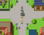
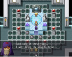
Art/Graphics: 2 / 5 - Mostly inoffensive RTP assets which would get a 3 from me, but the poor mapping and perceived lack of effort in most areas docks a point for me.
UI/Controls: 2 / 5 - Very little effort went into the UI, with default RPG Maker window layouts and text, as well as having to scroll through many menu options as the windows aren’t optimized to accommodate how many options there are. The UI is very sloppy, and the default layouts make it come off as lazy and uninspired.
Sound/Music: 2 / 5 - Mostly, it’s just generic and boring, but a few RTP songs are especially loud and grating. The choice to pitch shift a couple default RPG Maker tracks on its own doesn’t do much to make the game’s auditory identity feel deliberate or meaningful.
Sorry, I know this was a little harsh! I think if you can figure out a more clear direction for the game, you’ll have much more success! Good luck to you, and feel free to ask if you have any questions!
Thank you for the review.
It's thought provoking, in a good way.
My apologies about the error, it's probably related to some recent changes with the plugins. So, I republicized the previous update before those changes.
Thank you again, it's been very useful and informative.
V 1.3.3
1. Semi-fixed Discord-Rich-Experience
V 1.3.2
1 - Fixed a visual and audio bug in the intro
2 - Fixed a visual bug during Eliza's battle
3 - Moved a body to a better spot
4 - Fixed a plugin
V 1.3.1
1 - Removed unnecessary BGM commands, patching audio bugs.
2 - Rebalanced the economy.
3 - Fixed unoptimized events, and removed ones that are not being used.
4 - Fixed typos, grammical issues, reworded sentences, and reformated some
text boxes.
5 - Overhauled the Rat enemy.
6 - Updated credits.
7 - Fixed the gameover screen.
8 - Rebalanced when specific skills are given to characters.
9 - Added new early-game-low-level-crowd-control-skill.
10 - Removed some player skills.
11 - Saria now starts with a Tech skill.
12 - Edited Terence's class.
13 - Guard is now more effective
14 - Rebalanced all enemies.
15 - When stunned, the victim will gain 60% stun resistance for 2 turns.
16 - Updated used plugins.
17 - Added Q-audio plugin for "3D audio".
18 - Added new music.
19 - Randomized the sword clanking in the intro and final battle.
20 - Fixed a loading error at the ending scene.
21 - Ryoma no longer gains Heal skills besides First Aid.
22 - Permanently Fixed possible bugs present/fixed in old versions.
23 - Updated the boot-up screen, and made it slightly faster.
24 - Updated the nw.js.
25 - Rebalanced the weapons and armor.
26 - Descriptions added to all items!
27 - Fixed a graphical bug in the first cave.
28 - Updated the games pixi.js.
29 - Changed what the preloader preloads.
30 - Capped the game to 60fps.
31 - Frazzled is more effective, degenerates MP and TP by 8%. Victim has 10% more chance of being Paralyzed and Unbalanced while Frazzled. Decreases Agility by 2%.
32 - Resorted skills.
33 - Reformated all skill descriptions.
34 - Readjusted characters starting items.
35 - Readjusted the Swift Dagger.
36 - Fixed the gameover screen.
37 - Added Yanfly's equip_core plugin.
38 - Made enemy attack sounds more accurate.
39 - Rebalanced all classes.
40 - Changed the kingdom-soldier-enemy graphic.
41 - added quit confirmation.
42 - added equipupgrade plugin.
43 - Recatogorized some skills.
44 - Added smoothscroll to the camera.
45 - Overhauled visual transitions.
46 - Overhauled audio transitions.
47 - Added simple map interactions.
48 - Edited some maps.
49 - Rebalanced skills.
50 - Adjusted menu/text box color-tint to better fit the games overall style.
51 - Changed how the pathfinding in the final battle works.
52 - And probably things I forgot to list.