Play game
Nobody's Quest's itch.io pageResults
| Criteria | Rank | Score* | Raw Score |
| Sound/Music | #2 | 4.320 | 4.667 |
| Art | #2 | 4.629 | 5.000 |
| Overall Fun | #3 | 4.320 | 4.667 |
| Controls / UI | #6 | 2.777 | 3.000 |
Ranked from 3 ratings. Score is adjusted from raw score by the median number of ratings per game in the jam.
If you have competed before how has your game changed?
I submitted the game in the first feedback quest jam before a huge change, now stats matter much more in defeating different types of Evil Spawns!
Leave a comment
Log in with itch.io to leave a comment.


Comments
Hello! Welcome to Feedback Quest Pixel Art! I'm hythrain, the host for this quest and one of the streamers! This review is to let you know I just finished playing your game (this review is being written on stream) and am here to share feedback! If you want the VOD for afterwards, please let me know!
Right away, there was a quirkiness to the appearance of this game that I loved. It had so many overtures of Step By Step Villain. Then I heard the music, where those overtures cemented into an obvious style that I named as "PickleSlop" during the stream. You'll need to see for context. XD
For as much fun as I was having, there were two things that created issues. The first was the utter lack of Insight 10 enemies. I had every other stat well above 15 and a couple into 20, but Insight was still 12 because I had a hard time finding them. This also leads into the other issue, which is the chance for a stat up versus an item. If every enemy is intended to drop a specific thing, then this means there should be enough enemies to get all the level ups, right? However, I don't think this is the case because you not only have items that boost stats, but these items can be bought once you find a certain villager. These boosts would mean nothing if there wasn't a random element to it. If that is the case, then I think there needs to be improvements to getting those stat ups. At times I was searching and fighting over and over to get a single stat up, only to be denied again and again on the same colour.
What might work better is, if you keep track of the number of enemies with a certain colour and at a certain level, to create a loot table that is shared among all the enemies of that colour and level. So say there are 20 red monsters at level 10. You'd have a loot table consisting of maybe 9 items. The remaining spots are all stat levels. So when beating a monster, you have a 45% chance to get an item and a 55% chance to get a stat up for red. If you get an item, now it's a 40% chance to get an item and 60% chance to stat up. You would also want to ensure that the vast majority of level 10 red monsters are available to the player when they start.
The detection for attacking an enemy was also very off. I would be spamming the button to try and get it. Speaking of, awkward choice of controls. 100% recommend changing. :D
I played your game on stream: https://www.twitch.tv/videos/1850361813?t=00h01m34s
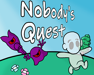
Overall, I had fun! The graphics are cute like Turn By Turn Villain, and the music is also whimsical and cute.. I appreciated the the Quing is non-binary :) And I liked that the game is set in the same universe with God S, and the villain in this game is the one you play in TbTV.
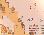
I didn't get to the combat itself, since I only did the stat-based comparison combat thing for a bunch of the monsters. I found that I kept pressing the wrong button on the gamepad to bring up my stats. It would be nice to have a way to pin my stats on the HUD all the time, or maybe have some way to visually show me which monsters I can insta-kill vs which I can't.. maybe by a skull icon on their heads or something.
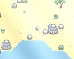
The exploration was nice, kind of like Zelda (maybe? I never played the original Zelda(s)) where you can enter zones and see places but can't access them for a while. Tunic had this too which was nice.
I liked the quest text with the Quing. The NPCs were not bad.. I think having more conversations with them might add more flavor and depth to the characters as well.
One big suggestion is on the combat initialization. It was difficult to get the victory symbol to show up and press the button to start combat. I eventually got better at it, but it was still tricky. I think you mentioned that you improved it in TbTV, and can make those changes here too. I think that would be a great improvement! :)
After I unlocked the Captain Beardie, I could have a ship that takes me to the villain. Maybe Capt Beardie should warn me that I'm severely underleveled :) Or maybe the villain can laugh at me, one-shot me and send me back or something.. I kind of expected that I'd go splat so I saved the game beforehand, but I can imagine a player getting upset if they lost all their progress. Maybe have an auto-save before the boss fight?
Thanks again for playing and for your feedback!! Yup, all great suggestions which I’ll make sure to implement! (Actually two of them are nearly done ^^)
This is actually my first project and then I got sidetracked with Step By Step Hero and Turn By Turn Villain (all part of the same universe), but Nobody’s Quest is far from being left aside!
Thanks again!
Hello there! I didn't realize you had another game. I played and reviewed this entry. Here's my breakdown (it's a lot, but I hope this helps). I haven't finished, but I'm really enjoying it, so I'll definitely keep playing. I want to finish the demo.
OVERALL FUN
Most important category (IMO) and you nailed it here. I'm really enjoying this game. I love how you need to unlock various different abilities to proceed further into each map and rescue villagers. The story and simple and cute, and I love how each villager has their own unique personality. My only gripes...
Combat, while I love how the # and color are associated with each enemy... hitting them with their random movements can get a bit frustrating, but this is minor.
The zones are big, and with no map, they feel a bit daunting at times. This may discourage new players if they get too lost and confused. However, in my case, I pushed through and as I started unlocking new abilities and items... plus learned the map a bit... it got easier. Have you considered a map of some sort, though?
CONTROLS/UI
Overall not bad controls, but they were a bit uncomfortable feeling. I think they'd be better if you let us have a couple extra keys for confirm and cancel/escape. Not a fan of Enter being the only interact/confirm button and Z being the only cancel/escape button. Maybe...
-Confirm/Interact could be ENTER & SPACE
-Cancel/Escape can be Z & ESC
-Love how ARROW keys and WASD can be used to move
Also... controller didn't work for me, but I use a PS5 controller... so it may only be compatible with Xbox. This may be my fault since I don't have an Xbox controller to test it on. I need a new one. I broke it over the weekend.
Full screen didn't appear to do anything. It enlarges the screen, but the game stays the same size with a large black border around it. It would be nice if the game, itself, went full-screen.
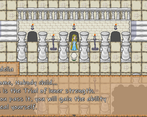
You have good tutorials, and you explain how to play very well.
It would be nice if there was a quick key to view all your stats on screen quicly. Going into the menu, cycling down, and then hitting confirm twice can get a bit repetitive after a while. It looks like you want to keep the game screen clear of HUD info, but maybe pressing a button causes a quick popup that displays HP, MP, Strength, Luck, etc. Pressing it again gets rid of it. Then players can choose to leave it up... or play without.
ART
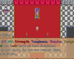
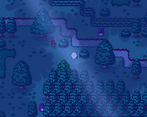
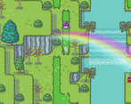
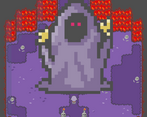
5 Stars! A+! Rotten Tomato scores you 100% here! Artwork is fantastic and very unique looking. I love each character's look, the animations are very well done, and the style is amazing. I love your animated speech bubbles, as well.
SOUND/MUSIC
Music and sound was very well done and fitting for the theme of the game. Love the music and it didn't feel like it got old or repetitive at any point (which is a good thing).
ADDITIONAL FEEDBACK
For all the locked doors... you should only have that message populate once or twice. Or, maybe a faster animation without a dialogue box: knock, question mark bubble, done. Not a huge deal, but I think players would get the idea without waiting on that text box.
I love, love, love that you have to learn everything: swimming, farming, dashing. However, I will say this... and I only do because old-school RPG players are obsessed with dash. If your character moves too slowly, and you can't dash... they get upset. My game is the same. You need to learn dash, so while I respect this and have no issue with it myself... you may get some complaints because walking is just way too slow for some people, especially with the size of your maps ;-) I get this complaint with my games, as well.
You should add a visual indicator on each building when you rescue a villager. Perhaps the shop sign has a crosshair over the icon until you rescue them? After they're saved, and the shop is open for business, and the new sign shows up without a crosshair?
The light green monsters with the white # is hard on the eyes and difficult to read. All other colors looked great, though!
Hi there! Thanks a lot for playing and for leaving such detailed feedback! Glad you enjoyed it overall, especially the art and music!
Sorry the PS5 controller didn't work, I tried with a PS4 one at my brother's and that did work, I thought it'd be the same... How odd. It definitely works with an Xbox one though! And yeah, i suppose this may be why it was more difficutl to chase the enemies wwhile playing with the keyboard.
Also I don't know why Full screen and window sizes didn't work properly for you... I'd have to test on different setups to find out what the issue is I guess... It really should go full screen, sorry you had to play at the tiny 640x360 size :/
A few points you mentioned are actually in the game: At the very beginning, the Quing gives you a map which you can open with M on the keyboard. It doesn't work in closed areas, but it does for the town and for the large open areas to explore. Furthermore, it does show you who you've rescued in town (the character's heads appear over their building once they're back in town), and if you've rescued Fortuna, she can show you where some of the lost villagers are, and add them to the map, so it gives you a bit more guidance to explore.
As for the stats, you can see them briefly on the field by pressing Backspace on the keyboard (or Start on the controller).
All this is detailed in the controls section of the menu.
Space will be used later for Jumping, once learned, but I'll look into ways to add another interact/cancel button, thanks for the suggestion!
Yup, I understand how some players would be frustrated to wait until they learn how to Dash to move around quickly, but honestly it should be the second ability you can learn (after diagonal movement), so... sorry for them I guess xD. I mean it's not that far into the game, and it just makes much more sense to have to learn it just as any other ability. It would be inconsistent to only have that one from the start. And also, it makes chasing Evil Spawns easier so it's a way to renew the gameplay after a while.
Let me know if you progress further in the demo!
One last thing I should add: I started this game in VX Ace, which is why it can feel clunky and old in some areas, but I'm thinking of porting it to MZ. At least I have all the assets, I'm hoping it won't be too much of a pain to reproduce all the mechanics plugin-wise. I'll try!