Play game
SevenDeadlyCards's itch.io pageResults
| Criteria | Rank | Score* | Raw Score |
| Narrative | #12 | 2.900 | 2.900 |
| Original Audio | #13 | 2.900 | 2.900 |
| 3D Art | #17 | 1.700 | 1.700 |
| Game Design | #21 | 2.600 | 2.600 |
| 2D Art | #22 | 2.400 | 2.400 |
| Use of Audio | #23 | 2.500 | 2.500 |
| Overall | #26 | 2.600 | 2.600 |
| Level Design | #26 | 2.300 | 2.300 |
| Commercial Viability | #29 | 2.200 | 2.200 |
| User Interface | #30 | 2.100 | 2.100 |
| Art Direction | #30 | 2.600 | 2.600 |
| Use of Theme | #31 | 2.300 | 2.300 |
| Itch Page | #31 | 1.600 | 1.600 |
| Technical Accomplishment | #33 | 2.000 | 2.000 |
| Fun | #35 | 1.900 | 1.900 |
Ranked from 10 ratings. Score is adjusted from raw score by the median number of ratings per game in the jam.
Number in Team
4
Does your game include Art packs?
all art is generated with an AI
(https://colab.research.google.com/github/alembics/disco-diffusion/blob/main/Disco_Diffusion.ipynb)
Does your game include Sound packs?
No, all our musicist
Does your game include plugins or pre-coded content?
No, all coded by hand
Please provide a full playthrough YouTube video of your game.
http://nonefornowwilluploadsoonpleasedonthurtme/
Please provide a link to a 30 seconds gameplay YouTube video of your game.
http://nonefornowwilluploadsoonpleasedonthurtme/
Leave a comment
Log in with itch.io to leave a comment.


Comments
Nice take on what came off like a card game/visual novel hybrid. The text was a little small unless it was full screened and my game ended up not showing options at the end of one storyline so I was stuck but it was fun up until then.
This page says the music was original (it'd be great to see the team credits on the itch page) and I liked it. A game like this could really offer some ways of making the music more interactive and responsive to player decisions, and that would be another way to really suck the player in in terms of immersion. Just an idea. Nice work though!
The one thing that would have improved this game considerably is making sure the text is readable.
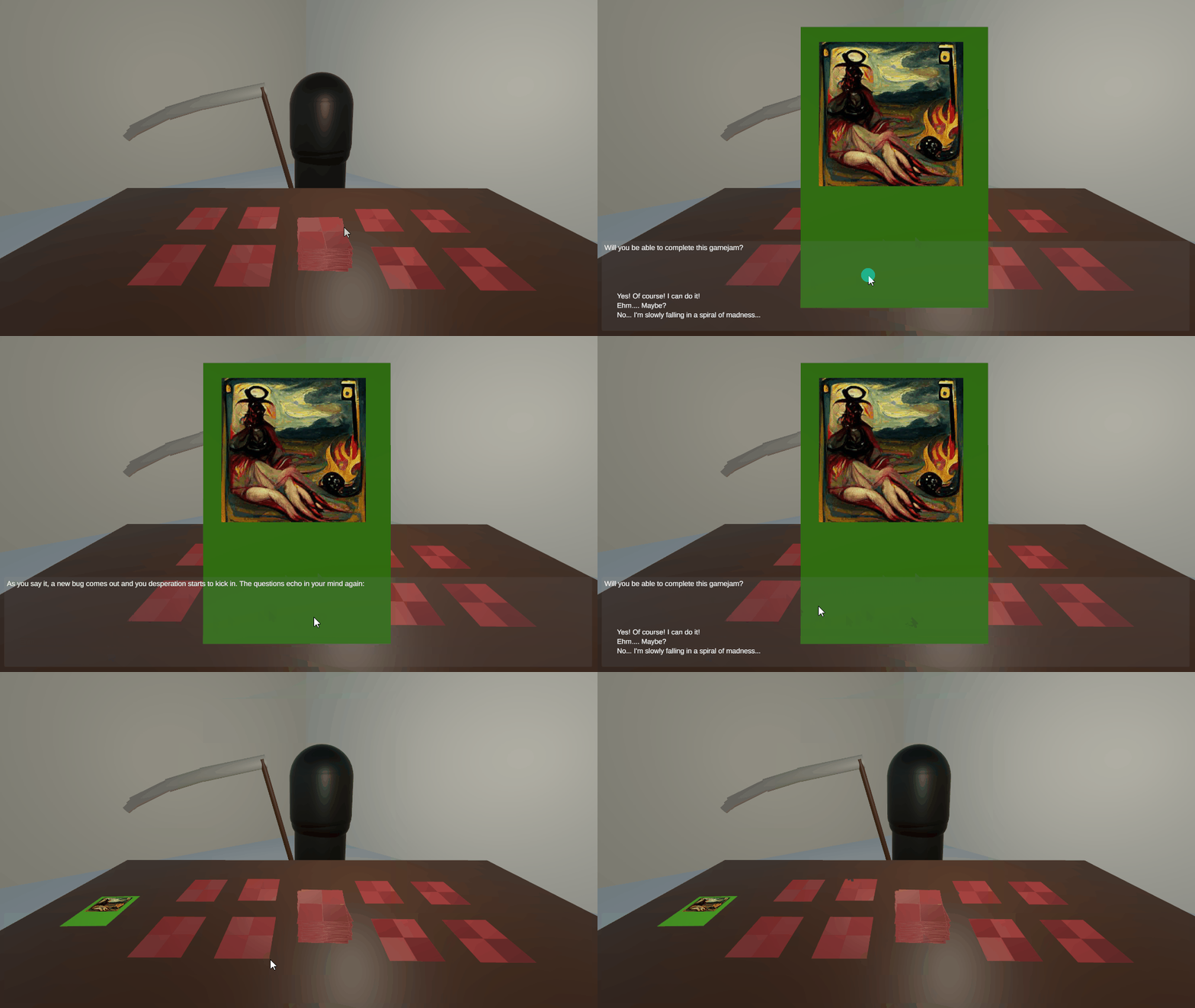
The cards - totally readable - but when you have the small text at the bottom there is the issue of font size (too small), as well as the text being insufficiently contrasted to the background panel. Here you are using a partially transparent panel with a grayish color and white text. I would recommend to increase the opacity of the panel, as well as choosing contrasting values for the text versus the panel colors.
I like the concept here. The stories were fun, though it was hard to grasp the rules that would help me make good decisions. I expected to be able to get increasingly better at understanding what sort of options I should choose, but I didn't feel like that was happening. Really neat idea. I'd love to see it polished and expanded into a full game!
The game is funny and interesting, but I think it needs some sort of tutorial, because at the beginning I hadn't understood what I was supposed to do. And a bit of polish on the text too.
I really liked the thought behind this game and the artwork was really interesting. I found the font size was a little small and so taking it all in became a labour that was a little confusing. I made good choices and bad, but tactics I never really got a handle on. It was still enjoyable
The game is interesting, however, playing it is kinda hard :) At first, it is a bit disorienting playing a card game without knowing the rules. You then start to get the grasp on it, but I am not sure I truly understand. I would really enjoy a future version with some help at the start. Overall, it is a nice game, good job!