Indie game storeFree gamesFun gamesHorror games
Game developmentAssetsComics
SalesBundles
Jobs
TagsGame Engines
A jam submission

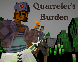
Quarreler's BurdenView game page

Turn based fighting
Submitted by TheSoulSelector (@SelectorSoul) — 3 days, 8 hours before the deadline
Add to collection

Play game

Quarreler's Burden's itch.io page

Results

CriteriaRankScore*Raw Score
Technical Accomplishment#33.5713.571
3D Art#33.7863.786
Original Audio#63.3573.357
Overall#73.5003.500
User Interface#73.1433.143
Use of Theme#103.2143.214
Art Direction#113.5713.571
Commercial Viability#113.0003.000
Game Design#123.1433.143
Fun#123.0713.071
Itch Page#132.7862.786
Narrative#172.4292.429
Level Design#172.5712.571
Use of Audio#172.7862.786
2D Art#301.5711.571

Ranked from 14 ratings. Score is adjusted from raw score by the median number of ratings per game in the jam.

Number in Team
1

Does your game include Art packs?
No

Does your game include Sound packs?
No

Does your game include plugins or pre-coded content?
No

Please provide a full playthrough YouTube video of your game.
https://youtu.be/kGp2y7V_GpY

Please provide a link to a 30 seconds gameplay YouTube video of your game.
https://youtu.be/kGp2y7V_GpY

Leave a comment

Log in with itch.io to leave a comment.

Comments

Submitted(+1)

Had a fun time learning how the game functioned.  The tutorial on fancy moves was a bit ambiguous but decoding it added to the things to discover. After getting to grips with the system I found that winning seemed like something I had a positive influence on 'cause I got a high streak pretty quickly. (But perhaps that's because the AI wastes time on healing when I attack every turn.)

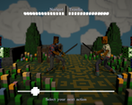
The UI was helpful and contained all the information I needed in a fight.  But I definitely had problems with being able to take in the options.  I'm sure if it was a turn based game I would sit for five minutes at a time working out the probabilities for a favourable outcome for each move based on the opponents possible combos and my own; so having the timer to keep me moving was overall quite nice, but I think I would've liked at least 1 more second. 

Understanding the current chain of combos could do with slightly nicer feedback though.  Some animation of the relevant part of the diagram causing the appropriate move to animate down to the bottom to join the queue as you get hit would really clarify why things were happening.  Sometimes I wouldn't realise a 2nd combo was happening, and sometimes I wouldn't realise that I'd missed my turn because I was waiting for the combos to finish resolving but they'd already finished a while ago.  In general I did really like the combo system though, and it added fun depth to the combat.

Getting outfit changes was a nice way to see the progression of your characters, but also serves to make you attached to them because they have unique visible progression, and it isn't just a high score of how many people they've killed.

Also the music reminded me of Gatherers. Which I thought might be interesting for you to hear.

Developer

Post jam will meet your needs time wise. Starts out slow and gets faster with burden. It's interesting. 

Submitted

Hey finally getting around to giving this a review but finally here and I'll try to make it as unbiased as possible. Firstly all the camera effects, attention to detail in the clean UI, custom cursor and nice voxel art are all an immediate great first impression. It's nice to immediately be able to tell that a lot has gone into this game and it sets itself up for success. Going into the gameplay side it's completely understandable why it works this way but it's much nicer to be introduced to new concepts slowly and all of the reading required can be a lot to get through. Depending on whether the player has payed proper attention to all the reading really decides how interesting/fun a lot of the gameplay is. I think properly understanding everything then a lot of fun gameplay is allowed to ensue but I can understand not being able to reach that straight away. Because of the random nature it can be very exciting with many random twists which is awesome and definitely for me would be more fun playing with a friend. Anyway overall of course really cool entry and was pretty fulfilling on the premise of rock paper scissors with a skillful and narrative twist! :D

Developer

Thanks brother. Yeah if only the rush wasn't on. It was interesting watching the stream to see how far it has already come in the post jam. I am trying to fix the easing into the mechanic issues. Just because it's really simple does not mean it's easy to work out. Once the penny drops it's done but lots of words do not help. Tutorial is in the pipeline. 

Submitted(+1)

Incredibly well done, could've fooled me into believing this was done with a team! I really liked the concept, it was fun to play and the rock, paper scissors foundation made it pretty easy to pick up on the core concepts. I would second some of the feedback that a little more variation in the outcome UI or sfx could have made it a little easier to catch on to the unique mechanics of this game (counters, combos, etc.) but after reading the in game guide (a fantastic addition for a jam game by the way!) I'd say it's pretty manageable to put 2 and 2 together for most of that stuff.

Loved the music as well. Had such a mood and aura to it, it practically put me in a trance just sitting in the menu. I also really liked the take on the theme as well. For a fighting game it would've been really easy to have gone the obvious route there but the idea of the mental burden coming into play and forcing the player to chose new characters was really neat. Really, really great work overall- and it's awesome to read that you're working on a post jam version too!

Developer(+1)

Thanks. I am pleased you liked the music. I really just knocked it out as I knew I was not going to have time to do anything clever with audio. I am working on making everything read better. I was trying to keep the action feeling swift so that some tension in the combat remained and making the symbols minimal does work once you have your eye in. I just needed to put some time into the introduction and explaination of them. Post Jam will see many improvements.

Submitted

From one solo dev to another, I must say you are much better at this than me. This is an impressive, polished package for any number of people in the time you were given, and even more so considering you did it yourself.

I think the game loop has the spark of a really neat idea. It reminds me of the Final Fantasy VII Gold Saucer fight minigame, for better or worse. It is rock/paper/scissors, which can be fun, and you added some cool twists to it, but it's still slightly too random for my tastes and I would have preferred some kind of layer of strategy. When it comes to the "healing," I couldn't figure that out at all. It seemed to only work when my opponent healed, which defeats the purpose.

I would be interested to see where you take this. Overall, it is an incredible job, and I quite enjoyed it.

Developer

Thanks for your feedback. Your game has lots of potential too. I very nearly had nothing to show for this Jam as I broke it pretty bad just before I had to submit. It's hard being a Solo dev when everything is your own fault! I use Jams to force me to get better at the stuff I don't really like doing. Mostly finishing things! I can see my progress from Jam to Jam.

I am working on a Post Jam version and it is already a much better experience. I will post it once the Parade is unlocked.

In terms of the Healing selecting it directly is pretty high risk. It is more successful if you can counter or combo into it. I am thinking of new move types that should create more interesting chains. It's been fun to refine it now that the time pressure is off.

Submitted

This is very impressive! The game loop is interesting and I found myself playing for a while. Despite the fast rythm, the UI helped a lot in understanding which action was doing what (even for us QWERTY people). However, I was surprised that you didn't choose the green color for the heal action.
The game art is also quite clean and it wouldn't need much to make it look super awesome.

Developer

Interesting call on the healing colour. My RGB obssesion comes out to haunt me. I did not really think of the colours that deeply but I used my comfort with RGB to help me keep the code logical and easy to not get lost. There are a lot of lists and data relationships under the hood and so that is what drives the colour choices. The healing is sort of outside of that logic so I did not really think about which colours would be good for which thing. Something to ponder.

Submitted(+1)

I'm surprised more people having tried/rated this game. This feels like one of the more complete packages in this game jam, and all from a solo dev no less! Very impressive.

The voxel art style is neat and consistent, harmonised by a moody, sepia colour theme that gives me fantasy RPG vibes. I like the added detail of your character aging or changing appearance when it wins a round. The UI design is simple but efficient and matches the overall theme. The rock/paper/scissors gameplay was easy to grasp, though relying on random guesses to win doesn't feel as satisfying. But I did keep playing to see how much the character would change each round. Sound is good.

Great work!

Developer

Thanks very much. I have been carrying on with it for a Post Jam version and getting it all a bit more rounded . Although you never know what is coming back at you, I am playing with how to read what you have and to make choices that are less random but more tactical. As I never really got to play test it properly, I am starting to learn the deeper tactics of the game. Whilst random is a perfectly good way to go about it there are choices to be made as your decks grow that make a difference. Victory is never assured though. It's a matter of intuition and fate.

Submitted(+1)

Very nice work on this. Interesting battle mechanic
I also thought the mysterious symbols were a cool touch.

Developer

Thanks very much. I fear it might have been a bit too mysterious!

Submitted (1 edit) (+1)

Animations felt really fluid, and overall I felt the visuals were excellent - a lot of detail in characters, environment, and UI especially so for a one-person team. The idea of losing character's you've built an attachment to reminds me a lot of how I felt losing characters in the XCOM series - don't know if that was an inspiration for you? I really liked the flow and overall feel of the fighting sections, but I wonder whether there is any way to introduce a little bit of prediction/skill into the otherwise randomised nature of a rock, paper, scissors-based game? Overall, great entry and good job!

Developer(+1)

I am reluctant to shift the mechanic from intuition to reaction time. You can experience what it's like to play it based on reaction times if you have a friend and do the 2 player mode. You can see each others selections. It's fun but even more frantic and it does not actually make me want to change it. Thanks for the feedback I really appreciate it. 

Submitted

This is a neat concept. It went a little quickly so it took me a while to catch on to what was happening. I get that it's rock paper scissors, basically, but then I wasn't really sure how to "read" the combos and stuff, but overall really good job!

Developer

Thanks so much for playing it. This Parade was unusually pressurised as I had to submit after 4 days knowing that it really lacked the playtesting time it needed. An hour before submission is was totally broken and I very nearly had nothing to submit. Having the polish was great but there was so much I wanted to do that felt out of bounds of the rules so things like the core fight loop remain untouched. I have spent a bit of time this weekend working on a post jam version. It already reads and plays better. Part of my thinking with the theme was to regularly have to deal with losing your characters and losing them permanently after bonding with them. You are going to lose no matter how hard you try not to! Such is life. 

Submitted

Fun game. Liking the depth you added to a simple Paper Scissors Stone concept. Characters refusing to fight was a neat way of making players choose other characters. The voxel art and depth of field effect looked nice. You must have spent a lot of time on this. Surprised this was a solo entry.

Would suggest making the timer longer. I found the combo system hard to follow because the turn always ended before figuring out what cards my opponent had.

Submitted(+1)

Would also suggest particles or sounds for hitting or getting hit. They had the same sound and it was hard to follow if I was reacting to the opponent in time.

Developer (1 edit)

Thanks for the feedback. I had another longer bar request and its funny because I was thinking of speeding it up as once you've made your initial selection you are locked in. There is nothing you can do after the first action is selected, so any combos or counters happen based on the move cards, there is no timing or reaction required from you. It's fate. But I just tried linking the length to the burden of the quarrelers. it's now slower when they start out and much faster when they have won a few fights. It will be in the post jam version for sure 

Submitted(+1)

Really amazing and fun gameplay loop, I'm extremely impressed with the 3d models and sound that came out of it, especially for a one man team on a tight deadline.

Issue I ran into was my browser not wanting to run the game properly (Opera GX), was able to navigate through the menus and into the fight, where the 2 characters would infinitely walk towards one another. Installing the game worked and was alot of fun!

Great work and amazing interpretation of the theme!

Developer(+1)

Thanks Toucan in the Discord pointed the bug out to me. It's a framerate issue. They miss their cue to stop. It can be solved by lowering the quality setting (pleased I remembered to include quality settings now). I was suprised the webGL worked at all, usually it mangles my games but I was pleased I checked as it was painless. I have now put a note in the description and will make the logic that stops them walking a little more generous. I am pleased you liked it. I enjoyed rolling about in yours.

Submitted(+1)

I really like the art style of this, especially the clouds. The music and the text made me feel like I was playing "Hand of Fate" (a comparison which is intended to be praise)

I was unsure how to perform the combos mentioned on the itch page or if I was preforming them successfully; maybe some UI element or sound effect variation would help communicate what's happening with that.

I got comparable success both actively playing the game and just watching it run without my input which seems a shame. Is there a specific pattern to each enemy that I could learn or some telegraphing they could do to indicate their next attack type? I didn't feel like I was making an informed decision when picking my attack.

I really liked the use of the theme and the detailing on the environment and boxes. I appreciate the cohesion in using the little cross on the boxes as the timer indicator too!

Developer (2 edits)

Hey thanks. Like with everything I am already reflecting on what could be better. The system is so simple that most confusion comes from assuming it is more complicated than it is. It's Paper Scissors Stone with healing and bonus conditions over and over. Which of the three strike types are you going to use next? That's it. The combos and counters just do more of the same, but have to have the right conditions to work. It's less that you perform them by doing something, more the conditions are met for them to do themselves. If it says Counter or Combo on the screen the conditions of that players card has been met and the indicated deck is played as a bonus hit. It would be possible to play this game as a card game for example in real life, you have shuffled decks of cards and you choose which card to play next. You have to collect them first anyway, new characters just have Default moves. It is totally possible to stick with one Deck and not change it, if the opponent uses strikes from a Deck that loses to that you will win, if they use strikes from a Deck that defeats it you will lose. Statistically you are more likely to win by changing, you might get lucky and win a few but death will come pretty quickly. In the two player mode you do get to see which options each other are picking which adds an element of bluff and last minute switching which I enjoyed. To get a character far you need a healthy bit of luck, but choosing when to use which deck definitly comes into play as some are more useful than others and get wasted if they get drawn against the strike they are weak against. If I had more time I would have liked to do a tutorial but I submitted on Thursday before going away on a project so I had to make sure I at least handed something in that had all the elements I knew needed polish. A nice tutorial was a task too far. I have no ide if that makes any sense? Why are the simplist things the hardest to explain. Loads of words there and I am still not sure it makes sense. Basically once you get it it's really quite simple, until then it seems a lot more complicated than it actually is.

Submitted(+1)

This was quite interesting, Although I am not usually a fan of luck, seeing what options the opponent had for combos, and certain moves getting more powerful gave the game a good amount of strategy. The idea of the men refusing to fight was nice, it happened to me when one of my other guys died, and I had to use a really weak one. That sort of emergent gameplay is exciting!

I think that going into another battle took a bit long, as you have to first pick your loot, then click back and pick a character again, with lots of transition. Also being able to see what kind of loot you will get would add another layer of planning to the game. I found the combo system hard to follow, maybe a more detailed explanation of what the different symbols mean?

I liked the voxel art style and the shader was super nice, the depth of filed effect was awesome.

Do the people look different as they get a heavier burden? maybe it was my imagination, but the variety in model colour and hair was great. I’m impressed you have animated 3d models in such a short time period.

Good job!

Developer(+1)

Thanks. I am polishing up the feedback in game and working on my thrown in at the last minute guide. Currently the outfit system is broken because the mesh had a fault that ruined it so they are all wearing pretty much the only outfits that were not horribly distorted. I am fixing that too. They grow facial hair as they become burdened at the moment. Thanks for the detailed feedback. The polish is already much clearer. I look forward to trying yours after the polish window closes.

Submitted(+1)

I’m waiting until the polish window closes to begin rating, so I look forward to seeing the improvements!

Developer

Polish is done

Submitted

The new tutorial page is super helpful. I felt that some of the options were too safe? such as chaining off the swing above, as you are guarenteed a hit 3/4 of the time, unless they have something to counter you. The model variety is great for this kind of game, I’m interested in how it was implimented behind the scenes, eg a bunch of models vs generating programatically. I got some big combos in this time, I think I got one that was like 6 moves long. Does anything happen after a certain number of kills? I got one guy to 13 before he died. Nicely Done!

Developer(+1)

13 is good going! I am not sure I have got any that far myself. I am pretty sure that either your dude will die of old age or a game breaking lack of logic somewhere will bring it all down! I am pretty sure there are bugs to be found in old age.

Developer

I realise I didn't answer the other question. Basically it's all generated programatically. The fighters are all the same gameobject which is fed info from a master script. The outfits are based on a list of Vector 2s for example with x for style and y for colours way. These are assigned at birth and revealed as the burden grows. Hair/skin/beard colour too. The Moves you collect are all Vector 4s that are randomly generated when you pick a box and then added to the specific Quarreler's list. Basically there is a very large amount of lists going on behind the scenes. A burden of lists! When you select a Quarreler the id information is sent ahead to the relevant gameobjects on the other stages and they clear the previous set up and update to be dressed right etc. Does that make sense?

Submitted

Ah, that’s pretty cool!

Submitted(+1)

Super fun! Other than that, it is pretty hard to catch at first, and symbols are not all that clear. Once you get it, though, it is extremely compelling. Great work :)

Developer(+1)

I am just giving it a much needed polish. I am pleased you like it. Looking forward to trying yours out too.