On Sale: GamesAssetsToolsTabletopComics
Indie game storeFree gamesFun gamesHorror games
Game developmentAssetsComics
SalesBundles
Jobs
Tags

How do I improve my UI?

A topic by Esben Nyboe created Jun 08, 2020 Views: 182 Replies: 2
Viewing posts 1 to 2
Submitted

Calling all visual experts! 

Hi :)
I've been told my game needs better UI, but I'm a total noob when it comes to visual design :D
So, does anyone have an idea for how I could improve the UI look of my game? 
I would surely appreciate that! 

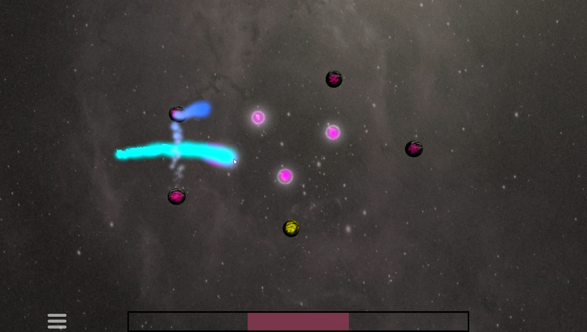
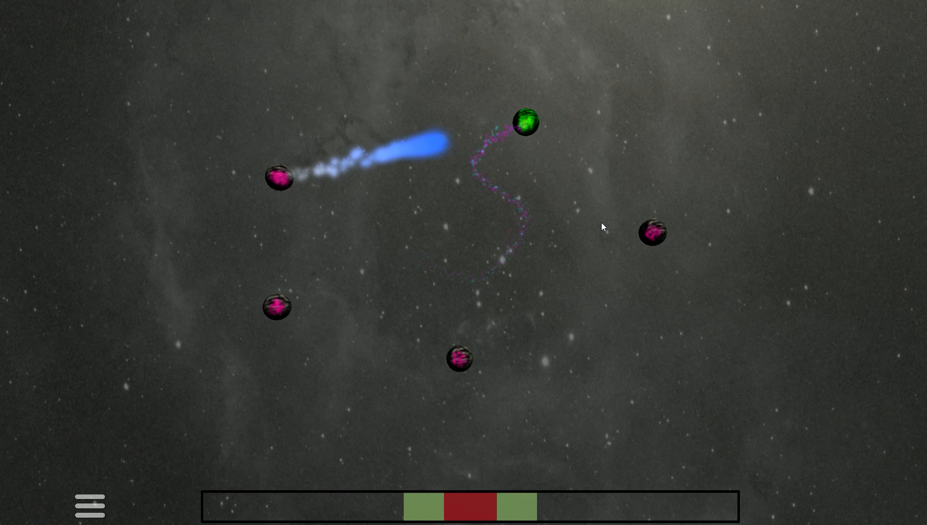
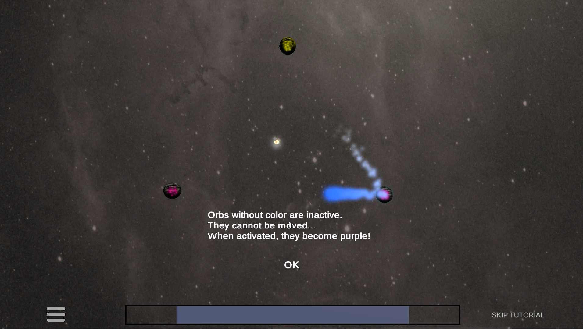
Here's a few screenshots of the game:


I don't know if posts like this are allowed. If not, I'll remove it right away!


The game page: https://esbennyboe.itch.io/orbit-crusher
(...other suggestions for visual improvements are also very welcome, btw)

Submitted

Hey whenever I'm stuck on how things should look, I just look up references. For your game I did some search on good looking space games and found games like Last Horizon, Moon 2, and Grid Space Shooter. You can study the games' UI layout, icon design, animations, and colour pallete etc. 

If I were to give some critique, I'd say you have too many colours. I know colours are important for your game but you still have to limit the #. Go to a website like https://coolors.co/ and explore the colour palletes they have. Pick one that suits your game's mood and style and stick with them. don't use any other colours in the entire game.

Otherwise your game looks really satisfying to play with awesome animations and sounds!


Submitted

Wow, this is some really good advice! Thank you so much! 
Those games seem like a great source of inspiration for this. And that pallete website sure is handy :) 
It's funny how it never occurred to me that "having too many colors" could be an issue :D 
I'll definitely try and go for a more simplistic color pallete, as you suggest, maybe limited to four, like white, magenta, yellow and cyan or something.