Play game
PLNT. Industries's itch.io pageResults
Criteria | Rank | Score* | Raw Score |
Gameboy Soul | #121 | 2.357 | 3.333 |
Soundtrack/SFX | #122 | 1.886 | 2.667 |
Gameplay | #139 | 1.650 | 2.333 |
Overall | #140 | 1.791 | 2.533 |
Graphics | #151 | 1.532 | 2.167 |
Interpretation of the secondary theme | #154 | 1.532 | 2.167 |
Ranked from 6 ratings. Score is adjusted from raw score by the median number of ratings per game in the jam.
Leave a comment
Log in with itch.io to leave a comment.
Comments
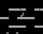
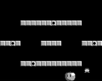
It's a neat little game, though a bit too unforgiving. I like the idea of having the stages be randomly generated, but it might be working against the game a bit. The very first stage I got was an unusually tricky one with lots of those slip-through holes, and I was kinda flustered while also figuring out how to play.
The second time the first stage was super-simple, though. Maybe if there were more way to control the complexity of the generated stages?
Also, I think it would help if the platforms that go up to the edges of the screen would continue on the other side for at least a couple blocks. Edge-wrapping is already a tricky thing to wrap one's head around without the extra difficulty of a platform that's on one side but not the other.
Anyway, those are just little details. I enjoyed the game for what it was!
Thanks for the indepth criticism, especially on the stage generation. I haven't considered implementing a way to control the level complexity on account of the levels already being pretty simplistic, but it would be a good idea to add it anyway.
What do you consider part of the stages complexity specifically?
Also I wouldn't really consider those `just little details`, I appreciate it anyway :>
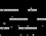
A fun little Mario Bros-like game. I feel the amount of enemies could be dialed down or at least slowed down on that first level whilst we get our bearings. The only other thing I think could really trim it up would be having enemies stop each other from moving instead of them often being behind each other's sprites.
I kinda thought the opposite would happen, that the first leveel is way too easy and boring - apparently not. I agree on your second point, it crossed my mind too, but I didn't implemented it for some reason.
Thanks for the feedback :>
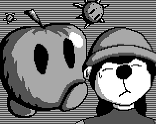
Very simple and clean. My only complaint is that the player’s collision box seems to be deceptively large, making jumping around a ledge to get on top of it feel a bit difficult. The icon is really really cute. This is not at all related to gameplay
I can see your complaint. The collision box encompasses the whole sprite, and not just the main body/legs, which would have made more sense in retrospect, that also means it encompasses a whole bunch of nothingness (literal just a pixel) at the front.
Overall Thanks - it's indeed very simple, part of me thinks it's too simple, but welp. I have no Idea what icon you're talking about btw :>
The boy