Play game
Subservient [Tech Demo]'s itch.io pageResults
| Criteria | Rank | Score* | Raw Score |
| Graphics | #91 | 4.071 | 4.071 |
| Interpretation of the Secondary Theme | #124 | 3.929 | 3.929 |
| Soundtrack/SFX | #134 | 3.357 | 3.357 |
| Overall | #184 | 3.314 | 3.314 |
| Gameplay | #215 | 2.786 | 2.786 |
| Gameboy Soul | #340 | 2.429 | 2.429 |
Ranked from 14 ratings. Score is adjusted from raw score by the median number of ratings per game in the jam.
How does your game meet GBJam's theme?
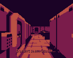
It's a horror game. Palette, aesthetics, lore, audio, dialogue was created with that in mind
Leave a comment
Log in with itch.io to leave a comment.



Comments
tthe ost is so weird that it makes it unnerving in a way.
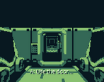
i really got jumpscared by the sound of opening doors honestly xd
ofc this would never run on a gameboy, but the aesthetic is there!
This was interesting for sure. It does feel (and obviously is) too advanced for a Gameboy, but certainly still does carry the vibes.
Just a side note: Update to Godot 4.3, which allows single threaded builds than can be embedded in the game page again.
Thanks! Yeah, we were aiming for "GBA 3d games" vibe, although that went a bit out of control too, and this is the original GameBoy, haha.
Just checked, the project is Godot 4.3. I don't remember the export settings clearly, but I think single-threaded was buggy for some reason, so I had to tinker. The bug was with the viewport, for some reason it was all in GameBoy dark color, and only the opened inventory could be viewed normally atop of it. Well, I wrote two shaders for this jam: one is "palette gameboy-nizer" as a safety measure (the artist made all assets in correct palette, but just in case 3d effects would distort the colors, it'd be converted back), and the second one is transition effect which takes the backbuffer and holds it, so we can have a nice fade-out.
So if I had to guess, one of these two got broken after the initial exports :) The current settings seem to work fine though, at least on the team's machines.
Awesome graphics and atmosphere ! I hope you will develop the game more :)
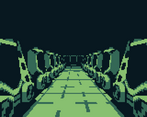
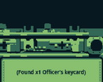
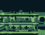
I liked the visual aspect of the game, it was pretty cool the way the 3D space was designed. Very eerie how the player was in a sort of facility but it was completely empty. The only signs of life was the remains of people, the hands, the bones and other belongings. Very nice demo, the full game is going to be so cool :)
Thanks! :)
Hold up. Is this one hand or a pair of hands? I need to know how many hands this actually is.
Also awesome tech demo, I see a lot of potential
Thanks! You'll see in the full version eventually ;)
Love the vibes here! The environment details perfectly convey the spookiness. Hope to see more soon.
Thank you! There was a lot of stuff planned, so we have docs on what to do in a post-jam version. Hoping to get to it after we catch a breath
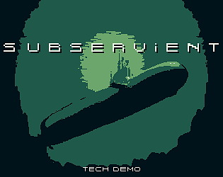
This was really cool! The controls are unique and was fun to get into. The art is awesome too, especially the title screen.
Thanks! :)