Play game
Astroship : Out of Control's itch.io pageResults
| Criteria | Rank | Score* | Raw Score |
| Presentation | #4255 | 2.109 | 2.583 |
| Fun | #4290 | 1.973 | 2.417 |
| Overall | #4400 | 2.041 | 2.500 |
| Originality | #4977 | 1.837 | 2.250 |
Ranked from 12 ratings. Score is adjusted from raw score by the median number of ratings per game in the jam.
How does your game fit the theme?
Player has full control of the ship, but it is a shooter in space, and because there is no friction in space, player will drift and have a hard time to fully control the ship, and there are also moving blackholes that have gravity!
Did your team create the art for this game during the 48 hour time slot?
No
We used pre-existing art
Did your team create the audio for this game during the 48 hour time slot?
No
We used pre-existing audio
Leave a comment
Log in with itch.io to leave a comment.


Comments
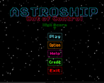
Since others already pointed out the controls, I want to add another suggestion: try to use more of complementary colors for UI. The flashy style with different bright colors is fun, sure, but I think they are not blended so nicely (I'm not saying they are bad, I just think they can be better than they are now). I think it's a fun game to play, especially since it's a first game jam for you. Keep up with making more games :)
I agree with you about the UI. I think the UI looks like it doesn't belong in the game. The reason we left it like that is because we don't have enough time to fix it. Our workflow is still a mess, and we are very behind the schedule. Thanks for the comment, we are still learning and we hope with enough experience, our workflow will become more efficient :)
Great twist on the oldschool game :)
Thanks for playing :)
The movement is pretty good but the other controls are very confusing. I love the idea, and the UI is nice.
Thanks for the comment. It is our very first game and we are very excited to submit this game to the jam. Can you tell us which part of the controls that are not good and an advice to fix them? We are still learning so your advice is very appreciated. Thx :)
Specifically I didn't understand the shooting mechamic however the movement is very nice!
Game looks nice and feels like it should, but having the controls be hard to use just feels anti-fun and leads to more of a frustrating experience than a fun one IMO
Thanks for the comment. Actually it is our very first game and we are very excited to submit this game to the jam, so of course we still need to learn so many things, including making a good game controls. Can you tell us which part of the control that is bad so we can improve it in our next project? Thx :)
The controls themself worked fine, but the lack of friction which happened to be your chosen gimmick for the theme just made the game not very great to play IMO. While it did make the game "out of control", it also hurt the experience.