Play game
Don't Eat Those Cookies!'s itch.io pageResults
| Criteria | Rank | Score* | Raw Score |
| Fun | #1879 | 2.858 | 2.941 |
| Presentation | #1881 | 3.087 | 3.176 |
| Originality | #1903 | 3.144 | 3.235 |
| Overall | #2043 | 2.915 | 3.000 |
Ranked from 17 ratings. Score is adjusted from raw score by the median number of ratings per game in the jam.
How does your game fit the theme?
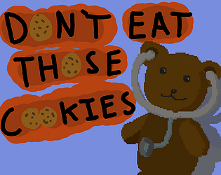
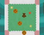
The playable character has an out of control addiction to cookies, so make sure he survives his cookie-low diet.
Did your team create the art for this game during the 48 hour time slot?
Yes
We created all art during the game jam
Did your team create the audio for this game during the 48 hour time slot?
Yes
We created all audio during the game jam
Leave a comment
Log in with itch.io to leave a comment.


Comments
This game makes me go YES!
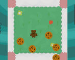
Pretty engaging bullet hell gameplay, with funny writing. Nice job.
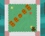
A unique take on the bullet hell genre in terms of grid-based movement and aesthetic. It feels fun to play, with the various cookie patterns and speed ramp-ups.
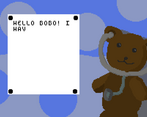
However, text scrolling feels too slow when reattemtping a day and does not word-wrap.
I recommend word-wrap to improve readability and a dedicated "skip dialogue" button so you can get back to playing the day you failed. Other than that, this game is sweet!
Thanks a bunch for the feedback, the text system is definately the one part I wanted to spend more time on! I actually totally forgot about putting in a skip dialogue option, it wouldn’t have been too much effort, but it didn’t cross my mind.
Oh man, I really loved what you did by juxtaposing the dialogue with the actual gameplay, that had me smiling the entire time.
Thanks for the kind words!
The text was very hard to read and the fact that the text jumped to the middle of the screenwhen you moved on was very strange, but that was entertaining and a fun challenge.
It's a cookie-based bullet hell game. I love it. xD Also, triggered by the intro text.
One thing that really jumps oout is that the typesetting of that text makes it kinda hard to read (also, I thought the W was an H initially), but otherwise, I love the idea and it'd be cool to see a more fleshed-out version of it. :)
Thanks for the response! I wish I had more time to work on the text system, I didn’t plan ahead on how to write text at such a low resolution (240 x 160), so i had to make my own font for the project when I discovered other fonts wouldn’t scale down legibly.
But I’m glad you enjoyed the game part!