Play game
Jukeblox's itch.io pageResults
| Criteria | Rank | Score* | Raw Score |
| Enjoyment | #3650 | 2.457 | 3.714 |
| Presentation | #4619 | 2.268 | 3.429 |
| Overall | #4911 | 2.173 | 3.286 |
| Creativity | #6002 | 1.795 | 2.714 |
Ranked from 7 ratings. Score is adjusted from raw score by the median number of ratings per game in the jam.
How does your game fit the theme?
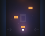
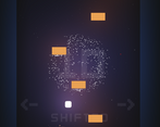
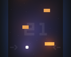
The walls start with a gravitational pull effect, then turn into to a magnetic repulsion effect. The roles of the walls are reversed every 10 points.
Did your team create the vast majority of the art during the 48 hours?
Yes
We created the vast majority of the art during the game jam
Did your team create the vast majority of the music during the 48 hours?
Yes
We created the vast majority of the music during the game jam
Leave a comment
Log in with itch.io to leave a comment.


Comments
Fun idea. Maybe the game was bugged, but there didn't seem to be much difference between pull and push (I expected the controls to have opposite effects, but they didn't.) Also, I would suggest having a higher starting speed of the enemies, or else have it ramp up faster.
Thanks for the feedback!
Would love to get your feedback after the recent update!
I'm pleasantly surprised by the visuals. You made good use of the shaders to add life to the minimalistic design. I'm gonna go in depth on what I see as the shortcomings of the game, and I'll be quite harsh on the music. But the base of the game is good. The collisions are good, the sound effects are good, everything works. And now the enemy speed is a lot better then in the previous version. What you have already made is a fully complete game and on the whole a well made game (besides the music). I don't want to come across as saying you ought to have done better, but these things below were the honest thoughts I had while playing the game. I hope you can make good use of them.
The game is still quite difficult. I think one reason is that the comparison with flappy bird gives the wrong expectations. In that game, there is an (almost) fixed jump. Regardless of your motion, you will snap to move at a certain speed and direction. That gives the player the ability to easily understand what the effect of their input will be on whether they loose or win. You hit the pipe, because you pressed at the wrong time.
In comparison, in the game it feels like there is a impulse applied to the player dependent on where on the screen you are. If you are closer to a wall, its force feels stronger then the opposite wall. This means that the buttons feel inconsistent, especially since there is no precise position. It's for example impossible to keep the block about steady, like it is possible to keep flappy bird about the same height by tapping in a certain rhythm. This may be intended as you want the player to weave in between the blocks. But for that you have very little ways to course correct. If you have even a little speed left while you are right (before score 10), then the effect of pressing right is so miniscule, you can no longer prevent yourself from crashing. This feels way to punishing to play. The only way I can consistently reach 10+ points, is if I actively limit my speed. This doesn't feel that nice to play, especially because of the inconsistency. Sometimes I slow down a little, sometimes a lot. Sometimes pressing a direction has a big impact, sometimes a little. The physics is probably completely correct, but it doesn't feel good to control, it feels annoying and finicky, like how these kind of force based systems usually are in real life. If you want to develop this further, I would focus on making the physics less realistic, such that it feels better to control.
When the 10 points switch happens, it feel underwhelming. It's difficult to notice the controls difference, since pressing left still moves you left. And since I usually play with trying to limit the speed with inconsistent feeling controls, I internalized the change by just reacting to this new inconsistency, like I reacted to the other inconsistencies. To reiterate, it's not that the physics is wrong that makes it feel inconsistent, but what you developed is inherently a chaotic system. And when the goal of a game is to control a chaotic physics system, the main reaction will be that it behaves inconsistently. Imagine a game where you have to make sure a double pendulum swings a certain way, while only being allowed to make small adjustments. That would probably be a very frustrating game to play. There is also the problem that when you get close to a wall in this mode, it's already game over, since the other wall is not strong enough to overcome the gravity.
The music is also questionable. The main theme music is not bad, but it's way more sinister then I would expect to hear from going with the ebb and flow. It also might be better to make it less loud. But the game music is really bad, and that is all because of how it starts. The starting tones are obnoxious and loop for way too long. Maybe it gets better later on, and it's good to have progression in the background music while playing. But it takes six points for one more note to be added. Most people will not reach the six points for many games as they try to get used to the controls. Around that time, I suspect most people will be so sick of the music that they will give up on the game. They will probably believe that the intro is the entire song. I suggest focusing on that part first.
The main screen does have some WebGL fuckery, which makes the play button not light up properly. I think it has something to do with whether the game is in focus. When the game is not in focus (i.e. you still need to click on it to enable inputs) and you hover over the play button, it doesn't light up. When you then click on the play button, it loads the game, and after you die, the play button still doesn't light up when you hover. Only when you click somewhere else does hovering over the play button light up.
Even though it might just be out of your hands why it behaves like that, it does come off as an poorly designed UI element, which is a shame. Also, when the hovering does work, you see the effective size of the play button, which feels oddly large for a computer game. And it's weird that the controls are so transparent it can be difficult to read which keys they are. Maybe have them also light up as you hover over them, if you want to keep the transparent aesthetic, but I would suggest making all the text per default more readable.
Thank you for asking for more feedback. I had quite a lot of fun writing this out.
Thank you for the thoughtful feedback! Can't say I expected anything this in depth, very helpful!
This idea was one of the concepts I presented to the dev I worked with, he was pretty devoted to his own idea though so I am happy to see this concept played with! I thought it made for a fun challenge to have a gravitational pull.
Will it work on my phone? Cause the screen ratio seems perfect for that, using touch control would be on my wishlist too, google store anyone?
Thank you, I agree! Touch controls, mobile support, etc. are on my list. Will update once the judging period is over
Would love to get your feedback after the recent update!
I enoyed gameplay a lot! Very interesting and challenging!
Idea is not very creative though, and I barely feel repulsion/attraction of walls. But still very nice!
Thanks! :)
Would love to get your feedback after the recent update!