Play game
Cheat Night's itch.io pageResults
| Criteria | Rank | Score* | Raw Score |
| Enjoyment | #3956 | 2.121 | 3.000 |
| Creativity | #4246 | 2.222 | 3.143 |
| Overall | #4419 | 2.088 | 2.952 |
| Presentation | #4796 | 1.919 | 2.714 |
Ranked from 7 ratings. Score is adjusted from raw score by the median number of ratings per game in the jam.
How does your game fit the theme?
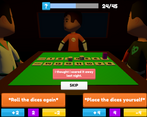
The player cheats in a board game in order to roll the dices once again.
Did your team create the vast majority of the art during the 48 hours?
No
We used pre-existing art
Did your team create the vast majority of the music during the 48 hours?
No
We used pre-existing audio
Leave a comment
Log in with itch.io to leave a comment.


Comments
Amusing concept, and the animation for the dice and pieces moving was very nicely done. I agree that the meanings of the colors was a bit hard to grasp at first - maybe using icons in addition to colors would help!
Thanks for the comment and the suggestion! I appreciate it :D
very well done game! the only thing you could really improve would be more suggestive icons to represent moves, suspicion, and the like, as well as make it more obvious that there is a turn limit. i genuinely enjoyed playing this game, well done!
Thanks for your comment and the feedback! I´m glad you enjoyed it :D
This is incredibly clever! I'll be honest that it took me playing a couple of times through the game to understand what was actually happening (and that's with reading the instructions first), so if you do anything more with this you might look into reworking your how-to's, but once I got a grasp of the mechanics, I really started to dig it.
I did have several play-throughs where I took the riskiest option every time, and the game still ended before either the suspicion capped out or I won, so I think there's a bit of balancing you could still do on the back end, but that would come with more dev time and playtesting. For a 48hr jam version, it didn't take away from the fun of it.
This was great fun, the "cheating" tactics were funny, and the UI/UX aspect is super clean and well executed. Congrats!
Thank you so much for your comment! I really appreciate the feedback!
I´m sorry that the game wasn´t very clear at first. Is there any recommendation you might have?
Besides that, i´m really glad you enjoyed the game :D
Oh, actually yeah! If you could see the color key info from the "How to Play" page in-game, I think that would be helpful (mainly suspicion and time). The only way to see it now is to quit the game first and go through the main menu.
The main other thing is that It took me a while to a) understand that the pieces on the table represented my game progress and that my goal was to get to 15, and b) that the purple numbers were how I progressed that. Admittedly, part of that might have been just me being oblivious at first, but worth mentioning.
Given more development time, there's ways to make these numbers-to-elements connections more clear through animations (like pulsing or floating the move number and zooming in on the game board as the board piece moves or something), but there might be simpler adjustments you could make, like maybe your board piece could be a closer color match to the purple UI element?
Again, I enjoyed the game a lot, and once it clicked it makes total sense! It's just the initial orientation to all the mechanics at play and what connects to what, which is almost impossible to gauge until you have people playtest.
Thanks!!!