Indie game storeFree gamesFun gamesHorror games
Game developmentAssetsComics
SalesBundles
Jobs
TagsGame Engines
A jam submission

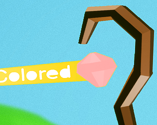
ColoredView game page

did a thing for GMTK
Submitted by Vlad79X (@Vlad79X) — 28 minutes, 45 seconds before the deadline
Add to collection

Play thing

Colored's itch.io page

Results

CriteriaRankScore*Raw Score
Creativity#46572.0492.556
Presentation#47351.9602.444
Overall#49901.8412.296
Enjoyment#54341.5141.889

Ranked from 9 ratings. Score is adjusted from raw score by the median number of ratings per game in the jam.

How does your game fit the theme?
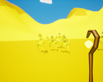
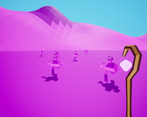
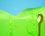
It rolls a colored dice to determine the color of the world and enemy waves

Did your team create the vast majority of the art during the 48 hours?

Yes

We created the vast majority of the art during the game jam

Did your team create the vast majority of the music during the 48 hours?

Yes

We created the vast majority of the music during the game jam

Leave a comment

Log in with itch.io to leave a comment.

Comments

Submitted

Semi-on-the-fly comments:

  1. Controls are QWERTY-only instead of layout-independent, BUT arrow keys are enabled, although without strafing.
  2. I like our magical staff. :)
    The enemies are super cute! :) And you managed to animate them.
    And I like the valleys too, with the ‘squary’ shadow near the top. :)
    I also like the way the die is shown rolling. (By the way, a coloured die instead of a numbered one is original.)
  3. I think there should be some limiting mechanic against shooting, because otherwise, you can just hold the left mouse button constantly.
  4. Is there some difference between the different types of enemies, such as health? I did not notice.
    Ah, maybe in speed! Reds seem quicker (while I am going back, they seem to go at about the same speed as me).
    I agree with ArmedChair and RabbitDev that some variety in enemy behaviour would have helped, because each colour more unique, with a different playstyle.
  5. Ah, managed to have the enemies slide on the slopes while I was descending! :)
    Bug: the purple enemies stay stuck there !
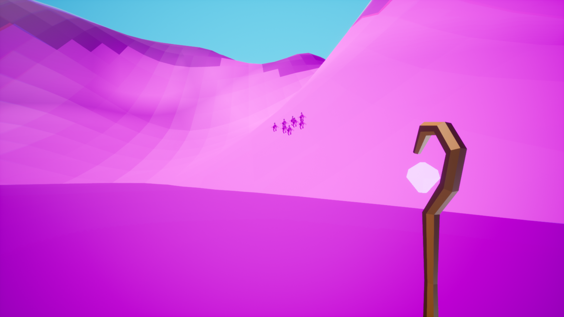
    Then some were stuck at the bottom on the floor, again, so it may be because of the slope.
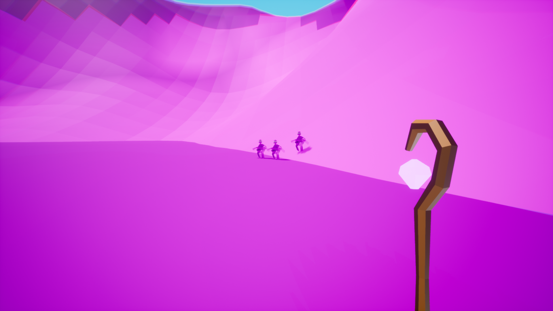
  6. I notice the clouds now; also cute to see how they are elongated. :)

The visuals are a nice base and go well with the colour-changing concept! I just wish there was more variety in gameplay, including both enemy behaviour and how we can act (shooting).

Otherwise, super cute; do not hesitate to reuse your graphics and idea.

Submitted

Would be helpful if you included a web build!

Submitted(+1)

The enemy models and animations are very nice, especially considering you made them during the jam. The waves can feel a little slow and uneventful, having the enemy ai have more interesting and varied behavior and maybe making them a bit less tanky would help with that. Nonetheless the game is pretty fun and has a nice aesthetic, good job.

Developer(+1)

thx a lot for the feedback!

(+2)

I love the colors and the enemies!

Developer

thankss

Submitted (1 edit)

Had fun playing this! Enemies are incredibly funny, did you design them all by yourself?

Developer(+1)

yes i had to speedrun modeling them but I cam up with the ideas and created them during the 48 hours, thanks :))

Submitted

First round I saw the blue enemies and it was chill, then the green enemies spawned and I got creeped! Fun little game

Developer

thanks a lot

Submitted(+2)

"you finished the game bruh" - your game. It has really unique and interesting artstyle - I like it. It has various enemies and the idea with a die is unique. Although every enemy is almost the same and there is not much juice in this game (music, sound effects, particles...)

Developer

I know the presentation isn’t the very best, thanks for the comment tho! :D