Indie game storeFree gamesFun gamesHorror games
Game developmentAssetsComics
SalesBundles
Jobs
TagsGame Engines

(done) sosasees progress report

A topic by poppy ribbon created May 06, 2023 Views: 275 Replies: 6
Viewing posts 1 to 7
Submitted (2 edits) (+2)

2023-05-06: day 1 of 9

game idea

i came up with my game idea — of course based on the theme Less Is More.

my idea is a game where you get overdetailed pixel art (it has so many details that it’s hard to see what it represents), and you have to fix it by removing unneeded details.

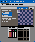
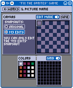
this is my mockup for the pixel editor that the game will be based in:
these are the attributes that i plan the pixel editor having:

  • game only for Desktop (because extra mobile support would cost too much time to finish in this jam)
  • fixed window size (for main window and subwindows)
  • fixed window positions (for subwindows)
  • ‘screen’ and ‘spritesheet’ are 64×64 pixels each
  • you can select 8×8px sprites in the spritesheet
  • fixed 16-color palette

window management

i spent 5 hours on a custom window border that replaces the OS window border, because

  • the OS window border can be resized to any increment — but i want my game’s window to scale only to 100% increments, so the pixel art stays as crisp as possible
    • i could just set the OS window border to be not resizable and put the zoom buttons under the title bar — but i really wanted to show that the zoom buttons are related to the minimize and close buttons, so i had to put them in the title bar itself

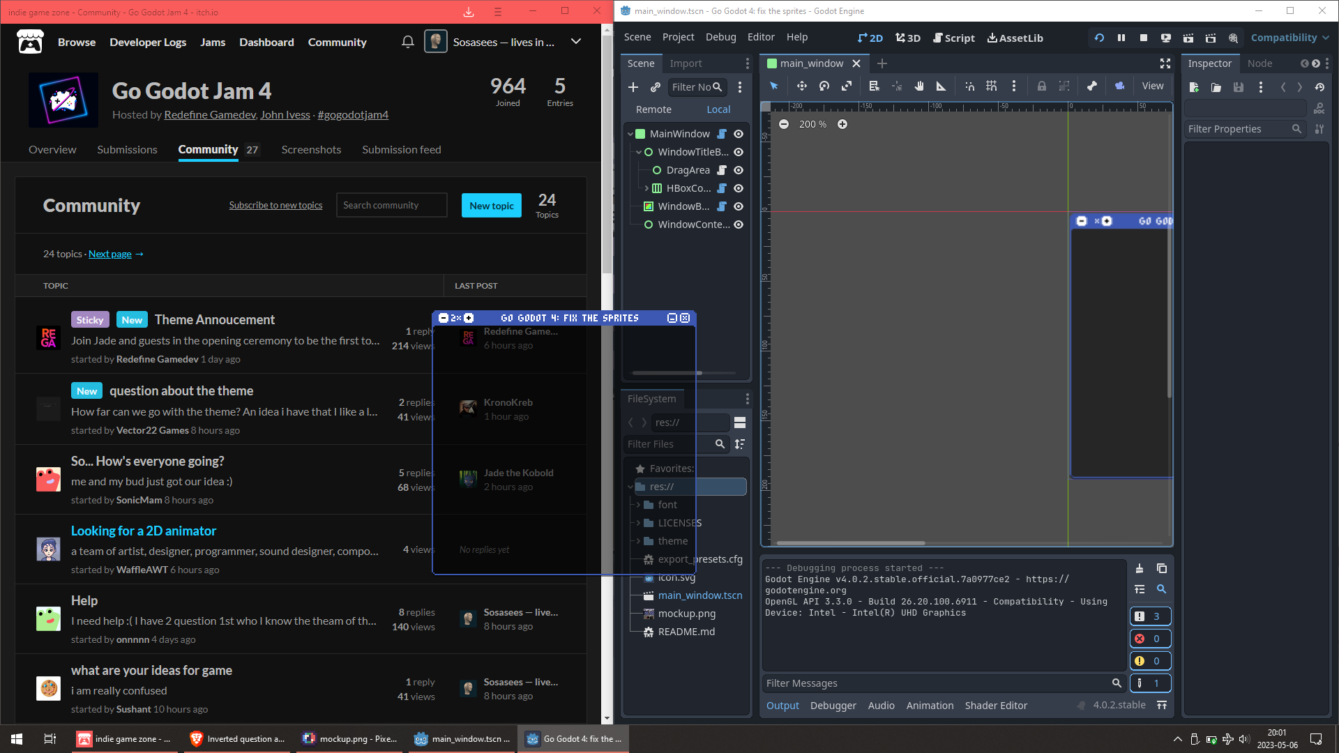
my custom transparent window on top of other opaque windows

this happes to be a really good use of Godot’s obscure ability to make transparent windows, so maybe this will get me a slightly higher Technical ranking

(+1)

Sick! Looking forward to the result.

Submitted (10 edits) (+1)

2023-05-07: day 2 of 9

more window management, theme refactoring

i added the subwindows and a toolbar — both are empty for now, except some title text.

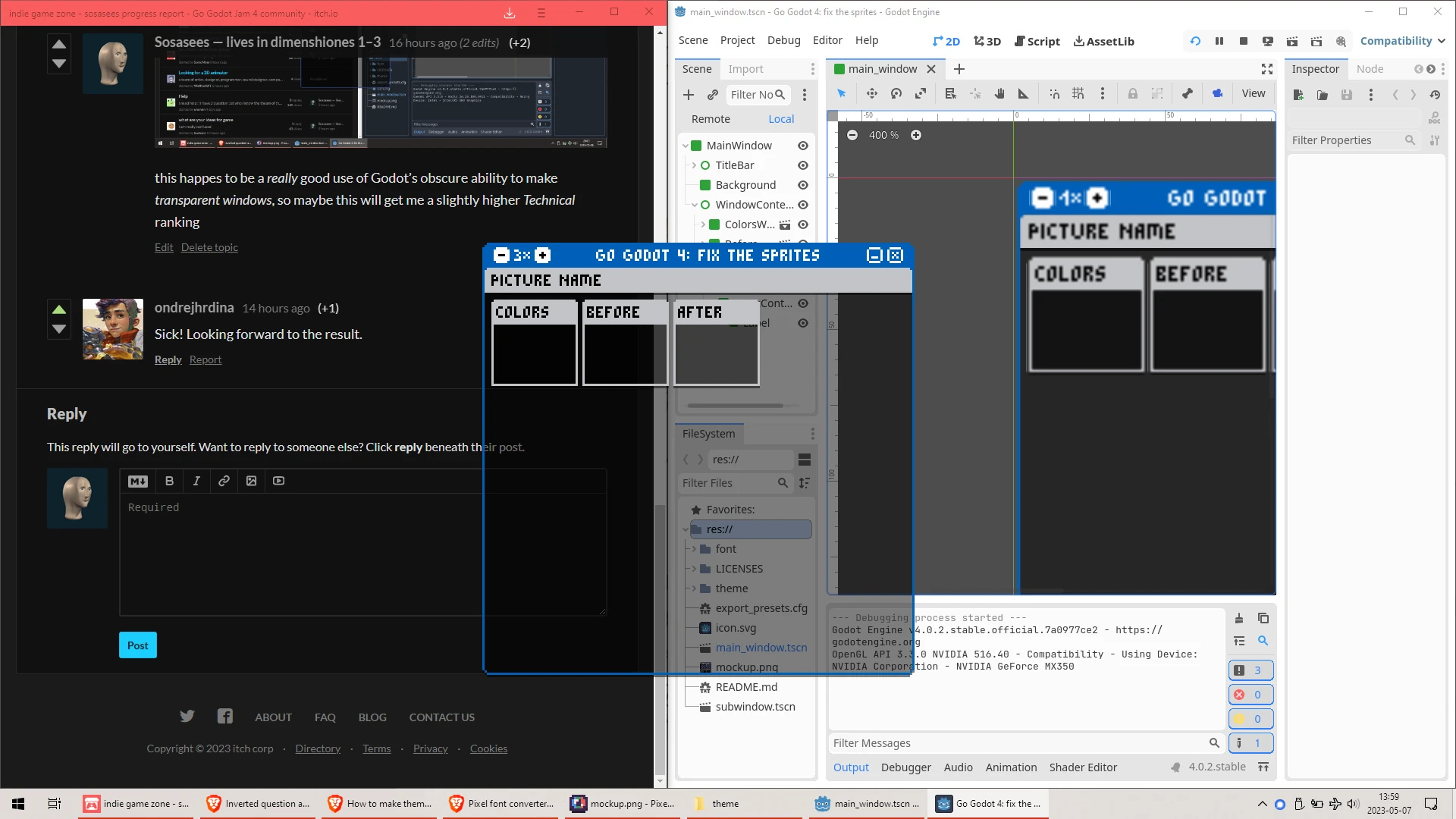
the custom game window on top of other windows

i also changed to using theme type variations for UI colors. i used tool scripts reading custom project settings of type Color before for this, which is less sustainable and slower to implement (so it has no upsides) — the only good reason to do this was because i didn’t think of using theme type variations yesterday. 🤦

this took 2 hours.

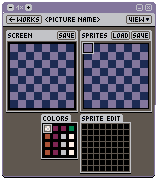
revised mockup

i realized that the variant of the game with a ‘spritesheet’ would be too hard to understand — especially that it would take some trial and error to find out how editing certain sprites would change certain parts of the picture.

so i changed the mockup (in roughly 2 hours) so there is no spritesheet — but i could keep a really good idea from the original mockup: an ‘area edit’ window where you can edit a zoomed-in 8×8 pixel area that you choose on the spritesheet (now the canvas), so you don’t need superhuman precision to edit the pixels.

the new game window mockup

themed buttons, added layout of ‘canvas’ window, changed UI colors

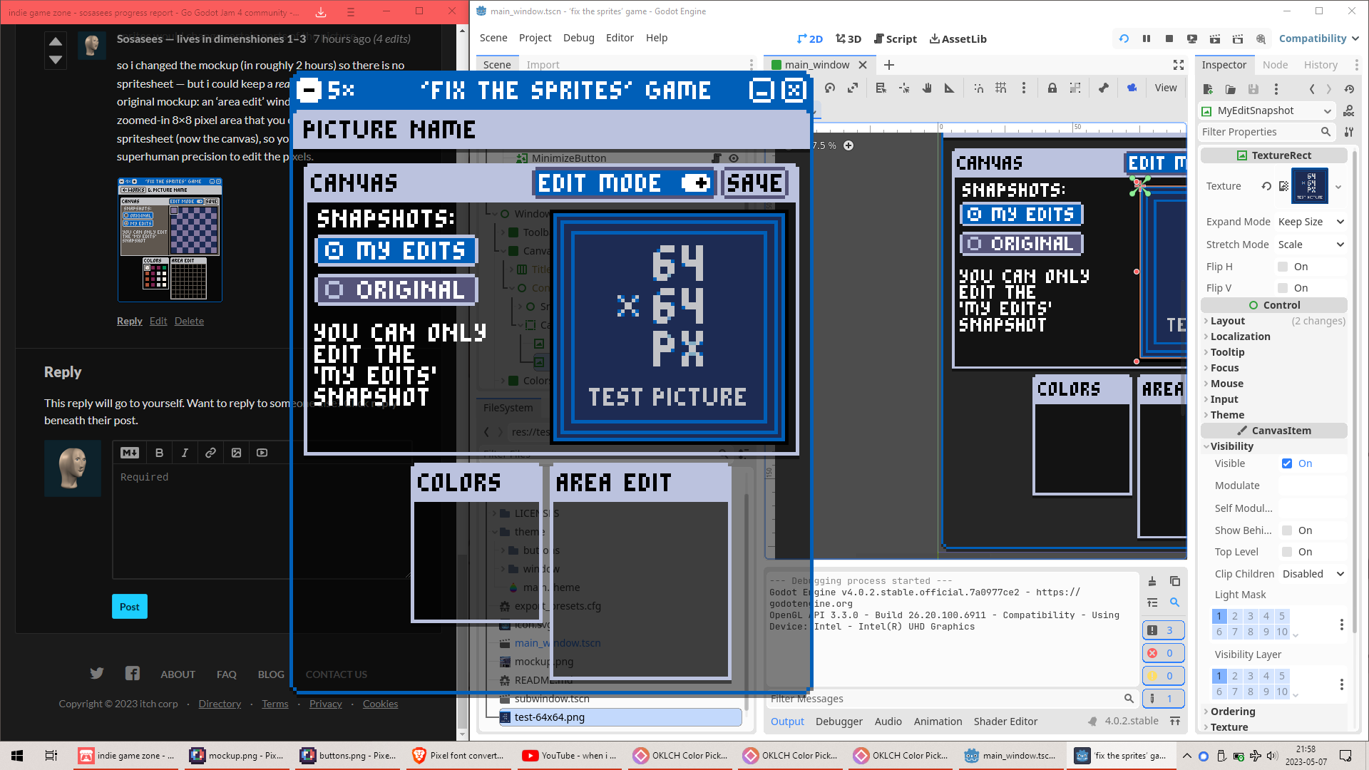
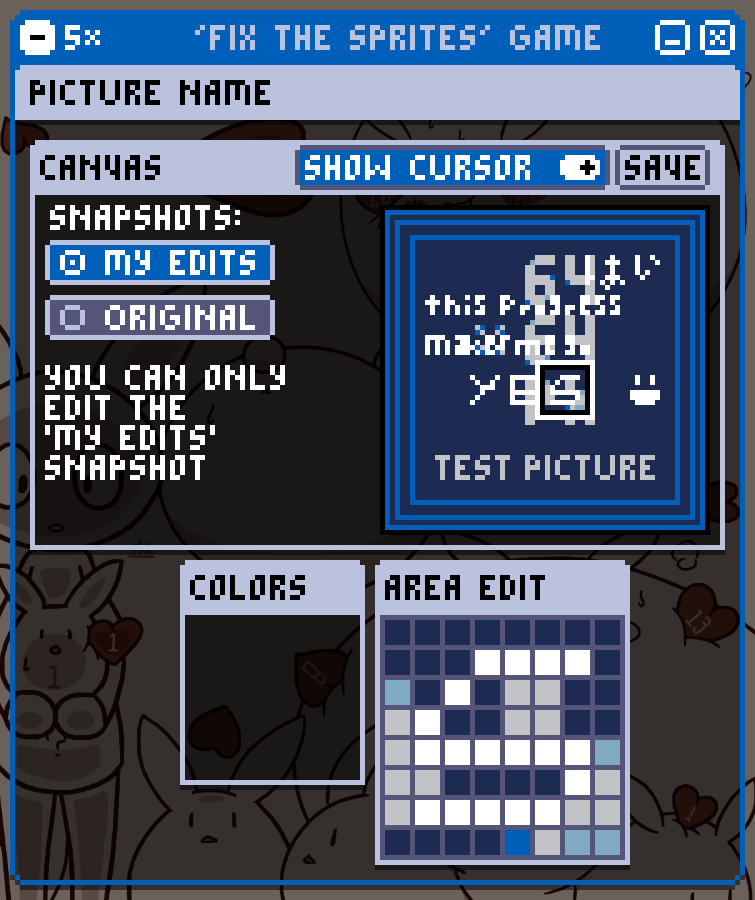
this is the result after 5 hours:

the layout of the ‘canvas’ subwindow is finished, grey colors became soft blue

most of the 5 hours was testing that everything looks like i want, and fixing unexpected layout changes.

Submitted (1 edit)

2023-05-08: day 3 of 9

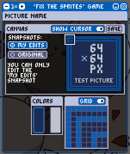
­¡finally! — ­¡i could ­finish most of the gameplay! (in 6 hours)

the game window with some test scribbles on the canvas, and the colors window being the only emty window

now i can

  • scroll the ‘area edit’ window by selecting a 8×8 pixel area in the ‘canvas’ window
  • draw over the original picture in the ‘area edit’ window
  • hide the cursor in the ‘canvas’ subwindow
  • switch between the ‘my edits’ snapshot and the ‘original’ snapshot in the ‘canvas’ window

i still can’t

  • draw in any other color than white
  • save the end result
  • hide the grid in the ‘area edit’ window (i just now realized this is needed, because of testing)

grid button

i needed to find a place for the grid toggle, and i found that the ‘area edit’ window doesn’t really need iits title (the name ‘area edit’ would sound more confusing than no name), so i replaced the title with the grid toggle in the mockup

Submitted (3 edits)

2023-05-09: day 4 of 9

today i was very close to not making progress because it was a bit of a crazy day so i needed to relax from the craziness — but i did make some progress after around 21:30.

i found that the game is closer to done than i thought:

i found that the game works much better if there is only two colors, so i put only 2 colors for drawing (instead 16 how i planned). i also found that 64×64 pixels is quite large for one sprite, so the game may only need one level with multiple sprites, not multiple levels with one sprite each.

i also added the grid toggle to the ‘area edit’ window.

Submitted (2 edits)

2023-05-10: day 5 of 9

¡all the functionality is now done! 🎉:

the last functionality that i needed to add was saving the picture in the user:// path and then opening the user:// path in the file manager. the purpose of saving the picture is posting the game results in Itch comments, so the picture has to be saved in the old PNG format instead of the modern WEBP.

(if i made a screenshot for today, it would look the same as yesterday)

now i need to replace the test picture with a finished picture, but i need suggestions for this picture because my creativity does not want to work right now:

🗳 pixel art suggestion box

Submitted (2 edits)

2023-05-11: day 7 of 9

🎉 i finished the game and the Itch page

finished game screenshot

Now you can download and play the game on Desktop