Play game
Life is Burning Fast's itch.io pageResults
| Criteria | Rank | Score* | Raw Score |
| Theme | #9 | 4.429 | 4.429 |
| Audio | #14 | 3.500 | 3.500 |
| Overall | #31 | 3.327 | 3.327 |
| Fun | #31 | 3.214 | 3.214 |
| Originality | #36 | 3.500 | 3.500 |
| Accessibility | #42 | 2.786 | 2.786 |
| Graphics | #48 | 3.286 | 3.286 |
| Controls | #73 | 2.571 | 2.571 |
Ranked from 14 ratings. Score is adjusted from raw score by the median number of ratings per game in the jam.
Godot Version
4.1.1
Wildcards Used
N/A
Game Description
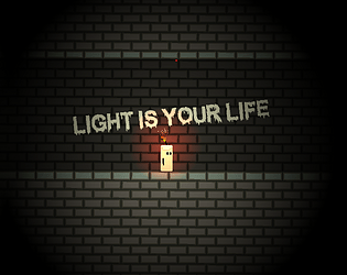
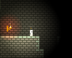
You control a little candle lost in the dark. You have to go through the dungeon while avoinding the traps and the ghosts. But your light is your life.
How does your game tie into the theme?
You are a little candle who can extend and reduce the light you emitt
Source(s)
N/A
Discord Username(s)
Aerkaos
Participation Level (GWJ Only)
It's my first time !
Leave a comment
Log in with itch.io to leave a comment.


Comments
It's a simple platformer, using illumination in two facets: 1. To mess with visibility, 2. To get by ghosts.
For those of you who are also struggling, this game's dev has revealed the secret to me.
This game's controls assume the AZERTY layout, which is used in France and Belgium. Therefore, the real brightness keys to us common QWERTY users are actually Q and W.
When you play the game with this knowledge, it makes much more sense. Being bright gives you more visibility, and freezes white ghosts, but you expend more life as an upkeep to do so. Being dim gives you blindness, but makes you invisible to black ghosts and costs no life as an upkeep.
However, I believe the game does not have enough to quantify a full experience. What is made here is competently made, where the complaint is stemming from a cultural issue.
You will have to consider these things in the future. Your common audience will be on QWERTY, which is going to take you out of contention from accessibility alone. Knowing, this however, will make you that much stronger if you come back
Due to a clear language issue, I have decided that this review is no longer fair, and have replayed the game and redone the review.
If you have a QWERTY keyboard try Q and W maybe.
I like the idea, but I didn't understand the more/less light. Maybe you can explain this. I couldn't figure out a change. I thought if have more light I am brighter and can see more but this isn't the case, I think it fits the theme very well.
Nice idea! Had some trouble understanding the "more/less light" mechanic. Didnt find any major bugs :)
Thanks ! Yes I'm not satisfied with the level design, it's actually pretty bad because it doesn't teach the mechanics to the player.
I like the idea, but unplayable with a qwerty without arrow keys :(
Ah didn't think about this, sorry ! I will remember this for futur jams.