Play game
The Ruins of a Fortress's itch.io pageResults
| Criteria | Rank | Score* | Raw Score |
| Originality | #60 | 3.243 | 3.357 |
| Graphics | #64 | 3.312 | 3.429 |
| Accessibility | #69 | 2.760 | 2.857 |
| Audio | #78 | 2.829 | 2.929 |
| Overall | #82 | 2.810 | 2.908 |
| Fun | #94 | 2.415 | 2.500 |
| Controls | #97 | 2.622 | 2.714 |
| Theme | #105 | 2.484 | 2.571 |
Ranked from 14 ratings. Score is adjusted from raw score by the median number of ratings per game in the jam.
Godot Version
4.0.stable
Wildcards Used
All
Game Description
A lone soul awakens within the ruins of an ancient fortress
How does your game tie into the theme?
you are overloaded with enemies. and you have little choice
Source(s)
https://github.com/Quicksilver151/The-Ruins-of-a-Fortress
Discord Username(s)
renderinguser
Participation Level (GWJ Only)
i joined probably three times in the past
Leave a comment
Log in with itch.io to leave a comment.


Comments
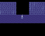
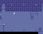
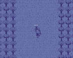
I am always jealous of people that can pull off the low color palettes, the visuals in the game are awesome! A big fan of the scene transitions. The gameplay was simple but I liked the choices and how at some point you get so overrun that you have no choice but to give up.
ive worked with 2-color color palettes for a while. but im still not that used to it. art took the most time out of everything else for this game. glad that was worth it.
also, the scene transitions was actually at first, a side effect of the shader i used to limit the colors. it looked cool so i kept it.
It's nice roguelike game. I think it has lack of storytelling, also I can't understand how to play with mage
Very cool concept. I enjoyed the style and I really think you nailed the "unspoken stories" wildcard in this entry.
TYSM, i try my best to do all the wildcards for these jams. luckily i was able to come up with a short story this time.
I just played the web version. seemed ok. (on safari browser)
Interesting experience. I like the long interludes with the player characters arriving into the fight. I liked the ghost-flame character walking around the castle. All very charming.
It felt like the fighting was intended to be straightforward in order to match the pixel art. Normally I would say "add more juice", but I don't think this aesthetic warrants extreme juiciness.
Good game.
tysm for the feedback. also yea i was going for a very minimalistic approach. in fact, i have a shader in that game that forces everything to be just 4 colors. also, i guess making my own assets this time paid off.
i really liked the pixel art style and colors, and that prompted me to actually give it a download since the web version is really janky for me... going into either of the doors just froze during the transition animations. Also I realized there was some cool fire particle effect to the lone soul character! I saw a lot more of the details in the downloaded version.
Really cool art style and atmosphere! I would have loved to explore more of the environment as the lone soul like it started out. It had a really mysterious vibe that I wanted to experience longer before the gameplay switched up. Like an old school parser-based interactive fiction game
Nice work!
tysm for playing and also for the feedback. also, its quite odd that it gets stuck on the transition. i played the web version myself and was able to complete the game. maybe its an issue with the browser?
i also do wish i could have added a bit more but sadly the deadline arived