This is fantastic, very original card game. I think we added feedback to the player (in the polish jam maybe) just for people like me that don't play a ton of these types of games - we need to be spoon fed information about what is happening, haha. I really, really enjoyed this.
Play board game
Tempo Battle Stage (Jam ver.)'s itch.io pageResults
| Criteria | Rank | Score* | Raw Score |
| Smooth, Polished & Bug Free | #6 | 3.333 | 3.333 |
| Interesting Gameplay / Fun | #6 | 3.500 | 3.500 |
| Likely to Release | #7 | 3.500 | 3.500 |
| Overall | #8 | 3.333 | 3.333 |
| Aesthetic (Art, Audio, Theme) | #11 | 3.500 | 3.500 |
Ranked from 6 ratings. Score is adjusted from raw score by the median number of ratings per game in the jam.
Solo Jammer
Made by a solo jammer
Prototype Jam Submission
https://itch.io/jam/greenlight-prototype-jam/rate/2129403
Comments
I love the aesthetic you've got now! I really love your manual and that I can bring it up in the middle of the game, it made it easier for me to learn the game when I can look up a term I forgot on the fly. I'm still not particularly good at your game but the manual makes it much easier for me to learn and try to do better in the next match.
Your art and music really convey the European martial arts style too.
As there are a large amount of aspects to the game to learn, the manual was the most helpful aspect. There's a lot of onboarding needed, and there's quite of bit of text to read through in order to grasp the the game.
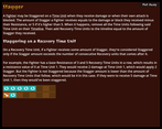
I like how the manual had some of the key terms underlined, as it highlights that it is important to know about (although this may be a side effect of wanting to indicate to players that they can click the word). I have mixed feelings about being redirected when clicking an underlined word: I think it's useful when I don't know what the term means, especially as a first time player. However, that meant having to return back to the page I was on, and find my place on the page again. This did contribute to my slow uptake of the game mechanics. Perhaps instead of redirecting to the relevant page, a tooltip could appear and provide an abridged description of the keyword.
The manual pages that had images were easier to follow, and helps break up the large walls of text. For example, in the Time Units page having the icons for common time units would firmly link the concept of time units to the actual icon. I think this would be useful in other pages too, especially in the Stagger, and Stamina pages. I only understood what the examples were trying to explain after being inflicted with 8 recovery tokens - I initially thought the game had glitched until the game mechanics clicked in my head and then I was able to understand why it happened.
Another area where images would be helpful would be in the Game Flow page. The concept of a time tray wasn't highlighted. As I was primed to look for underlined keywords, I mentally skipped over the term. In the stamina page, I misunderstood how stamina was recovered when I read the Stamina page. I thought stamina is recovered was when a new time unit was placed down. This misunderstanding was eventually cleared up in round two, but that did mean having to endure some confusion for a little while.
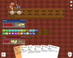
I like the planning aspect that the timeline element introduces. It allows for planning ahead and picking moves to suit the situation at hand. I think the variety of moves was just about right: There's enough differentiation that you can come up with different strategies with the cards you currently have without simply hoping for a particular card in future turns, yet there wasn't too much variation such that it felt like you wouldn't see a particular card as often.
Although I read the rulebook before playing, the first round was still confusing and a little bit slow as I tried to get to grips with everything. Most of the game mechanics only started to "click" in the second round. The game became a bit more straightforward as the planning aspects started to become apparent, and then it became enjoyable.
The tooltip that appears over the time unit tokens is especially useful when trying to plan out the next few moves. Daybreak did feel like the simplest and most suitably designed for beginners to learn the games, having a straightforward pattern of advancing forward and attacking with few gimmicks to think about. Playing Cadence straight after was a little bit difficult, as I had to think about zoning and distance due to the moveset being more varied and the Appeal mechanic factoring in some of the cards. However, it was extremely rewarding to be able to use the Finale move and inflict the slew of recovery tiles that I had experienced earlier. I'm curious on how the other characters would play out.
I like the boardgame-like UI and theming.
Overall, I like how the planning aspect allows for strategizing, and the current set of characters and their movesets feel well designed. The manual is extremely useful for onboarding, though it could use some improvements to help make it more digestible.
Thank you for the very solid advice around the rulebook. I was trying to not scare off players by showing them a large chunk of text of all the information at once, which is why I broke them down into sections with hyperlinks (also no need to worry about the explanation of terms). Having "sneak peek" tooltips over the terms would certainly be helpful. I'll make sure to add some examples for Staggering and try to fit some images into the Game Flow page.
I think you've got some excellent card game mechanics here!
In particular I really like that timeline, it's super satisfying to see what your opponent is going to do and countering them perfectly (not to mention how satisfying it is to stagger them over and over again). The horizontal positioning didn't seem as relevant in any of my games though, whenever I played as Daybreak I just ended up directly next to Cadence, and when I played as Cadence I just ended up in the corner
My thoughts for what I'd like changed kind of depend on what you want to do with this game in the future. If the goal is for this to become an in-person board game played between two actual people, then I don't have a ton of notes, but I'd definitely nerf staggering for both players.
If your goal is for this to be a singleplayer deckbuilder type game though (which I am thoroughly in favor of, this would make an excellent deckbuilder), then I definitely have some notes -- for one, I think that the opponent should always have priority. It's way more fun to respond to your opponent than to have to just guess at what's in their hand and hope that they don't just pop off out of nowhere. For another thing, I'd make it so the opponent can't stagger. Stagger is the kind of game mechanic that's really cool and fun for the person doing it, and really frustrating for the person being staggered. To make up for it, you'd have to way turn up how much damage the enemies will do, but I think it'd absolutely be worth it for gameplay. I might also simplify the enemies overall, too. When playing as Daybreak against Cadence, it's weird to see Cadence building up and managing Appeal when I don't really care about that (what does it mean for me if Cadence has 3 appeal? Sure, they might play a big card, but it isn't something like "when Cadence has 5 appeal they'll do a super powerful attack", it isn't concrete enough for me to really care)
Did also have some technical issues. All 3 of the matches I played froze at one point or another. One of them froze pretty randomly (maybe after looking in the rulebook?), one of them froze at the start of round 2 (specifically, it let me mouse over and click to play cards, at which point they'd despawn and I'd be given a new card, but none of the cards would actually resolve any effects, and there wasn't actually a Timeline in play, just a pointer), and one of them froze after I right-clicked to discard a card
I really hope I see more of this game in the future though, beyond this jam -- I'd love it if in a few years I saw a Slay the Spire-esque Tempo Battle deckbuilder (or if you'd prefer, a Tempo Battle boardgame or TCG)
Thanks for the review!
Yes the freezing/crashing issue seems to be a common one. I personally could not reproduce that consistently in my local environment, but I would try some measures like preloading assets instead of loading them on the fly for better performance.
A slay the spire-like was not part of my vision. The end goal (if the game ends up being "completed") was to add multiplayer. I would need at least four fighters available for that to happen, so each player would get two random fighters to pick from in the beginning. I do plan to have a "story mode" and make a story line for each fighter to characterize them a bit more.
Staggering is pretty powerful. I added the staggering cap of 5 to nerf it. Maybe it could be lowered more or the resistances could be higher. But most moves that are good at staggering require high stamina or a long time to finish, so you're not likely going to lose from just being hit by a single staggering spree (two or more would definitely do it though). I'm also planning to add a draw pile and discard pile view for both the opponent and the player (only draw pile count for the opponent), so it will become more predicable what cards the opponent would have ready in their hand (if you're familiar with their deck, which is ultimately how the player's expected to get better at this game).
Great concept! Really enjoyed it - although I wonder about luck sometimes, as I'll destroy the enemy with a good hand once then get dealt a bad hand and just lose badly. Values not updating properly is a minor issue - and I crashed once, but otherwise runs fine.
Hey thanks for the comment! A couple of things I want to check with you about, if you don't mind -
1. Did the crash happen shortly after you opened the rulebook? Or otherwise for how long have you played it until it crashed? I've noticed that happening but I was using a very bad laptop (temporarily) so I wasn't sure if it was just performance issue on degraded hardware.
2. Were you informed that discarding ("strategizing") by right clicking on a card and clicking on the buttons under the figurine to reposition were things you could do instead of playing a card?
3. Could you elaborate on which values are not updating appropriately?
(P.S. Will check out your game tomorrow when I wake up. It's a bit late in my time zone right now.)
Hey!
1. I crashed when I tried to discard a card. It didn't happen much. It's pretty early on in the game.
2. Yup for the discard. Have to admit that I missed the reposition though. Not really common to have control outside of cards in these games, but that one's on me. Cadence now makes more sense - I can see winning consistently.
3. Now this one I might've just mis-interpreted it, but I thought that the HP and Stamina values under their names would update when they change (Else hovering over health, stamina, or appeal to check would kinda break the flow of the game)! But that might not be the case after all.
Thank you for the fun game :)
Yeah you're right the HP and Stamina values on the cards holding the tokens are not supposed to change cause they're "printed out". I was a bit obsessed with the idea that the game should be playable as a physical game... But it does break the flow when you have to hover over the token spaces to check the updated values very often so I think I can add a configuration option to show token counts at all times.


Leave a comment
Log in with itch.io to leave a comment.