Play game
Grimoire - Production Phase's itch.io pageResults
| Criteria | Rank | Score* | Raw Score |
| Aesthetic (Art, Audio, Theme) | #9 | 3.801 | 4.250 |
| Smooth, Polished & Bug Free | #11 | 2.907 | 3.250 |
| Overall | #11 | 3.130 | 3.500 |
| Likely to Release | #15 | 2.683 | 3.000 |
| Interesting Gameplay / Fun | #17 | 2.683 | 3.000 |
Ranked from 4 ratings. Score is adjusted from raw score by the median number of ratings per game in the jam.
Solo Jammer
Solo
Made by a solo jammer
Prototype Jam Submission
https://kaepaken.itch.io/grimoire-prototype-stage
Leave a comment
Log in with itch.io to leave a comment.


Comments
I like the "wander through a dark forest collecting ingredients" concept a lot! The chill music is a nice touch too. And I liked the adaptation of the Macbeth chant/recipe to plants (with location descriptions in the grimoire), rather than literal animal parts.
I felt like I struggled a lot with seeing everything on offer here though. A few rough edges that I stumbled over:
- Maybe my eyes are getting worse, but the UI seems maybe 50-60% the size I'd like. I had to keep leaning toward the monitor and squinting to try to make out the writing.
- The mouse sensitivity feels ~2x - 3x too high. It'd be nice if there was a slider or toggle to adjust.
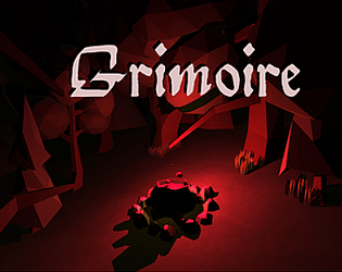
- The uniformity & completeness of the darkness, combined with the topography around the campfire, and the sensitivity of the mouse, made navigation difficult in a way that feels more accidental than intentional to me—I couldn't tell how far I was turning because the visual feedback seemed to be 90% black + 9% almost-black + 1% stars randomly positioned, and also because the mouse sensitivity was difficult to predict. Going into full-screen mode helped a fair amount with the darkness (probably because the playable area isn't surrounded by white that way), as did turning my monitor brightness up a lot. Putting a tall dead tree or something nearby the campfire so that its lit portion is visible from further away would help with orienting, as might bright sparks or glowing fumes rising from the cauldron. A slightly larger candle-light radius and (if it's not too time-intensive) a bit more ground detail / a few more landmarks might also help once the campfire is sufficiently far away.
- I had trouble when a candle is nearly spent -- it seemed like it was going down, but I couldn't tell roughly what percent was left (it seemed like a lot of candle was left when it went out). Maybe there's an extended sputtering as some indication of being low? The light flickers so much it's hard to tell though. As a quick hack, just having a text warning ("my candle is low. i should head back.") appear could help. I also felt like I should be able to carry more than one, which would help when deciding how far to wander / when to turn back.
- It seemed odd that I was being attacked next to the cauldron & campfire. I thought that light would be enough to protect me?
A few bonus ideas, if you have time:
- A sound when the candle goes out might be a nice touch. Maybe an ominous tone, or just a light fizzle followed by a slow fade-in of a spooky night ambiance loop.
- It might be interesting to have the candle blow out due to wind, and need to be re-lit occasionally / when moving for an extended period. Or it might just be annoying, I don't know. I'd be curious to try it, though.
- A rough/partial map in the grimoire for some of the area could be a neat way to help with orientation & finding some of the ingredients.
I look forward to trying the polished version this weekend!
This looks really nice. I really like the atmosphere and the music. I would like to see either the sensitivity of the mouse turned down or a setting to turn it down. I had to go find a mouse because I needed more precise movements.
Really nice aesthetic so far :)