Play game
Back To The Overworld's itch.io pageResults
| Criteria | Rank | Score* | Raw Score |
| Instructions | #1 | 4.250 | 4.250 |
| Creativity | #1 | 4.750 | 4.750 |
| Enjoyment | #2 | 3.750 | 3.750 |
Ranked from 4 ratings. Score is adjusted from raw score by the median number of ratings per game in the jam.
Leave a comment
Log in with itch.io to leave a comment.


Comments
Congrats for the 2nd place! c(m)~
Thanks alot
Back To The Overworld
A Game by Jennifer Barrios Tettay
Review by Carl Marajay
..........
Good Points:
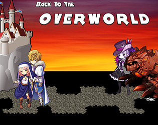
-The player seeing the Title Screen has a sneak peak of some of the characters of the game which will create interest towards the player. "Who are these characters? I need to find out!"
-I like the new placement and format of the Title menu, not the usual centered box title menu. You put a shutdown which is good for easy exit when fullscreen mode.
-I like the Intro, good job. The fog blends well with the background image plus the relaxing guitar, I can also hear a violin? It felt like some war or battle has ended. Sometimes it felt like an ending scene already.
cool, well done.
-The font is also readable.
-I like your wordings and the choice of music.
-The scene of Draco and Despoina with the background music of a woman singing kind of sets the mood and interest of the player even more.
-Changing of the text size really helps to make the player focus and felt like the player is really visualizing in his head the right emotion and emphasis of some words. Good job.
-Watching and reading the intro felt like some huge event has ended and a new beginning has come. The sun is setting and hiding between the rocky mountains. Felt mellow and peaceful. Good job.
-I like the classes of each characters. Not the usual classes in videogames. Interesting choices. Good job.
-I like the sprites at the battle. Very cute and chibi and not the usual RM chibi sprites which is refreshing for me to see.
-While in battle, I like that you did not clutter the screen with unnecesarry HUDs. Not overwhelming at all. Good job.
-I like that you teach the player one step at a time like the sleeping effect, to avoid overwhelming the player. Good job.
-The character faces and portraits are beautiful.
-I like the conversations between characters. Felt real. Good job.
-I like that you put a kind of treasure that player won't expect it to be always a treasure chest but it can also be a trap chest. Good job on that.
-Esmeralda is hot mamacita lol.
-The convos were funny lol.
-I like the animation effects scene. I felt like playing a 2D and 3D game at the same time lol.
-Ahhh...I like the scene at the lake and the BGM fits well, very soothing and calming. Good job.
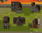
-I like what you did in the town, very refreshing for an RM game. I do like the guitar BGM with birds chirping at the town. Very relaxing. Fits for a resting area. Good job.
-At the Crypt, the atmosphere and BGM blends well. You have given it an identity. Good job.
-You gave each character an identity too. Good job.
-Good job in adding a variety of mini games.
-You introduced and connect the tutorials to the story which is smart. Good job.
-I like the decision based through paths. Felt dynamic and non-linear. Good job.
-I like the dialogue choices too. The player will really think. Some were obvious though like 95% of the right choice is to spare the priestess' life, the other choice is I think just to give the player another path for experimentation and what if I did this 5% choice? but still good job.
-I like the icons, well presented. Good job.
-I like that in every area, you change the BGM and the atmosphere in result, it gives each its own identity. Good job.
-At the Cave, I like the mini game of Belrios. I like the variety of mini games. Good job.
-I like some background images too like the blue cave.
-I like the timed attack in the battle though easy (I realized I change the difficulty at 50% in the settings). Good job.
-Gorgeous character sprites and portraits.
-NPCs are interesting too. They each have different introductions. Good job.
-I like that you put tutorials as book items for the player to scan anytime. Good job.
-Playing it more than an hour and no errors at all. Good job.
..........
To Improve:
-The Title Screen Image has some inconsistent graphic design. The castle does not fit well with the character images. Kind of out of place. You can still improve the title Screen.
-The Title BGM felt like I was in a cowboyish country feel. Maybe because of the opening intro sound. That's just me. But as I listened to the most part of the music, it kind of giving me a happy feel and a battle sound.
-I'm not sure but I think ... is the correct one and not .. - add one dot (.) I'm not sure.
I'm talking about the sentences in your intro.
-I suggest you put an option whether to skip intro or not specially if it's a dialogue intro. For old players who wants to revisit the game and doesn't want to go through the intro again.
-The dialogue scene where Jackie introduces himself, I hope you change the BGM temporarily. With Jackie's dialogue, it does not fit the mellow dramatic BGM playing while he wants to slay some enemies. Maybe change the BGM to a medium fast sound or something that the player will remind them of Jackie's personality because of the music. First impression matters.
-The character introductions of Jackie, Liless, and Vrazhar does not fit well with the BGM. The character's dialogues were kind of jolly while the BGM playing is mellow and peaceful.
-The intro of "Eye" like the other characters does not fit with the BGM. The dialogues of Liless and Eye felt mellow which is I think wrong because the BGM should have been some upbeat or alive music. It really destroys the focus and connection of the scene to the right emotion and expression.
-The word 'Notification' in Draco's dialogue kind of out of place for me. Reminds me of social media. Maybe it's just me but I hope you can replace it and find a much better word that fits the world structure of the game.
-"Both girls playfully giggling, apparently having fun." excerpt from the game while a mellow peaceful dramatic BGM is playing. Does not blend well.
-At the forest...I hope you put a nature SE like a hush wind and some birds chirping. It adds to the atmosphere and believability of the game's area. For me the BGM at the forest/woods does not fit with the map. That's just me.
-The BGM really distracts me from feeling the right dialogues of the characters. I don't know but the BGM at the forest is too fast that instead of reading and visualizing the character dialogues, the BGM gets into my head. Maybe a less slower BGM will do.
-At the battle, add a choice box at the end of the tutorial to either repeat the tutorial or continue the battle. Some players may accidentally press the key without reading some instructions. It is better to have an option for the player to read it again or put an item at the game's inventory for the tutorials, maybe a note?
-The BGM while adventuring is distracting and does not fit with the character conversation. The conversations were great but the BGM kind of removes that right feeling. The BGM became a distraction instead of complementing the dialogues of each characters. Maybe it's just me and my personal taste.
-The Background does not fit with the character portraits/faces but I know you intended it that way. It has some charm but I suggest you choose a little cartoonish background but still 3D looking one. I felt like the characters were cut-out and pasted lol but I know you decided it that way so no issue really. Just want to point that out.
-The BGM felt repetitive, no variation, speed change, or change in the scene's personality. Yep I'm also guilty of this one lol.
-The lake scene with the mysterious girl kind of short? I hope you add more!
-Naming the town a "ghost town" while having a relaxing BGM may not fit the theme of the area.
-"Pizza" and "Cola" in this kind of game world may be funny but it may also destroy the immersion of the game. I suggest you rename a pizza to something that fits the game world. Names like "Kabara" or "Pizzari"...just comes to mind.
-At Liless' Status menu, there's a mispelling of the correct word "COUNTLESS" with "T".
-The mini game at the Crypt is good but I suggest you put their faces instead of card images. It will connect to the narrative well.
-The wordings "Delete", "Game Over", and "Notification" kind of destroy the immersion of the world. You put an interesting characters but you gave them some words that does not fit their world.
-The main quest of gathering your allies and let them return home felt uninspiring for me. Maybe give them a random freewill? I mean some allies will return and some stays and give reasons why.
-The allies' dialogues were repetitive and just the same. Make them personal and unique too just like the party characters. Add some dialogues.
-Some dialogues were funny but immersion breaking like the alchemist's dialogue "wrong game."
-The game has no measurement how many allies were there. I suggest put an indication of your goal. Put the ammount of allies to be rescued so that players will know how much are still left.
-At the half of the playthrough, I have no idea where to go or how many allies were left. I felt looping into areas without any clear path and no indication whatsoever.
..........
Final Thoughts:
I love the game, very refreshing from the usual RM game that I've played. No errors for more than an hour of playing. The party characters and NPCs has unique charms on its own. The MCs has different identities and uniqueness. I love the dialogues though there were some small issues (personal taste), I still enjoy the game. The battle system though the usual side view, you added some changes which I appreciate. No dull moments but I kind of lost in some areas without any clear path to take. For a game jam, this is well done. I love to see this game improved even more and released as a commercial one. Great job!
Thank You for the chance to play your game. Best of success!
c(m)~
Very cool idea of a visual novel /RPG hybrid. Here's my review:
First the good: The use of clickable arrows to move is pretty unique. The character busts/graphics are very cool, I've seen them floating around the internet but never used. The battle sprites are very well done but really small. Battles were fairly balanced and smooth. They were really fun to play. Background images are very pretty. The premise of monsters heading out into the world to take it back from the humans who have oppressed them is a great take on the game jam's theme. Mini games were very fun and presented well into the overall story.
Now for the bad, and please take this as constructive criticism because overall this game is really fun. The art styles of your background images and character art clash and look out of perspective. This may be due to in most visual novels you don't see there feet. They're usually right up on the screen so any perspective issues go unnoticed. I have no idea where I'm going. The "first person" view is really disorienting. I could go left and then back right and not be on the same screen as before. So I was never sure if I was going in circles. I have no idea what's up with the town scene other than the shop. Battle sprites are really small and hard to see. Timed attack sequences are a bit overdone. Also I am so used to giving a command and sitting back and relaxing that I would forget and botch the skill. I would love more troop variety, but limited time game jam I know. Action sequences could use some more work. The font is all over the place. Small then big, odd spaces on first lines. It can also be a little difficult to read. The window skin doesn't go well with your aesthetics. Way to much dialogue at times especially at the beginning. I skipped through some of it just so I could start playing. Also what time period is this? I would get the feel of a medieval fantasy but the dialogue is more modern teenagers i.e. "WTF".
Wrap up: very very cool game, unique premise and game play. Beautiful art, albeit clashing at times, it grew on me. Dialogue needs to be chopped down. The battles are really fun, during the long banter between party members, I was hoping to just get into another battle. I love seeing RPG maker used to make games other than the standard JRPG! The point and click aspect is very original. It was fun, really fun and well done, especially for a game jam with limited time. Keep up the great work!
Thanks alot for the feedback, I really appreciate it!
It's true that at some points it lacks variation which indeed is due to the limited time (in fact when I submitted it was on the last day 3am in my country), so I can just agree on that.
Also there was sadly no time left to let anyone else playtest it, which leads to the next issue you mentioned, the player feels "aimless". In fact 3 people have given me a similar feedback on that point and it's something that will be changed, to make progression noticeable to the player. In fact progression is there, but in hidden variables. How that negatively affects the player, I didnt notice by myself testing it, but now that I know it, I can work on it and hopefully release an improved version in future (after the votings of the game jam have ended). In fact I plan to make the progression directly visible on the screen, so let's say (tho the system right now works different) - it shows 2/10 maps explored. The number would increase on each map change and the player would know, he needs to explore 8 more before he unlocks the next NPC.
The town scene actually progresses with the player. It would become populated as the player proceeds exploring and "brings back" various NPCs, which would sell different items or unlock small features (as improving the own equipment). Each new NPC would come with its own dialogue scene, too. Well, but the issue here is connected with the mentioned before, as the player can't notice the progression, so I see, how it can end up in frustration. The town self plays a central role in the story as it advances and later leads to another event/scene, which again leads to the boss (in fact there's a boss fight in the end) and finally to the end of the story.
I've seen your Action Sequences in one of your videos, so I'm not surprised about your comment. Myself I haven't yet worked with them before and was trying a few simple effects on the last day, as before I had only used them to show the weapon image on skill attacks. However, I find the possibilities fascinating so I already planned on taking a closer look and learn more :)
I agree on the background images. Tbh I found it incredible hard to find some I could use. I haven't noticed that VN would hide the feet (Myself I hardly played VN). It could be something to try out, so I guess changing the overall perspective. I will keep it in mind.
I am not sure about the Battle Sprites, as I think their size is pretty much standard for MV? Or am I misunderstanding something at this point?
The arrows (while exploration) have some randomness but are partly planned out. So for example after a battle you'd never encounter directly another battle; Minigames are abit more rare than for example finding an item; some "1. time scenes" are "forced" after a certain value on a var has reached - like the human encounters which do perma changes. Or when a way leads to a treasure chest it could be randomly be the one with the gold or the other one. Guess that's something that needs testing and testing and testing again to optimize..
About the time period.. yes, it was intented, a medieval surrounding but with some modern aspects in the dialogues. However, you're not the fist one who mentioned it, so I'll try to take a closer look on them after I fixed the main problem (the feel of being aimless).
I really appreciate that you tried my game and I also appreciate your feedback. Thanks alot! It will def. help to further improve it. :)
I'm still playing it actually, I'm at about an hour of play, I don't get a lot of time to actually play games and I'm going through the game jam games and trying them all out and rating them. Once again, just constructive criticism, because this game is a lot of fun, I actually love the battle system and would just love to see this game get some more polish, and I can't say this enough, but very well done job on such tight constraints.
And again thanks alot, it makes me really happy to see the game is being enjoyed.
You've also done an amazing job, I just didn't want to write too much, to avoid spoilers. But when u decide to keep working on it, I'll gladly playtest if you need someone :)
There are plenty of things you can do in the game that are fun, but there isn't a clear linear goal that you can actually work towards like in traditional RPGs. I think it relies too much on randomness for me, gameplay wise.