Play game
Culler Wail's itch.io pageResults
Criteria | Rank | Score* | Raw Score |
Neat Idea 🧠 | #8 | 3.742 | 4.000 |
Palette usage 🌈 | #12 | 3.742 | 4.000 |
Mouthfeel / Vibe 😶 | #15 | 3.074 | 3.286 |
Fun 🎊 | #15 | 2.940 | 3.143 |
Overall | #15 | 3.100 | 3.314 |
Evocativity 🤗😭 | #18 | 2.004 | 2.143 |
Ranked from 7 ratings. Score is adjusted from raw score by the median number of ratings per game in the jam.
Leave a comment
Log in with itch.io to leave a comment.
Comments
The red snapper has come back to fight for its rightful place on the palette throne :O
Making the voxel engine is very impressive and the character designs are quite adorable :P
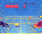
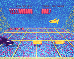
I agree with the others that it was very difficult to recognize where the jelly fish attacks were going to land. As an idea, instead of the lightning bolt you could have the square itself highlight (with static charge) for a short time to warn and then electrocute like it was struck or something?
Travis is OP
Otherwise awesome. I will be the king of the ocean.
The characters and animations feel great with the 3D world. The background, while having a lot of noise, did not distract too much from the characters. That said it made it near impossible to tell where the lightning bolts were headed on the later levels (levels with the jelly fish and eel at the least). The background also makes it hard to read the names of each combatant while in combat. If there were a full screen option this might be remedied.
The enemies starting at level 5 were difficult with seemingly a very minuscule window to switch between two lanes without getting hurt.
Besides those issues, the combat was fun.
Pretty cool style! Love the trippy background and the MS paint-looking art (I think that style is on the come-up). I found the game really hard, but I think that was intentional to go with the retro-style gameplay.
If I could suggest an improvement it would be a clearer indicator where the thunderbolts are landing on Match 4. Also, a full-screen option would be nice (window is pretty tiny on my 4k display)