Play game
Labyrinth of Darkness's itch.io pageResults
| Criteria | Rank | Score* | Raw Score |
| People's Choice | #70 | 3.133 | 3.273 |
Ranked from 11 ratings. Score is adjusted from raw score by the median number of ratings per game in the jam.
Leave a comment
Log in with itch.io to leave a comment.


Comments
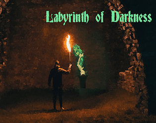
I love the music choice to open the game! I also missed the lantern right beside me at the very beginning and had to restart. After that, I enjoyed this game, though I do wish it were a LITTLE less dark.
Fun entry! Nice work! :)
Thank you for the feedback! I will decrease the darkness in the future :)
Fun game where you play as a bearded dude with a monocle footpumping an axe to kill imps. The only problem is that i completely missed the lantern 2 feet away from me at the start, so i ended up getting nowhere in total darkness. But i restarted got the lantern and finished this fast game. Pretty funny, i liked it!
Thank you for feedback, I really should change the way to find the flashlight hahaha
Labyrinth of Darkness
by André Vanzolin
Hey there André Vanzolin, thanks for submitting a project to the 2022 IGMC. I'm Drifty and I was asked to judge your game in round one of the IGMC 2022 game jam. Here's some feedback about your project.
I don't understand why the game needs to get tinted so dark before the show text even finishes the tutorial message.
It could be a slower fade, and maybe killing enemies could increase the brightness. It could be a cool effect.
It's kind of funny how the axe animation swings from the actor's foot. I mean I'm pretty sure that wasn't intended, but it adds to the absurdity that is this game.
At first I just kept dying a bunch of times, but eventually I learned that if you mash attack as fast as possible non-stop you can actually get through the horde of enemies. While you do take damage, the level-up process fully heals you.
Good job on spacing the experience curve out so that you get that full heal by the time that you need it.
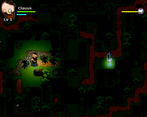
As you progress and get items, the maps get darker, (grabbing souls) which I honestly feel like is the opposite direction that it should be going. The thing I dislike the most about this game is how I'm mostly staring at an almost entirely dark screen.
I can't really see what I'm doing at all and for the most part I'm walking back and forth on two maps.
I think this could have been a decent title if done a bit differently, keep making games and I hope to *see* the next one.
-Drifty
Thank you very much for the feedback, I will improve this game as you told me and soon I will release the new version of it :)
Quite an impressive and fluid system of combat that I'd like to see and play more of. However I really couldn't see enough of the action at the beginning, so I found it very hard to progress. Maybe increase that radial lantern at the start, just so your players can get a feel for the game first before the challenge of limited view - try to ease the player into the experience a bit more.
There were a lot of enemies in a small area, so maybe space them out a little at the start just so I can try all the different skills and see which one I think works best for how many enemies are on screen.
I think you've got a good core game here, it just needs to have more of a difficulty curve to teach the player.
Thank you very much for the feedback, I will improve this game and I will post updates soon.
Nicee
I loved the game. I finished. The ABS system is very satisfatory! Very good, mano! :D
Thank you!!! :D