Play game
Heart Fable's itch.io pageResults
| Criteria | Rank | Score* | Raw Score |
| People's Choice | #45 | 3.611 | 3.611 |
Ranked from 18 ratings. Score is adjusted from raw score by the median number of ratings per game in the jam.
Leave a comment
Log in with itch.io to leave a comment.


Comments
I enjoyed your opening, though the dialogue on the black screen could've benefitted from some art behind it -- even if just a screenshot of the map or a battleback, to avoid the black void.
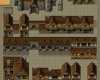
Ah, I am quite a fan of the Ancient Dungeons tiles! There's just something about them that helps set up quite a lovely atmosphere. You do have some minor mapping errors, but nothing that keeps me from playing the game. Similarly, there are a few spelling / language issues, but since I noticed your descriptions are in Portuguese, they are definitely super minor -- but make sure when you're working on an English jam that you remember to also translate your database entries!
Some of the fights are VERY dark, since there's no battlebacks being used, which makes it very hard to see.
I think you have a good start here and hope you'll continue improving post-jam! :)
Thank you, Erin. I will fix those dark moments and the texts (my mistake and a very rude one :/ ). THe tiles are awesome, they almost map by themselves. :D
Thanks again.
A game of choices. Despite bringing a confusing theme, we dive into an ambitious journey, endowed with several difficult choices. The game still needs improvement, but what I was able to play, surprised me and had a lot of fun.
Thank you, Cafe. As you say in Brazil: "eita". That means "nice", right? ❤
I tried to play this but this was absolutely not my thing, so take my input with a grain of salt.
I'm sorry, ignore me if this is too harsh of me, but this game just massively fails to entice or engage with me.
its not bad, its nice to see you send me your opinion. I appreciate your time to write all the topics. Thank you, Indrah.
Beatiful game!!
Thank you, OZ.
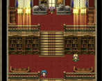
Something pretty about this mapping style, seems to hit all the right places and I can see a lot of time has been spent making this look very striking - really like that. I would however consider brightening them up a bit - sometimes it is just too dark to see! There's some emotional weight to the story too that I personally found very capitvating :) fantastic job!
Thank you, Codapill.
Great mapping style, I love how you make the map tile height is enough to make a cinematic feeling. Liked some attention to detail to Zu and the other golden warrior slightly hunched forward while dashing.
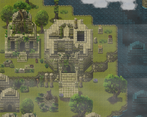
Maps too dark at some places thou, and some of the passabilities may be bugged(?), anyway love that waterfall and underwater ruins thingy.
Got the guilty ending and got gaslighted by pixels lol. Great game
LOL.
Well, pixels never lie. Hahahaa
Glad you liked. Thank you.
Really loved the game, so beautiful yet with serious bagage of emotional feelings, the mapping style was pretty impressive though, and the light effects are wonderful. Another 5 STAR game by th autor!
Thank you for the words
Mapping with celestian times is really inspired me to make this one like you, this project is really great job with parallax and tileset mapping. Player have freedom choice with the story. Overall this games is really make me attention after played a little while. Well done!
Thank you, GingerSun.
For someone like me, that sucks doing map, I really like it. I got the guilty ending too haha!
Good luck!
Hahahahah You like to kill everybody! Hakuen is an angel :D
Thanks, Eli.
I like how you do mapping, and also the effects put around! I got the guilty ending. hehe
LOL thank you. So, you are guilty, huh? Haha thanks for playing.
Thank you, Emanu.