Play game
Mauve: Prime Directive's itch.io pageResults
| Criteria | Rank | Score* | Raw Score |
| Sound/Audio | #1 | 4.000 | 4.000 |
| Overall | #5 | 3.500 | 3.500 |
| Visuals(Graphics) | #8 | 3.250 | 3.250 |
| Fun | #8 | 3.250 | 3.250 |
| User Interface (UI/UX) | #11 | 2.750 | 2.750 |
Ranked from 4 ratings. Score is adjusted from raw score by the median number of ratings per game in the jam.
Leave a comment
Log in with itch.io to leave a comment.



Comments
This looks like a cool game, but it lags very badly for me in the web build. I don’t exactly have a high end pc, but this still seems weird, considering the game does not look that complex. Not sure what might be causing this, but at the moment, I don’t think I can play it, unfortunately.
The music is fantastic. Was reading your devlog - you did that during the Jam, great job! It fits just perfectly the theme and mood of your game.
Some suggestions mainly based on my moments of "hu? what is going on?":
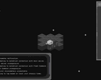
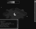
I really enjoyed the opening sequence and the exploration! I feel like the minimalistic graphics and the controls are supposed to mimic how a robot like M.A.U.V.E would actually operate. I actually got kinda attached to the vehicle bc as it gained new parts it started looking like it had a head with a mouth, which was cute in some way xD
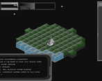
I do wish the scanner worked a bit better, as I assume it's supposed to alert you to the location of nearby parts but it didn't show anything after I unlocked the first component. Nonetheless, I had fun driving around the planet and seeing just how far I could go. Great job on this!!
Very cool idea! The opening menu to opening cut scene is really neat~
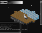
I liked that when I got a new part I could see more of the map! The sound was great and the pixel art + parallax background gives it a lot of depth.
I did feel a bit odd that I could just move through the walls(or it looked like I was, perhaps my ship is flying?) Also, on my screen the text was a bit hard to read.
Great work and Keep it up! Please check out my metroidvania when you can :D