NeatGames
Creator of
Recent community posts
Thanks for the feedback~ Were you able to reach the first boss? (there are 7 bosses currently) Last time people said the game was "too hand holdy and linear" for a metroidvania haha. So I opened up the first part more and added alternate paths. I think once you have the seed form and dash the exploration is much better (boss 1 and 2 give those). Once I have the full world made then I'll weave in more NPCs and story for sure. Currently I'm trying to reach and scope and gameplay of Haiku the Robot, simple combat and lots of exploration. If you didn't see the trailer, the game is actually quite big right now haha, maybe 2 to 4 hours blind? (I have been working on it for 2 years in my free time)
If you ever want to play some more, this is the way you go. You were so close hehehe. (the game is currently 70 more rooms to explore)
From watching I learned I gotta make the currency nodes more visible, and make sure they aren't where you fight enemies haha. Also I gotta figure out how you got 2 spears at one point.
I wonder how I can make the path a bit more clear, it's a tough balance cuz metroidvania fans hate hand holding, and average gamers hate getting too lost.
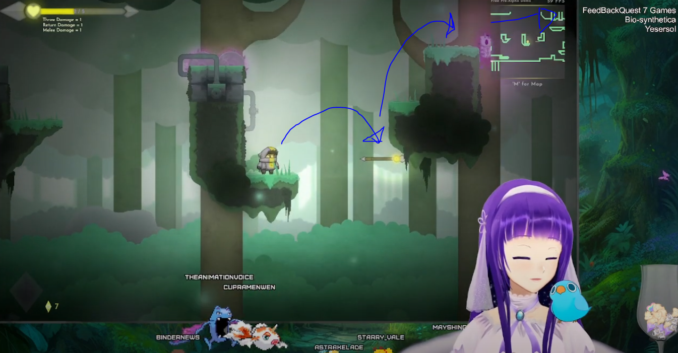
Oh thanks for playing! I would love to see the the YouTube VOD once it is out, please let me know! I learn a ton from watching people play blind and with no help.
Thanks for all the notes I'll add them to my notes for sure! Someday I'll add keybinding so people can do it how they like, I have the melee attack on a lot of buttons cuz that gets the most complaints haha (I think it is on the mouse thumb, the mouse wheel button, the shift key etc.). I just did the text dialog last week so it is super WIP still.
I'm quite shocked about the sound design I did a TON of work haha, layers of ambient wind, cave echos, trees, random bird chirps and cave moans, every player movement has a sound (foots steps, landing, jumping, melee swings), running through grass has a sound, positional audio (like if you stand near electricity you hear it and it fades as you walk away). I wonder if the overall volume is low, cuz I always use headphones heh.
Thanks for the super feedback~ I added it to my notes :D
The visuals I tried to make unique, cuz my initial style got Hollow Knight-clone hate haha. It is intended~ It is actually 64x64 pixel art units animated in engine (not frame by frame). I hope it gives it a unique/good look + easier work flow for me.
Oh my gosh thanks for the recordings!! I'll study them well, I learn so much seeing someone play with no hand holding. I'll check them out after work~ If you got almost all the fragments you almost made it to the end of the Demo!(only 20% of the whole game done i think) Thanks for playing so long. I'll keep improving it for sure, gonna try and finish it by 2026 heh. Thanks again!
Thanks for playing!
The infinite spear jump up isn't intentional hehe, but a few players can do it. So i have tried to make the levels so you can't skip with it~ I even made some tile that the spear can't stick to and i plan on going through and putting them in ares I don't want the player to go :D
I'll check out your game soon for sure!
Thanks for the awesome feed back!!
Thanks for playing so much! I hope the game will be 10ish hours when it is finished. Yeah the difficulty does ramp up hehe. It's hard to carter to Metroidvania (like Hollow Knight) fans cause they complain if it is too easy hehe. But I will try to make phase 1 of Boss 2 easier for sure, let the player warm up to the fight mechanics. That's a good idea with Boss 1, have the orbiting thing come for phase 2.
Thanks for pointing out that the currency node was hard to see. I'll try adding some glowing particles to it so it stands out for sure :D Later on the melee attack does get damage upgrades~ but I should add more benefit to the melee for sure. There is a seed form heal, upgrade I need to put it in a better place, you can get it before boss 2. I'll be added some NPCs to help point things out in the future too.
Thanks again, I added all the feedback to my notes!
Thanks to you and your nephew for playing my game! I'm glad he likes it :D
Thanks for the awesome feedback, I'll add it to my notes!
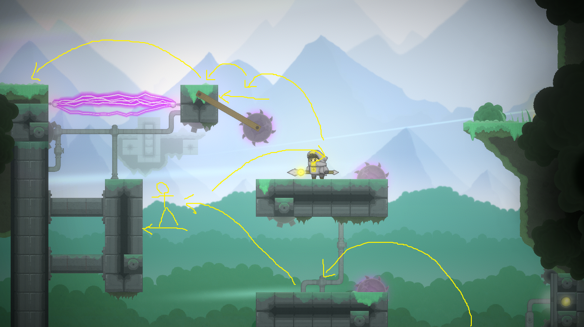
I think I know the place with the moving saws, I've seen people struggle there before. I'll try and tweak it to be more clear and easier. The saw blades need to be avoided and you move up~
Thanks for playing again!!
Thanks a bunch for checking it out! I have been working on it for just over a year now :D I will probably work on it 2 more years and then release it on Steam. Yeah I need to make a tutorial for sure, thinking about a cool way to do it. Glad to hear people are liking the art, tried to be kinda unique with it and not look like Hollow Knight (cause so many metroidvanias copy it's style these days hehe)
Thanks for playing and giving it a try :D Glad to hear the game is visually pleasing (trying my best not to look like Hollow Knight since a lot of games in the genre these days copy it heh)Thanks for the feedback, I'll keep working on it! Gonna do key re-mapping someday for sure, probably end up finding an asset, but even though are hard to implement haha.
- Overall: This was amazing! I haven't played many games in this genre so not sure if there is a unique hook, but still I really like it!
- Fun: It was a lot of fun to decide what to do during the battles.
- Visuals (Graphics): The art style is great, love the emotion shown in the characters.
- User Interface: Nice a clean. Sometimes the smaller white text with a black border was a bit hard to read. Maybe play around with borderless text for the small font.
- Audio: Nice sounds! Maybe some ambient village / inn / bar sounds would help the vibe. And some character voices, like different pitched "ugh~"s for each enemy.
Keep it up, this is an amazing start! Please check out my game when you have time :D
- Overall: The game was really cool and I like the special abilities! I wish I could just hold down the button to shoot, and not click click click hehe.
- Fun: It was a lot of fun to control and avoid enemies. I like the clone ability the best. If you add rogue-lite upgrades you could do a lot of cool upgrades for the them, like more clones spawn
- Visuals (Graphics): Great start! Some simple squash and stretch animations on the sprites would help it look more lively in an easy way.
- User Interface: Looks like it is still WIP. Just some simple transparent button sprites would look better~ and then add some spell icons later.
- Audio: Adding some subtle foot step sounds when the player moves would be nice.
Great job making a cool little game, keep it up! Please check out my game when you have time :D
- Overall: The game was really slick and the controls felt nice and precise.
- Fun: It was a lot of fun platform and grab the crystals
- Visuals (Graphics): Nice and clear with the simple shape art. You could easily improve it with some Unity prost processing and 2D lights and shadows. I like the level frames, maybe you could have the levels transition by having those metal arms on the sides of the frames push in new levels~
- User Interface: nice and clean!
- Audio: Some of the sounds peak in my head phones, you could normalize them more in Audacity, but they do the job well~
Keep it up! It's a great start to a puzzle game~ Please check out my game when you have time :D
- Overall: I remember playing this last year! It keeps getting better and better.
- Fun: It is fun exploring and trying to survive.
- Visuals (Graphics): I like that you can zoom in on the map now, seems to be a lot more texture to the sprites now. Looking great!
- User Interface: AMAZING
- Audio: Very cool!! Maybe there could be some ambient sounds added? Like when you visit a tree there is a short audio clip of wind blowing through trees?
Keep it up, this game is awesome~ please check out my updated metroidvania if you have time :D
- Overall: The game was really fast passed and juicy.
- Fun: It was a lot of fun to try and dodge everything. Maybe holding left click needs a stamina bar? I was just holding it the whole time. Might be cool if there was a shooting power up that let you shoot through asteroids for a short time.
- Visuals (Graphics): The particles are great! I think a scrolling parallax background would look cool.
- User Interface: Nice start!
- Audio: Some of the audio effects peak in my head phones, but they sound pretty good.
Great start to a game! Please check out mine when you have time :D
- Overall: The game is looking pretty nice, and the map layouts are cool.
- Fun: It was a lot of fun to explore and talk to people.
- Visuals (Graphics): The pixel art is a nice start! Maybe different areas could have slightly different color pallets to make them feel more different.
- User Interface: The dialog system is great. However, I think the character portraits should be on the other side? It looks odd that they are looking off screen. Usually the player portrait is on the left and looking right, and the NPC portrait is on the right looking left~
- Audio: Nice simple sounds so far, a bit loud in my headphones though. Some ambient wind and medieval city sounds would make it more immersive
Awesome start and keep it up! Please check out my metroidvania when you have time :D
- Overall: Great start to a simple idea~
- Fun: It was fun to explore the world, I think the small things like flowers don't need colliers.
- Visuals (Graphics): Nice start to the pixel art. Full screen would help a lot. The lighting sprites should be a bit more smoothed out alpha gradient. Also, I thought the cat trail was blood at first hehe. Maybe light grey/brown would be a better color
- User Interface: Good start. Hard to read because I couldn't do full screen
- Audio: Nice simple sounds. Might be cool if each box had a different meow~~
Nice work and keep it up! Please check out my game when you have time :D
- Overall: The puzzles are pretty cool and the explanations are clear.
- Fun: It was fun to figure out where to shoot the guy. I liked the rotating parts.
- Visuals (Graphics): Nice and clear vector art! Might be cool if the "light" had some glow or particles too.
- User Interface: This simple style does fit~ and super cool screen transitions. The level select could us some better/bolder font.
- Audio: Great sounds!
Great work and keep it up! Please check out my game when you can :D
- Overall: The game is really charming!! Nothing happened after like day 4 or 5, I wanted to play more :D
- Fun: It was a lot of fun to be a good cobble collector meeting strange people~
- Visuals (Graphics): I love the trippy style and character design and character expressions!
- User Interface: Fits the game style perfectly and like the character face and other character interactions.
- Audio: Nice chill music.
Awesome idea, kinda felt like a 3D Undertale for some reason heh, keep working on it! Please check out my game when you can :D
- Overall: Great start to a cool idea!
- Fun: The movement and shooting/aiming felt pretty smooth!
- Visuals (Graphics): Some Unity prost processing + squash and stretch animations would make the simple shape art much better. 2D lights too~
- User Interface: Nice start~ the leaf pixel art doesn't match the vector art style much, but perhaps you plan to do pixel art later?
- Audio: It is better than no sound hehe. Once you do the life tree art, some ambient wind and tree sounds would be nice.
Nice start and keep it up! Please check out my game when you can :D
- Overall: That's some great writing !
- Fun: Getting through the battles and reading the story is fun!
- Visuals (Graphics): I like the crisp and clear pixel art! Also the screen shake adds some great juice. Perhaps you could add some old school pixel art effects, like a sword slash.
- User Interface: The UI is great and I like the scrolling text box, I can go up and re-read things I forget.
- Audio: Nice old school sound!
Great work and keep it up! Please check out my game when you can :D
- Overall: Awesome start to a survivals prototype. Maybe the weapons could have elements too and the enemies could have elemental weaknesses.
- Fun: Controls felt smooth and some cool weapons!
- Visuals (Graphics): Very cool story book 2.5D art style! Maybe the terrain could have hills and not just be flat to take advantage of the 3D ground.
- User Interface: The weapon upgrade text boxes could use some images of the weapons and larger text.
- Audio: I'm a big sound advocate, so the lack of sound makes it quite dull. Even simple temporary sounds make a huge difference~
Great start and keep it up! Please check out my game when you can :D
- Overall: Nice simple idea :D
- Fun: I liked the simple controls and I liked that I could push the button at any time (didn't have to like time the shots)
- Visuals (Graphics): Great pixel art! Might be cool if the naughty people had like naughty/angry faces. Also, on full screen sometimes I could see the parallax scroll resetting.
- User Interface: Great main menu!
- Audio: Nice start. Could use some ho ho hos~~ heh
Great work and keep it up! Please check out my game when you can :D


