Play game
Connection on Lighthouse Island's itch.io pageResults
| Criteria | Rank | Score* | Raw Score |
| User Interface (UI/UX) | #7 | 3.000 | 3.000 |
| Overall | #8 | 3.143 | 3.143 |
| Fun | #9 | 3.143 | 3.143 |
| Audio | #11 | 2.857 | 2.857 |
| Graphics | #13 | 2.714 | 2.714 |
Ranked from 7 ratings. Score is adjusted from raw score by the median number of ratings per game in the jam.
Developer Feedback Questions
Among other changes, I added several sound effects. Curious if they improve the game? Any other constructive feedback welcome.
Leave a comment
Log in with itch.io to leave a comment.


Comments
This was charming. Maybe the arrow buttons make it too obvious on where to go, and they could instead show up after being moused over? I didn't really feel like I was exploring like I have in older games I've played in this genre, rather just clicking on where to go next. Also maybe adding a few more screens in general, maybe intermediate steps like first zooming into the area of the lighthouse where the brick is before being able to interact with it?
Some other small criticisms: I would swap out of the font for something less.. MS powerpoint. The inventory could probably be collapsible or only appear when you obtain an item. I also noticed the music just kind of abruptly ends and doesn't loop again for a while, and the volume on it is a little too high.
Overall a good submission though!
That was a neat little game. It's short, but I think it's as long as it needs to be. It has a lot of charm to it, too, and reminds me a bit of an old Flash game.
There are a lot of nits I could pick. The homemade grappling hook probably wouldn't work, and all the items being conveniently there pushes suspension of disbelief. The game has an inventory, but you don't use items from the inventory and sometimes ones you shouldn't have anymore don't disappear. The music is a bit too loud.
But ultimately, I'm nitpicking. The game is short enough that nothing really grows from a brief thought at the back of your head to anything that really sullies the experience.
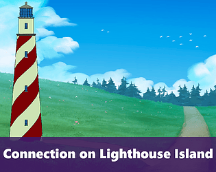
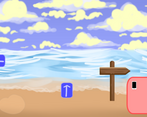
I think if there's one complaint I'd really level it's that the art is really inconsistent in both style and quality. There are some beautiful handpainted backgrounds, but these clash pretty heavily with the almost mspaint looking foreground objects and whatever style the lighthouse is supposed to be. Having to work with whatever stock assets can be had and whatever can be scraped together can be rough; I'm not an artist and I've been there. Ultimately I ended up trading fidelity for consistency in most of my projects.
That being said, the visual contrast does make finding objects much less of a pixel hunt than it could have been.
All in all I think this is a pretty solid game. It's simple, but it doesn't overcomplicate things.
This was kinda nice, honestly reminded me of escape the room flash games from the 2000's internet. The puzzles were fairly simple and straightforward, I think it took me about 3 minutes to beat the game in its entirety without a walkthrough.
A bit more exploration and puzzles in a bigger world would perhaps make the game more enjoyable, but honestly for what I imagine is intended to be a quick little adventure I think its fine as is. I definitely prefer a straightforward point and click to an obtuse frustrating one.
The artstyle is mostly consistent, with some differences between the free assets and your own stuff, but having used free assets in my own work extensively I can say this game blends the styles pretty well. And like I mentioned earlier gives me some Flash nostalgia.
The sound effects make the game pop a bit more in some cases, like the hammer sound. But I think the pickup sound may be a bit too cartoony, and the music a bit too jaunty for a game about getting shipwrecked. The tone as a whole may be a bit too upbeat, but that may have been intentional. Maybe having the sound of a bag rustling for picking up items and footsteps for moving around instead of a click. Just my 2 cents, in any case what's there now is I think better than the game being silent.
From the improvements I saw listed in the devlog I think the changing of the fire site was especially helpful, as was some of the interaction fixes with the crate.
Thank you for the detailed feedback. I have and still do play a lot of 2000s flash escape games, so it is heavily inspired by them. Most of the sound effects were default assets from the program I used, including the pick up sound effect, which I worried was too loud. I debated exporting it into Audacity to make it a little quieter, but was in a rush at the time. Maybe sometime I will adjust the audio or experiment with a new sound.