Play game
Chubby's itch.io pageResults
| Criteria | Rank | Score* | Raw Score |
| Graphics | #6 | 3.200 | 3.200 |
| Fun | #7 | 3.200 | 3.200 |
| Overall | #7 | 3.200 | 3.200 |
| Audio | #8 | 3.400 | 3.400 |
| User Interface (UI/UX) | #10 | 2.800 | 2.800 |
Ranked from 5 ratings. Score is adjusted from raw score by the median number of ratings per game in the jam.
DevLog Link
https://cyborgcamel.itch.io/chubby/devlog/480888/patch-10
Leave a comment
Log in with itch.io to leave a comment.


Comments
Nice little 3d platformer, solid obstacle and level design. Overall I like the aesthetic you're going for and the sound effects add a lot. The enemy explosion animation was satisfying as well. I also liked the shift to a 2d perspective in the mountain level.
For some specific criticism on the actual platforming physics, I didn't like that the character takes some time to build up speed from a stop, it felt muddy and slowed the pace considerably. I thought the jump was a little too high and floaty and made it too easy to skip over obstacles on the ground. In addition, I thought the camera perspective when jumping needs work, I never had a ton of confidence on where I was going to land because the camera was too high in the air and the shadow (which you can't really see at the peak of your jump because of the camera) did not help gauge where you were.
One other thing I think could be improved is the attack, it has a really short range and didn't feel that great to perform. If the character moved forward and the hitbox was more pronounced I think it would add a lot to the feeling.
Unfortunately, I only had time to play one level. But it really was a delight!
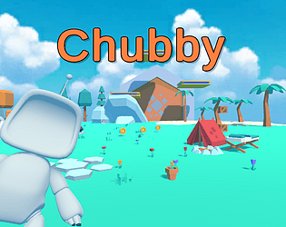
The game is quite polished and well executed, making a good impression from the get-go. To be honest, I'm not really into the lowpoly aesthetic in general, but this game is cute and charming enough for me to give it a pass.
As a 3D platformer it's solid. The mechanics are- once again- well executed. The only oddity is the shift to walk slowly; I'm not really sure where that comes into play. The hitboxes on the saw hazards might also have been off, but maybe I just couldn't quite tell where I was standing. That's a bit of a problem, but it's hardly unique to this game; it's an issue with basically every 3D platformer ever.
It really does remind me of some of the early 3D games of the mid-90s to early-2000s. Almost Super Monkey Ball meets Super Mario 64, although maybe those are just the games on my mind at the moment. It doesn't seem to really break any new ground, but maybe it doesn't need to.
New Text, Man! :)
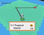
(this happens when selecting "Level Select" from the pause menu while standing on the sign of any Level to Select)
This mini-map also has no collision borders and the character may fall out of this map, but instantly respawned in this case.
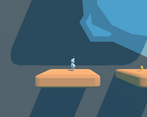
In addition with what Enygmatic said, I could really mention that the aiming in Pseudo-2D level feels not good. I did not feel the depth where my character stands, and have lost several tries when jumped in front of the platform when I was sure I will land directly on it. Also, red spikes from the floor may consecutively deal damage, which is enough to instakill you.
Aside of this, the game is good enough in comparison with some others, and deserves a good rate.
Thank You for your hard work!
I think the overall look of the game is good with the low poly and robot stuff. I only made it to the start of the 3rd level so I only have feedback on those areas.
Progression in platforming difficulty seemed mostly good, the switch to 2D for the 3rd level was unexpected but I think was kinda neat.
I liked that there were actual checkpoints, and the little crystal would light up and float.
There seems to be collision missing from several game world objects, specifically in the first area you can just walk through the trees, the checkpoint signs, and the little tent.
The combat so far could use some juice since its currently just a little jab, a more expressive animation could be something cool to add in later versions.
The hitboxes on the moving saws on the ground are definitely off, I was standing in between two of them and even though my character was clearly not touching the saws I got damaged anyways.
And maybe this is just me but in 3rd person platformers I always like it when the player character has a blob shadow directly underneath them. So it can be used for aiming jumps like in Mario 64, I even implemented it in my FPS game lol. But your mileage may vary.
Thank you so much for trying the game and writting a detailed feedback. this game was my first attempt to create a real game and I'm really glad you like it and I will make sure to fix the issue the mentioned. again, your feedback is really appreciated and thank you for your time.