Play game
The solar system tastes like chicken's itch.io pageResults
| Criteria | Rank | Score* | Raw Score |
| Sound/Audio | #1 | 4.600 | 4.600 |
| User Interface (UI/UX) | #1 | 4.600 | 4.600 |
| Visuals(Graphics) | #1 | 4.600 | 4.600 |
| Overall | #2 | 4.200 | 4.200 |
| Fun | #6 | 3.000 | 3.000 |
Ranked from 5 ratings. Score is adjusted from raw score by the median number of ratings per game in the jam.
Developer Feedback Questions
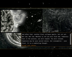
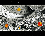
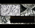
Any bugs, music not playing...? Do the images clarify the nature of the objects well enough or do some interactions remain mysterious (and if so, in a cool way or in a not cool way)?
Leave a comment
Log in with itch.io to leave a comment.


Comments
Hi.
I think your game is damn good. If you want some suggestions about further improvements:
Hi back!
Thank you for the suggestions, I've forwarded them to the team. :) Could you elaborate more on what you mean with the second point, though? Since the game has two endings, I'm not quite sure which one you're referring to!
Hi ofbleedingink;
ofc, - sorry for being unclear, twas late and I'm not a native speaker -: McKit got it right, I was talking about the list at the end of the game were some objects are further explained.
Greetings!
Thanks for the thoughtful comment! I'm really glad you liked our game so much.
About the explanation in the credits: we added it when the game was in a different state. The only illustrations it had were the backgrounds, so the identity of the various objects were up to the players' interpretation. There also still weren't sound effects, which in many cases help with that too. Generally speaking I agree with you, explaining too much in art is not the best approach. But in this case I felt we needed to strike a better balance because some players didn't get what 3/4 of the objects were and that really didn't sit well to me. Now things are different though and it might indeed be unneccessary. The Vegas monument replicas and especiially the bull are still near impossible to recognize but that's probably fine, I don't know.
You're right about the sound, it still needs some tinkering, with the volume too. We were still working on it when the deadline expired and we completed the soundtrack just yesterday, so we still have to test and balance it properly. In a week or so the game will be finally playable in its almost complete version, with all of the sountrack (all of the three main locations screens will be much richer).
That is the one that would really benefit from some feedback...
I don't know about the first point, but it's still interesting. The suggestion of stopping the growth in that particular case doesn't feel in line with the games' philosophy, but I know it was just an example... in general it's a more complex matter that would require more discussion among the team.
Hi McKid;
you're welcome! :).
I see. They don't harm much, but I believe that a certain uncertainty isn't at all to bad.
To illustrate this further: I wasn't sure what the bull was meant to be, and even thought that it could be a idol in human form, twisted by the destruction that occurred, or, when I took a closer look the golden calf; I didn't got it as you wanted, but it still worked out well ;). I can however relate to the wish to make the game accessible. The graphics are indeed fine, though.
If you need some additional testers regarding the sound, feel free to contact me. (mail: contact@R3M0VEthunderperfectwitchcraft.org, without the remove).
I suggested the opposite: Only allow to further the expansion and remove the option to stop if the player skips the inspection of the world that is devoured ("I accept all of this!"). This would be - as I interpret it - in line with your games philosophy: The sun, ignorant of what surrounds her and thus unable to reflect about her own nature or existence, goes on without any consideration of what she destroys. Again, no must - the game is damn fine as it is after all.
Hi and thanks again!
About the last point, I misunderstood. In fact it does make sense.
If you have the interest and the patience to try the game with the complete soundtrack and give us some feedback on what could be changed for the better I'll gladly contact you! :)
You're welcome.
Just shoot over!
Very immersive atmosphere, I like how the experience feels.
Nice job on the game, and on the page around the game.
Thank you very much!
Realizing this game being made for a "Fuck Capitalism" Jam the ideas is just brilliant! All these rock-solid parallels, enveloped in an "out of this world" scenario, spiced up with a strong touch of art (visually as well as audible) is all fantasticly implemented.
My thoughts for improvements:
The click on the first "Expand" button could trigger full screen mode (for such an immersive experience fullscreen is mandatory anyway, I think) Talking about fullscreen: The icons top-left are too minimalistic and their iconography too unusual for their function (would recommend to add tooltips or choose a more common icon for triggering fullscreen)
The theme overall is just made for people like me. I am a big space enthusiast, because of that I also have a YT recommendation for you: melodysheep. In case you shouldn't know this guy, I can highly recommend watching his videos. To me they are true art - masterfully combining content, visuals and audio - this is the real stuff! In his last one the expansion of our sun is also a topic (at the very end). Grab your headphones, lean back and enjoy!
Thanks for the lovely comment (and the cool recommendation!) -- and great feedback as well, will definitely forward it to the team!
The sound design is very calming and eerie, in some way. The writing is amazing too. The art, with nothing but monochrome and orange colors looks very nice. The rotten and abandoned wastelands of Earth and Mars really conveys the fact that everything is gone, and you must accept that. Overall, the game is great.
Thank you so much! I'm super-glad you enjoyed the game :D