Play game
Saving Pebble(Alpha)'s itch.io pageResults
| Criteria | Rank | Score* | Raw Score |
| Visuals(Graphics) | #1 | 4.667 | 4.667 |
| Fun | #2 | 4.000 | 4.000 |
| Overall | #3 | 4.000 | 4.000 |
| User Interface (UI/UX) | #4 | 4.167 | 4.167 |
| Sound/Audio | #4 | 3.667 | 3.667 |
Ranked from 6 ratings. Score is adjusted from raw score by the median number of ratings per game in the jam.
DevLog Link
https://lebreadconsumer.itch.io/saving-pebble/devlog/673897/improve-my-game-jam-31-devlog-1
Leave a comment
Log in with itch.io to leave a comment.


Comments
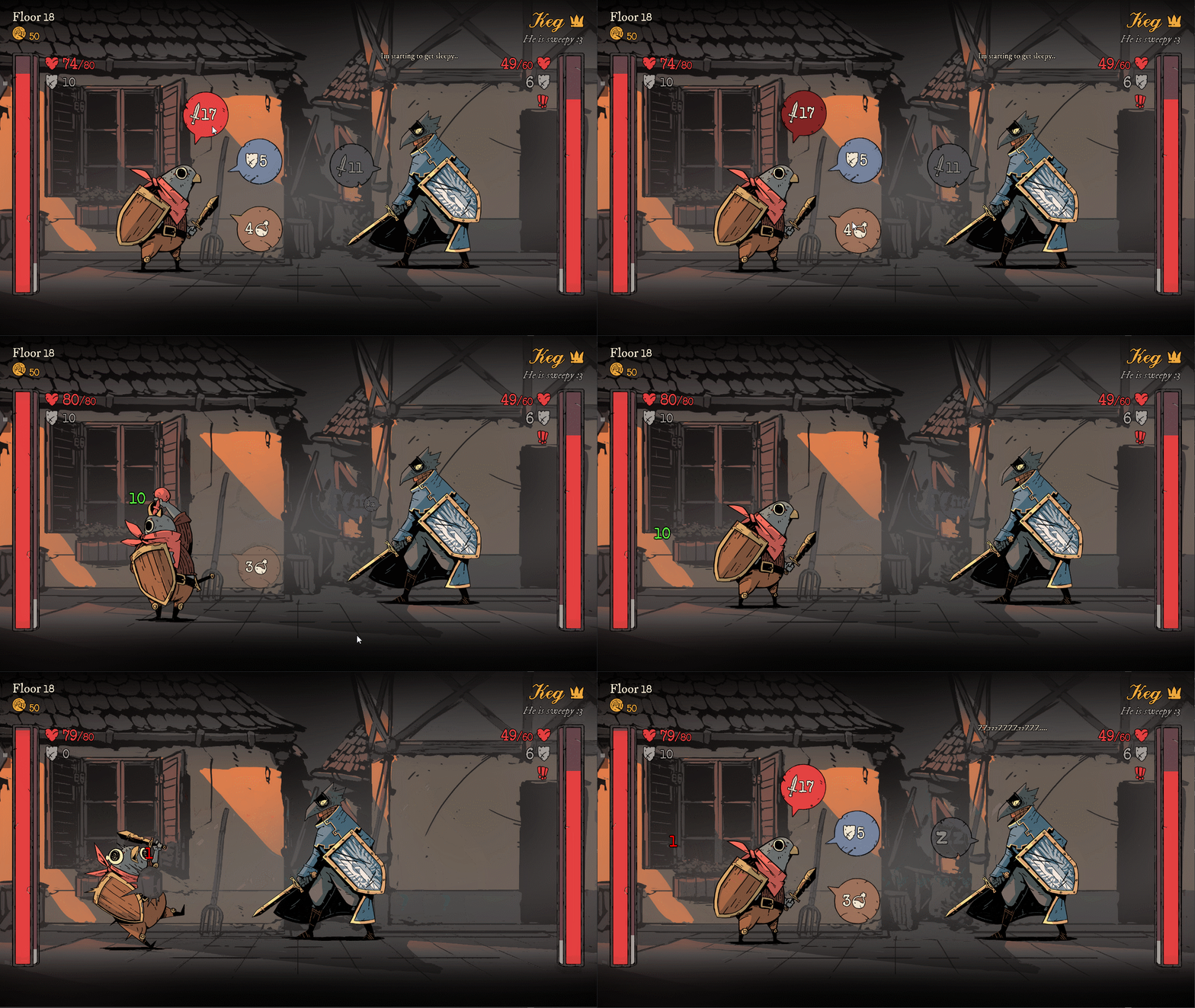
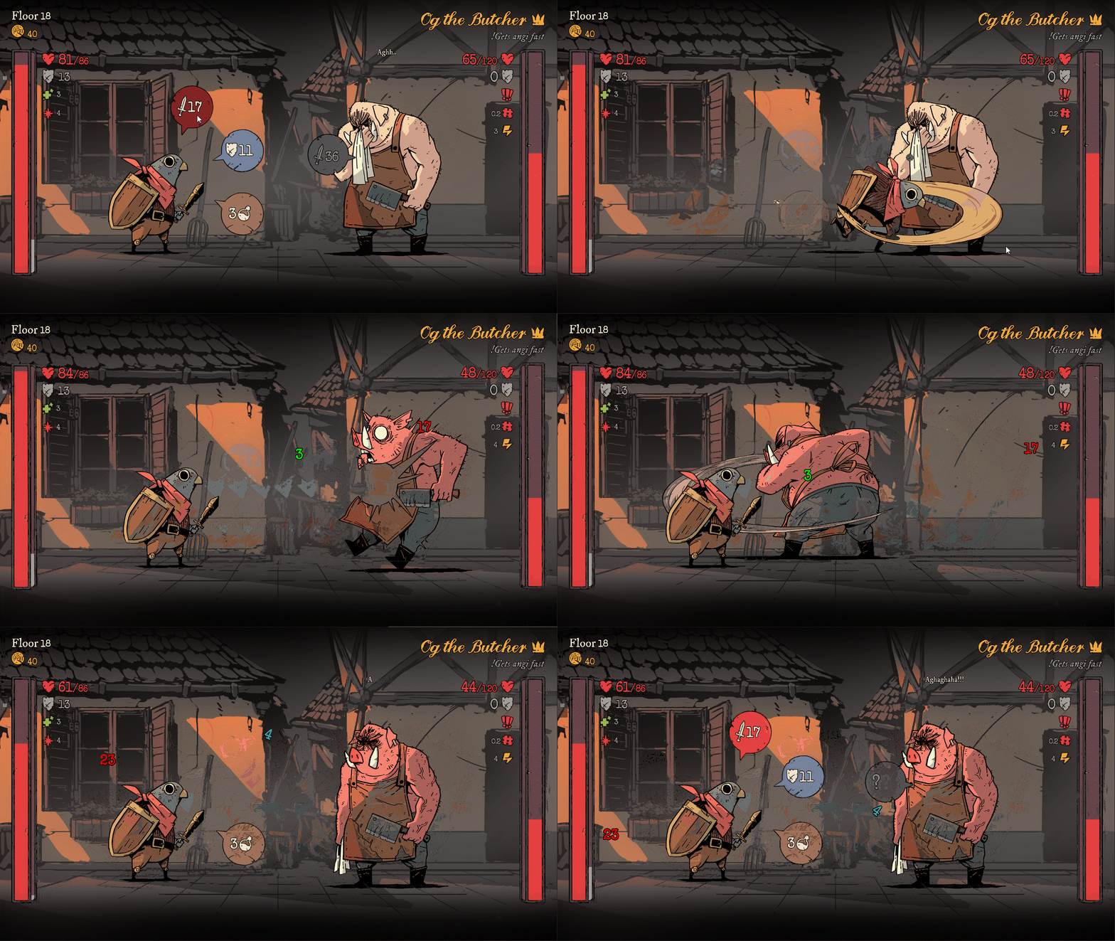
Simple but interesting fight and levelling system.
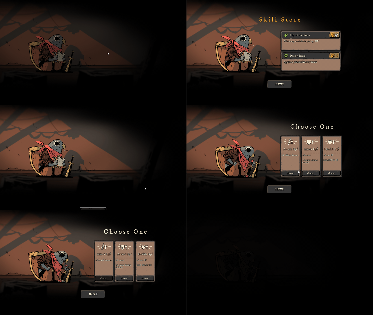
Artstyle is truly beautiful (description doesn't lie) and sounds are good. As for gameplay, since it reminds me of Slay the Spire I want to compare them but on the other hand that's really different games. Nonetheless, I can say that gameplay lacks some deep: there are only 3 options and there is no variety of different tactics for the playthrough which bad for rogue-likes. (I'm not rogue-like expert so I maybe wrong)
Keep it up, this is an amazing start! Please check out my game when you have time :D
Really good initial concept. Love the visuals the audio and the amazing feedback when hitting (or being hit). Like the perk and upgrade system. I think the combat might need a little more tweaking somehow as I didn't feel that there was too much strategy involved in the combat. Otherwise awesome game. Hope to see more improvements in the future.
Thank you for the feedback!
Yeah we try to come up with something to get the player more involved with the main combat loop. Maybe more complex enemies will help or giving the player more actions to choose from.
Fun and cute game! After my 3rd death I think I got a solid grasp on what is going on lol. I think the game was pretty good so far and everything was pretty intuitive.
The only thing I would say is to make it more obvious on what is chosen during the upgrade section. I noticed that the grey out button means something is chosen, but maybe adding a bit more visual feedback on that would be nice. Maybe making the card tween larger? I did not notice or understand if I gotten something at the store on my first play through is why I mention this.
Other than that, amazing work!
Thanks for the feedback!
We already made a change on the upgrade page, mainly thanks to your feedback :D Now a little more straight forward It's usage, but we still working on it to make it a more streamlined experience for the player!