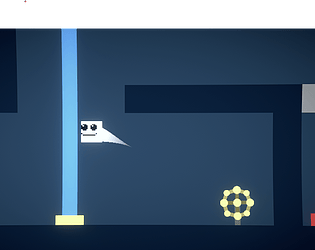
Play game
Overflow's itch.io pageResults
| Criteria | Rank | Score* | Raw Score |
| Sound/Audio | #24 | 1.155 | 2.000 |
| Visuals(Graphics) | #25 | 1.732 | 3.000 |
| Overall | #25 | 1.732 | 3.000 |
| User Interface (UI/UX) | #27 | 1.155 | 2.000 |
| Fun | #28 | 1.155 | 2.000 |
Ranked from 1 rating. Score is adjusted from raw score by the median number of ratings per game in the jam.
DevLog Link
https://kebabmanfr.itch.io/overflow/devlog/744210/update
Leave a comment
Log in with itch.io to leave a comment.


Comments
I think the game is fun, it just has some level design issues, like these I show in the video: you can die pretty easy with the purple square that is sticking out by a single pixel, there's like an invisible ceiling in a corner, you can get stuck in the right corner of the level too, you can press restart, but it's never good to rely on the player pressing restart. There are other unintuitive things in the game, I just wanted to give a few examples. I like this game, games like this are always fun, just need a lot of attention to details when it comes to the level design to avoid frustration when learning how to play.
The instructions are quite unclear. I think the valves are supposed to make/destroy walls, but in the first level I can "ride" one up so they're not exactly walls. Also, some of them made balls instead of walls which I don't think does anything. Also, things that kill you if you touch them should be labelled clearly as such.
Jumping (more specifically falling) feels really floaty. I would recommend increasing the fall speed a lot, and increasing the jump speed a little bit.
Its also really hard to tell what is going to kill me, at least at first. I would recommend changing the color to red or something with more contrast that is obvious, and not used for anything else.