Play game
Allstar Arcade: Brawl Bots - Indie City Allstars 2024 Jam Submission's itch.io pageResults
| Criteria | Rank | Score* | Raw Score |
| Spectator Appeal | #8 | 3.167 | 3.167 |
| Sound | #11 | 3.333 | 3.333 |
| Visuals | #12 | 3.417 | 3.417 |
| Overall | #15 | 2.931 | 2.931 |
| Engagement | #17 | 2.750 | 2.750 |
| Overall | #17 | 2.750 | 2.750 |
| Ease of Learning | #18 | 2.167 | 2.167 |
Ranked from 12 ratings. Score is adjusted from raw score by the median number of ratings per game in the jam.
Leave a comment
Log in with itch.io to leave a comment.


Comments
I will just echo some earlier comments about finding it difficult on how the attacking worked. Being able to move while the attack animation played at the same time felt floaty to me, and without any visual or audio cues, I was never really sure whether I hit an enemy or not. Along with cues, I think just a slightly more easy ramp up would help get the player situated with the UI and controls before the real waves start coming in. This might just be me being a bad gamer, but I also just found it tough to know where I should be focusing my attacks.
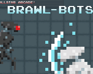
I think the base designs of player vs enemy work well, and would encourage exploring some visual language/color palettes to help differentiate between the characters. As it is now, the player character and enemies both have similar palettes and blend in to the equally lighter/blue background. I think you have the start of this already (such as the red eyes on the enemies), they just have to stand out more! I really liked the music for this one, it reminded me of a mid-2000s action game that I'm nostalgic for.
I found myself a bit confused on how things worked mechanically. It's still not clear to me what the energy bar is for exactly, or how the throw attack works, exactly. It seems like there's some sort of cooldown on the throw attack, but I couldn't find any visual indication of what the cooldown was or when it was available to me. It was also difficult to tell when my melee attack was connecting and how much damage, if any, it was doing.
Another issue with the melee attack is that the delay between pressing the button vs the animation of swinging the sword is pretty big, but the actual hitbox of the attack is instantaneous. This means walking up to an enemy and pressing melee attack causes the enemy to just vanish, then half a second later you swing your sword, which is pretty confusing. Once I realized this was the case, I was able to win fairly quickly.
It also seems like you can spam the melee attack button to continually put out new attacks, much faster than the sound effects and animation make it appear.
The page description also says you can hold down either attack key to charge, but I never noticed any difference between holding a button vs tapping it.
I did also get stuck on the inside of a rising floor tile once.
On the other side, the pixel art looks great, and there's good variety in the enemies and their behaviors - I particularly like the smaller enemies that chase until they attach to you and detonate. They made me pay closer attention to watch out for them in a way that still felt fair
Liked the art, and it was fun chaos once everything got rolling!
I'm not sure what the UI was all about, energy didn't make sense to me and the items above didn't either. Also, the hitbox detection and feedback could've used some work, felt like I should have been hitting enemies when I wasn't.
Really great start here! I think with a little more polish, this could be something stellar. First off, the pixel art is super charming! Although, many things were a little small. I also often had a hard time with the controls. Attacking felt pretty unresponsive, I had a hard time getting the robot to attack where I was going, sometimes he wouldn't at all if i hit the button and if I did get an attack out, there wouldn't be much in the way of feedback to show that I hit something. I love the idea of charging an attack, but I had a hard time telling if i was actually charging anything, even looking at the HUD. The hud is a bit cluttered, and after playing 5 or so rounds, i still couldn't really get a feel for how energy worked. Honestly, if you tightened the feel of attacking, you'd have something really special here! The game sounds great and has a super cool aesthetic, and with some tweaking the gameplay could really help it shine!