Oh! I get what you mean. I think this is one of those things where you might want to ease players into thinking that way. I haven't played TTYD (my only PM experience) in a while now, but I think there's a lot of soft/obvious examples of playing with space before they get really serious with it - but by then you're conditioned to look out for those more extreme cases.
Metroixer
Creator of
Recent community posts
I basically got stuck at the part where it says to "test all you've learned so far." Apparently I am bad at learning because I forgot about something specific with the ice/sludge and how they worked together? So an undo button in that instance would have been nice to experiment in individual turns rather than having to reset the stage and try to retrace my steps.
I played through the game before I saw what the prompt was. Needless to say: lmao.
Such good character models, and I loved how you started playing with the camera angles in the second half. It was starting to give me that late 90's Playstation vibe. Also, the hallway shot from the side when exploring the hospital kept reminding me of SNES/PSX Clock Tower.
I had a little trouble figuring out what was and wasn't interactable. The area where you input the pin, I basically found by accident when I happened to catch a sliver of it floating off to the void. I'm not sure if the camera placement to make it obtuse was intentional, but playing in the moment it felt unintentional. I'd also recommend lowering the typewriter sound. Trust, I love a good menu sound, but from my laptop speakers, it felt a bit too loud and grating. Sound mixing is a tricky art in general, though.
But who is this mysterious character at the end!? Will the good detective engage in chase? Fisticuffs? High jump challenge? I eagerly await the conclusion.
Great job leaning into the aesthetic. I really dug the bandit designs and how they were just distinct enough to clearly be their own enemies. It also seemed like, from wave to wave, there was a progression to the song where it got more intense the further you went? May have been my imagination, but it is one of those things that always gets me hyped up.
I wanted to echo the camera movement feedback. I too felt I had to move too close to the border to actually move it, which can also lead to the tricky instance of an enemy surprising you without any time to react. My particular note is with the bullets, outside of the rat bullet (which I thoroughly enjoyed) I couldn't tell much of a difference between the others. At some point I stopped thinking about my bullet order and just sprayed when I could, seemed more effective.
Really, I just want every bullet to be a rat bullet. Give me the rat gun.
Great work!
This game is tight. Great concept and solid execution. The feel of actually hitting the cue ball and watching it fly around and take out the enemies is very satisfying. My biggest feedback is that I felt impatient waiting for my next turn - it seems like the game is waiting for the ball to completely stop before you can hit it again - but what we perceive as "stopping" versus how the game does that math can feel like a big gap. I would love to play this where the time between turns is faster paced and really fly through these dungeons!
Cool interpretation of your prompt, I can see it getting crunchier and lofi-er to really let the mood set in. Puzzle games are a great genre for getting the cozy feel in (while also providing enough challenge to keep the player engage. I'll admit, I am a bit stupid. So I did not get too far into the game, but the possibilities of the basic ice and snow mechanics alone can take you real far, which is one of the fun things about working in a genre like this. A catchy bgm loop can really help people lock in some hours here!
You mentioned on the itch page that this was a big learning experience, so I hope the below isn't super intense. These are just some immediate observations/feedback from someone who has played through a couple puzzle games this year:
- Undo button! As someone who is stupid, I sometimes forget what certain mechanics do. It can be pretty deflating committing to a move not fully understanding what's going to happen, then being forced to start from the very beginning. If that is the level of challenge you want, the world is your oyster. I am just used to the likes of puzzle games like Baba is You and Void Stranger giving you the ability to undo your last turn (or last 10 turns) rather than starting over from the very beginning every time.
- Faster character movement! You had already mentioned the animation in your page, but I feel like the movement is a far more important part of the experience. Ironically, despite being slower games, players usually expect snappier controls. This is especially the case when you have to redo several turns or an entire stage (which brings back the importance of point 1, as well.)
First, I will echo complements on aesthetics - I particularly liked how you pulled off the parallax scrolling effect from that diagonal perspective. It makes me think of a stage play or a puppet show. You could potentially lean on that aspect, using elements of said shows to help address the challenge of positioning and perspectives (player/enemies hanging off string, maybe?)
A lot has already been said about positioning, but I will add one thing that I don't think anyone has mentioned yet - I haven't played zaxxon, but in most scrolling shooters when you die, the player typically respawns right away. Maybe I'm sticking to tradition too much, but I feel like this game would benefit just a little bit more in doing that, rather than having the screen fade out and fade back in. The way it is now, I felt as if I've lost all momentum, and have to re-orient myself to what's ahead.
All that aside, I think the game feels good when it comes to movement and shooting, and your music doesn't loop too much nor is too distracting - going to interesting places and knowing when to move on to another chord or melody. I think once the positioning stuff is down, you got a real solid framework for a full game here.
As far as feedback goes, I don't think I have anything new to offer that wasn't already mentioned in the previous two reviews - ie feedback on whether squeezing was optimal (to me "bad juice" could be a good thing within this game's context(maybe it is good and I don't realize it!?)) and not being able to see the full UI (I thought it was just because I was playing on a smaller laptop.)
I really dig the artstyle! It's eye-catching and reminds me of eXistenZ/Binding of Isaac. Perhaps this special controller will be equally evocative?? All that put together makes me excited for how it will play with an in-person crowd.
Having seen where this was in development just a couple of days ago, you got an impressive amount done in the interim. I really like the visual style. Understand it's referential to the titular artist, but it does make for a unique entry here. As someone who's not a huge fan of grapple mechanics in most games, I actually think it worked relatively well here. There's a bit of a stiffness to the movement when you're in the air, but that feels intentional to add to the overall challenge.
There is a point playing where it seemed like I had nowhere else to go, when in fact I had to use the momentum of the grapple to get to the next platform. On the one hand - a good way to increase the difficulty after getting used to the basic controls. But, I couldn't see the platform at all, even when jumping, so I initially thought I had reached the "end" of the stage. So some work on positioning may be needed there.
And in fact, I think I did reach the "end" at the 160s. This will probably be less of an issue if played in a live environment, but I did find myself wondering if there was anything else I could do with several seconds remaining. I ended up trying to time my momentum grapple jump to be at its peak right when the timer ended!
A great, great concept that - for someone who is stuck with only a touchpad during this review period - still feels great and snappy. I can't say I'd have anything to add that anyone else hasn't already said, it captures the frantic spirit of games like "Typing of the dead" while rocking the Geometry Wars aesthetic. It ramps up nicely, it feels snappy and responsive, and restarting is quick and easy. What more can I say?
Holy moly what detailed feedback, thank you!
I actually was hoping that the multiplier (which, to be fair, is not explained in the game at all) would discourage button mashing. In fact, from your strat, it seems to have done the exact opposite lmao. I didn't want the timing to feel too unfair, so that anyone would feel at least a little satisfied after playing. I may have gone too far in the other direction. I'll need to rethink either how the multiplier works or make the off-screen distance less forgiving.
I hear you on some of the controls being used. I considered starting off right away with bouncing, but wanted to give players a place to practice and ramp up before the real game started. Again, this stemmed from anxiety from not trusting the player, and I agree there could have been a better way to use some of the rarely used inputs.
The score displaying wrong, yeah, it's essentially counting up way too slowly. With how quickly the score can go up with the multiplier, it takes forever to pace and catch up with the final score. It's really a quick fix, but one I didn't get around to in my rush before the deadline.
I'm glad the game was still fun to play! Appreciate your input once again.
I agree with the previous review that this feels very suited for a more mobile gaming experience. The controls feel just right for an idea like this though, there is a weight to each button press that almost makes you want to physically lean in the direction you want to go. That, plus the balance of managing the player and the enemy, makes for an interesting push and pull.
It wasn't immediately clear to me how the elements on the screen interacted with each other - like how the first red square you see is an "enemy" that shouldn't be touched by the player. I would also agree to get rid of the lives! I wanted to see more of the puzzles, but the touchiness of the collisions leaned on frustrating when it meant I had to start from scratch. With a foundation like this, I feel like you have the ability to make a lot of interesting levels - even better if you can paint it with some type of visual aesthetic (though not necessary!)
First, I didn't go past the title screen until the music looped because I was digging it so much. Even better that it gets an arranged composition during the actual game!
What I have to say otherwise isn't too different from everyone else so far. We love destroying offices around here. Some more feedback on stomping would be good. Me personally I thought only certain things could be Stomped because it wasn't clear to me that they had an effect on certain objects. I would also say visually, as things break down, putting more emphasis on the destruction of items would make things feel better. As it is now, tables and walls sort of crumble like paper, which doesn't feel as satisfying as it would. My two cents - something as ridiculous as making objects act like they're exploding once you attack them would feel in place with the game's tone here!
Throughout my reviews of these I've mentioned Ramping Up difficulty a bit, and I think this game strikes that balance pretty well! In the beginning, you have time to figure out the controls and "Get It". By the last 10 seconds, it is chaos akin to the final moments of a Vampire Survivors.
Very funny game that I would love to watch other people play. Once I realized what the loop of the game was, I thought I had it in the bag. Then, a slight shift of the fingers made me feel like I lost control. I scrambled to fix everything but in my panic, the dam broke through. It felt like my brain turned off, but in a way that was very fun and made me laugh. I appreciate the consistently up-pitched music to add to the tension. Great work!
I will just echo some earlier comments about finding it difficult on how the attacking worked. Being able to move while the attack animation played at the same time felt floaty to me, and without any visual or audio cues, I was never really sure whether I hit an enemy or not. Along with cues, I think just a slightly more easy ramp up would help get the player situated with the UI and controls before the real waves start coming in. This might just be me being a bad gamer, but I also just found it tough to know where I should be focusing my attacks.
I think the base designs of player vs enemy work well, and would encourage exploring some visual language/color palettes to help differentiate between the characters. As it is now, the player character and enemies both have similar palettes and blend in to the equally lighter/blue background. I think you have the start of this already (such as the red eyes on the enemies), they just have to stand out more! I really liked the music for this one, it reminded me of a mid-2000s action game that I'm nostalgic for.
- Visuals: Distinct and immediately attention grabbing! It seems to me there was a conscious decision to balance how the animations and their length would play an important role to how quickly you could attack. It makes all the attacks have weight and requires some strategizing from the player, which I think is important for any kaiju or kaiju-adjacent game!
- Sound: Great kaiju roars and rumbles, the music was kind of in the back of my head.
- Engagement: After I figured out the controls, I got into a decent flow state. Others have already said what I'm thinking in much better terms, but I generally agree in wondering if there's a way to ramp things up. Perhaps it's by simply having the scrolling move faster?
- Ease of Learning: At first, I thought I was fighting against the controls when the player kept moving forward. I'm not sure if there is a visual way to help facilitate that. Also, while the animations are great, it felt like I couldn't move long after they were finished; it gave me the impression of input delay. Like mentioned before, I eventually got into that flow state, it just took a little bit of deducing.
The idea behind this is great lol, I really liked playing it! I would have played it more if I wasn't afraid of breaking my laptop keyboard.
- Visuals: The hacking! The pop ups! It's perfect for what it is.
- Audio: Love it, I'm guessing early 2000s Y2K era influence?? It felt like it would fit right in with a dreamcast minigame, at least.
Engagement: I am going to be team pro "switch to mouse". It provides a frantic tension to the game that would be sorely missing if you took it out. It's great to always be on guard and be ready to switch on a moment's notice, in my opinion.
Spectator Appeal: This will be a great one to watch others play for sure, especially as they get it. I would recommend bringing some sort of disposable keyboard to the live event, because it's gonna get mashed.
Ease of learning: basically the same feedback as engagement. My one big thing: for the passwords with exclamation marks, it's especially easy to hit "Enter" instead of "Shift" to get the "!". When that happens, it seems like the player loses focus away from the input box, but that's not immediately obvious. I'd see if there was a way to either avoid that from happening altogether, or give some visual cue that the player needs to click on the input field again.
- Visuals: Straightforward and easy to read!
- Sound: In a shmup, audio cues are pretty important. I would have liked to hear one whenever I picked up a special because I wasn't sure if I actually grabbed it or not. I did like the music and the audio effect when using your special is fun.
- Engagement: On an initial playthrough, the ramp up was appreciated in learning the controls, movement, and enemies. But on replays, I would have liked for the faster/more bullet hell parts to come sooner. Maybe this is just an issue with shmups in general though? A multiplier system of some sort might be a good way to keep players engaged in the early stages of a replay.
- Spectator Appeal: It's a shmup! You'll have people yelling and going "aaaa" when you barely dodge a bullet (especially after using a special.) They're classic for a reason.
- Ease of learning: For what it's worth, I played on a gamepad and found the controls pretty accessible. I did find the initial movement a little slow and that took some getting used to. However. I'm also very used to Treasure/CAVE shmups which usually has jumpy, frantic movement.
- Visuals: Great! Crisp, accessible, feels like I know what info I have through a quick glance after the tutorial.
- Sound: Nice loop with the song, but I do think the sound effects clashed with the abrasive drum and guitar. May want to either lower the volume of effects or the music?
- Engagement: Loved it. Gave it a couple tries, I wasn't sure if it was getting more difficult over time or if I was slipping up. It does feel like there's not a lot of incentive to move away from the center - my highest score was when I just stood in place on top of the drill and focused on aiming rather than flying around.
- Spectator Appeal: Think this would be a great game for a crowd! You have the tension between your health bar and hunting for resources on a timer. I would agree that maybe some iconography for the fuel squares could help people "read" quicker on what's happening. Without the tutorial, it's not really clear.
- Ease of learning: While the tutorial does give you a baseline understanding of what the player is looking at, I did feel a bit overwhelmed when I had to get moving. A smoother ramp up period might be helpful here, because everything is somewhat thrown at you at once. After I got the basics down, it was a nice balance of resource and health management.
- Visuals: Simple, but easy to read!
- Sound: The background song itself is a nice loop. I would agree that some audio feedback (sounds when picking up the blue stuff(gas?), beating enemies, opening doors) would help with the overall gamefeel.
- Engagement: It's easy to want to reset and try again. This is clearly a game for the speedrunners. I can see a group of friends challenging each other to get the fastest time.
- Spectator Appeal: Fun for someone who's played to watch how others do it. Hard to say for someone hasn't played it, though.
- Ease of Learning: As far as basic controls go, it was straightforward. It wasn't really clear to me what the priority was - do I want to avoid enemies? do I want to collect all the blue stuff? Should I just be gunning for the finish ASAP? I think some feedback on how your score iterates depending on what you do can go a long way!
Mentioned it in the Discord, but the distinct style of this is a homerun. And a varied cast of characters! I am a fan of BLOODBAG and RUCKUS.
Disclaimer on the following feedback - I was unable to print or play this in its intended form before the ratings close, so my take here may be moot. That said, It may be good to have a summarized or quick-start version of the rules and guidelines, as the initial explanations and glossary feel a little overwhelming.
Great artwork in the Zine and sharing anecdotes of other's peoples experiences with dreams (real quotes? I choose to believe.) The style is distinct and captures the feeling of being thrust back into a world you thought you left behind, with the fun added touch of a dreamlike quality.
It reminded me of my own back to school dreams, for some reason they usually involved me having to take a Spanish final without ever going to Spanish class...
The school schedule was also a fun integration between Zine and game. It made me think "How did we used to do so many classes in one day???"
My biggest recommendation would be to perhaps have the locker combination input be directed by something other than the mouse. I felt like I had a difficult time to spinning the dial and sometimes it would randomly switch directions, making me wonder if I had to start over or not.
I can see the Study Hall origins of this, and I think this could become a bar game / quick board game staple. Short, fast and easy to understand matches with the dice rolls for good ol' RNG. Great setup with the wrestling theme too, the character designs and variety remind me of Tekken (probably because Tekken inspired by wrestling, but still.) Solid foundation to build on!
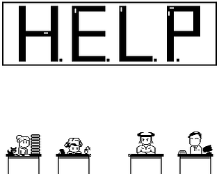
Thank you for giving HELP a shot, really interesting to see your experience. It looks like I should give people the ability to view the tutorial anytime (not just the prompt at the beginning). It also is clear to me that it's not immediately obvious you can talk to your heroes, which is one of the most important parts of the game.
Thanks again!
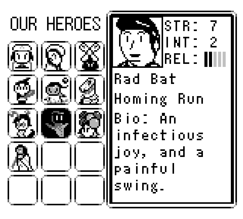
The Heroes Enhancing Lives Program (HELP) is now hiring for new talent! Are you a team player who works hard, can handle challenging situations, and questions the status quo? This fulfilling position is located at the peaceful hamlet where you can enjoy homely, local cuisine or take a breather at the nearby forest path.
No experience? No problem! If you have finished all certified HELP examinations prior to applying, our expert management team will give you high class, AWARD WINNING training to get you settled in.
So what are you waiting for? Apply today!
https://metroixer.itch.io/help-the-heroes-enhancing-lives-program


