Play game
Ghoul Frenzy's itch.io pageResults
| Criteria | Rank | Score* | Raw Score |
| Theme Implementation | #4 | 3.125 | 3.125 |
| Graphics | #4 | 3.375 | 3.375 |
| Fun Factor | #4 | 2.750 | 2.750 |
| Gameplay | #4 | 2.500 | 2.500 |
| Audio | #6 | 2.625 | 2.625 |
| Overall | #6 | 2.646 | 2.646 |
| Mutator Implementation (1 star if none incorporated) | #9 | 1.500 | 1.500 |
Ranked from 8 ratings. Score is adjusted from raw score by the median number of ratings per game in the jam.
How have you implemented the theme?
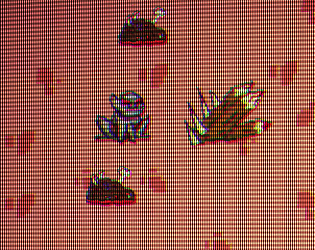
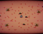
It's about a spooky ghoul collecting gory dead bodies.
Leave a comment
Log in with itch.io to leave a comment.


Comments
Quite a fun little game. It's got a spooky ghoul and an impact font meme - what else could I possibly want? I could imagine a lot of ways this could be developed further. There's a battle going on in the background, maybe some of the soldiers who show up aren't quite dead, or maybe there's stray projectiles for you to worry about. But still, what you have here was fun.
Interestingly, I didn't get the bug the other commenters mentioned, running the game in Firefox on Linux. Might be platform-specific or have something else weird going on.
The game was fun to play and the art and audio were really goood. Also the CRT effect gave it an nice flair and game feel. The speedboster pickup also added some variation. It only needs to spawn more often because my last round was impossible to beat (76 highscore). You should also experiment with maybe giving the obstecals an new random location next time.
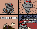
Also the meme explaning the gameplay was 10/10.
Like 8BitSquid said, there was a little bug, that your game didn't strech the whole screen. Next time do a little bit of playtesting with the online version. You still had a little bit of time :)
Was fun to play, would be nice if the grey part of the screen was used for something
Grey part? 😨 Not sure where that is, maybe a bug I missed? Would love to see a screenshot, maybe I can tweak a thing or two. Thanks for playing!
Sure here is what I see when I play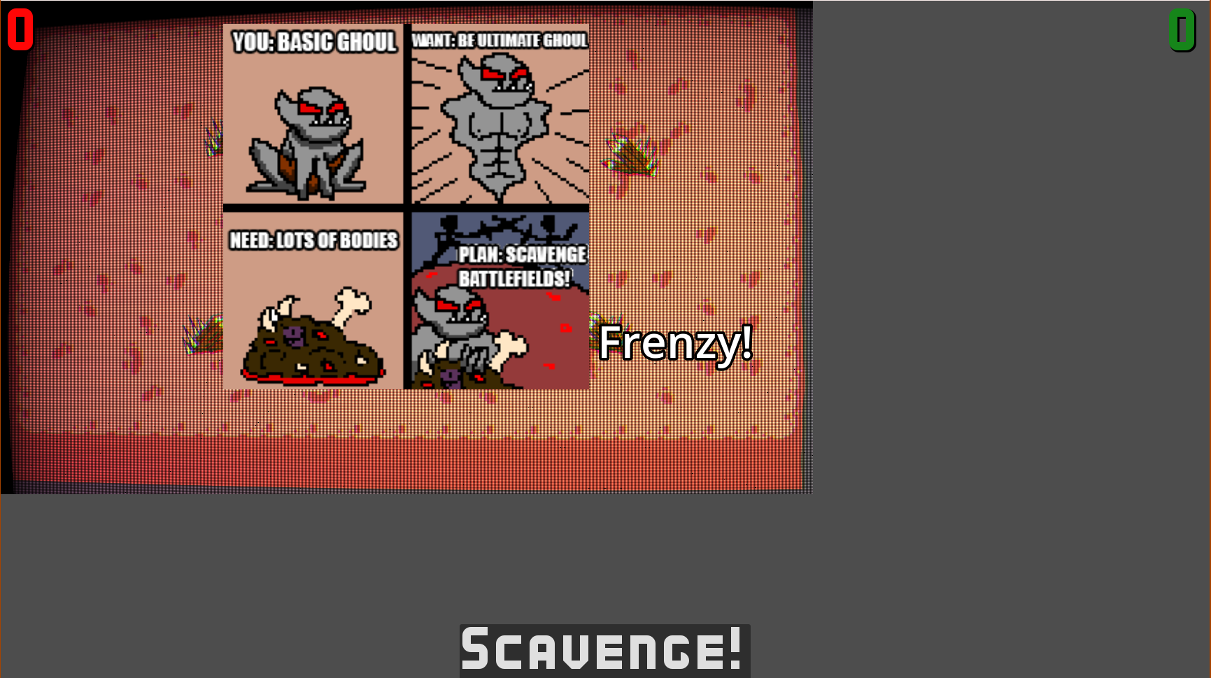
Ah, that's not supposed to be there like that indeed. I'll probably need to snoop around Godot forums to figure out how to test/avoid this on other machines. In the project and my system the entire screen space is utilized. Thanks for spotting it!
Probably has to do with the stretching. Try changing the values in Display->Window->Stretch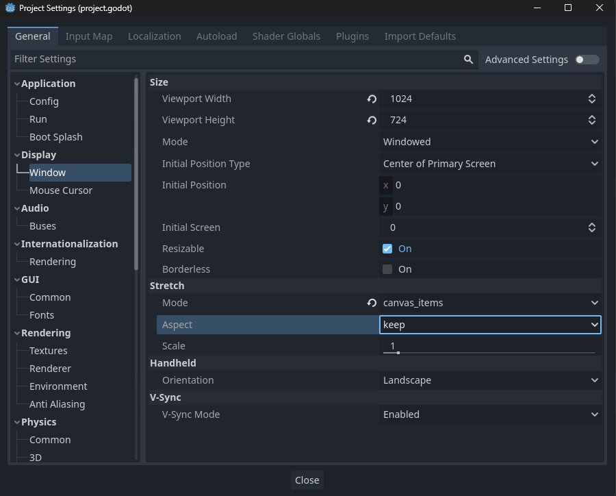
You can replicate this by resizing your windows, or zooming your browser page to other than 100%