Play game
The Mask of Sar-Lakhmu's itch.io pageResults
| Criteria | Rank | Score* | Raw Score |
| Audio | #330 | 1.501 | 2.167 |
| Overall | #355 | 1.732 | 2.500 |
| Graphics | #357 | 1.732 | 2.500 |
| Gameplay | #358 | 1.617 | 2.333 |
| Authenticity (use of resolution) | #368 | 2.078 | 3.000 |
Ranked from 6 ratings. Score is adjusted from raw score by the median number of ratings per game in the jam.
Did you work in a team?
Programming and art by me. It was pretty fun, but started to get a bit stressful near the end, and I ended up not finishing the project to the point that I wanted.
Was the resolution a challenge?
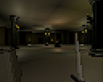
Trying to make the game not look too noisy when in 64x64, which I solved by adding an option (on by default) where most of the textures are zoomed in massively, which makes them one single colour, and I tweaked around with some graphics settings to try to make it easier to look at, at low resolution.
What did you learn?
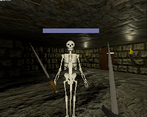
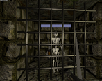
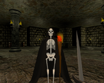
I learned that I shouldn't be too intimidated by 3d modelling. Even though I think the skeleton model turned out badly, it looks surprisingly decent in-game.
Leave a comment
Log in with itch.io to leave a comment.


Comments
Good job on the game, but I wish you'd gone with the 64x64 restriction truly.
Pixelated games with 3D movement and great combat mechanics always amaze me, I wish the looks of this game were also fit in true 64x64 canvas. Overall, I liked the game although it was hard for me to get used to the controls and mechanics. As you have mentioned below, a checkpoint just before the boss fight would be awesome!
Good entry!
Thanks! It is in a true 64x64 canvas, what made you think otherwise?
My bad, that's not what I tried to mean. I wanted to indicate the environment looking more detailed cause of the lighting, thus not truly representing the feeling of a 64x64 canvas but a more high resolution one. The props in the scene look very low-resolution, but the ceiling/floors do not fit in with them to a great degree.
I see what you mean. While I started making this for the lowrezjam, I also want to work on it post-jam, probably at a higher resolution, so I didn't limit myself to making very low-poly models and going with simple lighting.
In that case, it is perfect that you took post-jam versions into consideration! I'll follow you for the updates, looking forward to them!
Didn't make it past the first boss but still it was a really cool game!
The text is a little bit hard to read and the combat takes some getting used to, but overall I loved the concept. Even with high quality textures on I didn't feel like the graphics were too noisy - Still looked really cool
Thanks! I should've put a checkpoint just before the boss-fight!