Play game
J.A.N.U.S.'s itch.io pageResults
| Criteria | Rank | Score* | Raw Score |
| Theme Interpretation | #33 | 2.985 | 3.500 |
| Graphics, Audio, and Polish | #33 | 2.772 | 3.250 |
| Magical Girl Concept | #37 | 2.665 | 3.125 |
| Overall | #37 | 2.601 | 3.050 |
| Engagement/Fun | #42 | 2.025 | 2.375 |
| Originality/Creativity | #44 | 2.558 | 3.000 |
Ranked from 8 ratings. Score is adjusted from raw score by the median number of ratings per game in the jam.
How does your game fit the Magical Girl Genre?
The main character is a time mage who
Which theme(s) do you pick?
Spacetime Curvature/Time Dilation/Length Contraction/Relativity
How does your game fit the theme(s)?
A magical team is working on a project to perfect time travel using a combination of science and magic.
Are all your graphics assets made by yourself during the duration of the jam?
No
some of them were purchased; but most are stuffs made during the jam
Are all your audio assets made by yourself during the duration of the jam?
No
a good chunk of them were purchased
Leave a comment
Log in with itch.io to leave a comment.


Comments
A nice short sci-fi story introducing a scientist cum magician working on a time traveling project. The mystery behind the idea isn't fully revealed in this version but I can expect a good story out of this if there is continued development. The original character art and choice of personality fits perfectly with the idea of the story.
Magical Girl Concept: The main protagonist, Nulla is a Magical Girl that is able to manipulate time. However her character design could have looked the part of a magical girl with fancier clothes design rather than the plain turtle neck. Since her companions Primus and Tertia dresses a lot like characters in a sci-fi fantasy setting, the main protag design should be emphasizes and be able to out shine the side characters design. (Spoiler Alert! Start) The concept of Magical girl is fully utilized as it is mention in dialog that she used her time reversal magic to clean up the mess made by the two side characters (Spoiler Alert! End).
Mechanics: The game does not have any additional mechanics besides the stock Ren'py mechanics.
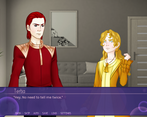
Visual: I really like the character design and color choice used in the game as it matches well with the genre as well as with the modern science/magic society. The process applied to the stock photography was done really well and gives it that nice visual novel feel to it. Locations of each background selected is relevant with where the story took place. The subtle facial expressions and animation added a ton of quality to the visual aspect of the game. A lot of consideration has been put into making the character feel alive with the animations and it clearly does bring out the liveliness of each character.
UI: The title screen and menus are superbly design with its own color scheme which immediately rings a sci-fi genre. It also has its own layout and there were additional dialog box UI used in the game. The main dialog box served its purpose at displaying the text with good clarity and color. It was pleasing to read each and every word in the game.
Audio: The music tracks used is composed really well and they match with the background scene or situation taking place in the game. The music loops really smoothly without issues. One thing I would note is that the audio volume could have been adjusted a little better for the living room track since it was louder compared to the two other scenes. Besides that, the single sound effect that was used in the game gave a good impression of what is happening with its impact and intensity.
Theme: The game does feel like it utilizes the Magical Girl theme and as I pointed out the main character could have been dressed a lot like one. The side themes picked are Spacetime Curvature/Time Dilation/Length Contraction/Relativity. I think time is the main focus among all the themes stated since the story is relevant with time travel. (Spoiler Alert! Start) The story kind of got cut short before any actual time traveling happened but the story build up at the start is pointing towards a decent time travel plot with magic involved (Spoiler Alert! End).
Challenge / Engagement: The game did not present any challenge. As for engagement, the story by far is very engaging, tickling my imagination of what Nulla is up to with the science experiments and the quirky dialogs between Primus and Tertia gave it a good boost to the comedic value of the story.(Spoiler Alert! Start) Introducing Secunda added an air of mystery about the current outlook of the current science magic society of the story world before the game cuts to an abrupt end(Spoiler Alert! End). I think there are many directions this story can go and I hope there is focus on the use of magic on science experiments as mentioned in the early dialogs logs.
Originality / Creativity: The story is original since its about a group/team of scientist/magic users conducting time travel experiments in a modern/future society where magic and science coexist. The story is well written with creative means of revealing each piece of information about Nulla's work and the interaction between side characters.
Story: The story has a good amount of mix between a sci-fi and magic fantasy and is integrated naturally in the entire story. The dialogs were written really well with good amounts of science terms used and it was flawless with no typos or grammatical errors. I would say the story is at a good start and more can be done to make the story compelling depending on how it would be directed. Currently, it feels more of a mystery since only a few clues have been revealed about the setting of the game and what entails further has been subtly highlighted in Nulla's logs at the start.
Overall: The game has a good solid start with the initial introductory story. Its currently short but enough to get the imagination juices flowing. I would love a good time travel story especially one where characters are involved in studying the effects of time travel. It might be a difficult undertaking since, the concept is pretty much open to interpretation especially on the understanding of time traveling and its paradoxes.
Paradoxically, this game feels both very polished and very rough.
The character graphics are fantastic. The animation isn't dramatic, but it manages to add so much to the expressivity of the characters. The UI is just super slick and polished, it fits the theme of the game and looks very nice. For the most part, the animation and sequencing work is superb. The journal at the beginning is a bit info-dumpy, but it's well executed.
The music is a mixed bag. I'm not sure about the choice of music for the menu scene, but it is very nice. The first song in game is nice overall. The second one is a bit of a weird choice, and it's too loud in comparison to the others.
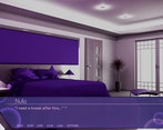
The backgrounds are also hit and miss. The first one is clearly a manipulated photo, but it works. The second one (living room), eh, it's fine. The third one just looks like a picture and has a car from the 2000s visible on the right.
Story-wise, though, the whole thing feels like the first draft of the first chapter. I think you did mention it's a prototype, so that does make sense although the high level of polish in other areas makes it stand out. In the part with the explosion it's not clear what's going on- missing effects, maybe? It's even less clear why it's happening. I thought they were working for some institute, but it seems they're actually just doing this in secret, and competing with a science fair for access to supplies for their potentially world-changing technology? The intro text dump does a good job of explaining the what, but not the who or where. Everything also feels way too familiar for something set in the next millenium, unless it's meant to be a zeerusty throwback. It feels maybe at most 100 years in the future, not 1000.
All that being said, it is an intriguing storyline. As a hook it works well enough; despite my questions and reservations I want to learn more about this world and the story of these characters.
There's no gameplay at this point, but maybe it's supposed to be a kinetic novel. I'm personally not a fan of those but there's nothing wrong with them.
There are a few things that... I don't know if I would call them bugs or flaws, but certainly oddities. Nulla's portrait is in a different spot and it took me a while to figure out why. Dialogue has quotes around it. The Renpy button bar overlaps the journal UI (though it fits the dialogue UI nicely).
I always have a tough time judging unfinished games. There's clearly a ton of potential here, and some of it is already realized. This one is doubly weird because it's so slick graphically it makes the story feel even rougher- some kind of cognitive dissonance, I suppose.
I think it's going to be a pretty damn good visual novel if you can address some of the weak points, tighten up the storyline, and of course bring the whole thing to completion (which for me is always the hard part).
EDIT: Typos.
This one has potential, but seems like the story wasn't completed in time for the jam deadline, so I'll treat it as a demo.
I really like the character designs and artwork! The backgrounds (either photos or 3d renders?) worked well enough, though the outside one didn't quite say 3047 to me. The menu and UI was slick, I liked those.
The story has potential, but right now it's a combo of too much and not enough. It starts with a LOT of intro text. It wasn't bad, but probably a little long. The scene in the living room also seemed to go a little long, and it wasn't 100% clear what was happening, beyond some sort of research gone wrong. I did appreciate the levity though, a little humor is nice!
Beyond that, it ends too soon to really "hook" me. At this point, I'm not entirely sure what's going on or what's next.
But I'd still say this is a good start! With a little tightening, the current sections should flow better, and since it's not very long yet, there's still time to present elements/revelations to keep the player interested.
Nice work, I hope you continue development on this!
Thoughts recorded during my playthrough
+ = I liked it
- = I didn't like it
* = Comment/neutral
====================
Note: I had to take this picture using my phone because my screenshot tools were only capturing the settings window for some reason.
- This menu layout is a little awkward. I like that it's out of the way, but the fact that it overlaps with the text window looks weird.
- The intro is throwing a lot of text at me with a static background. Would it be possible to illustrate these points somehow? Even pictures of the characters that are being mentioned would be an improvement. I get that it's a log and we're just setting the scene and introducing the characters, but I would like a little more "visual" in this visual novel.
+ I do like that the audio log section introduces the characters and gives a sense of the structure of the team. There appears to be a hierarchy and the narrator appears to be a fairly competent character.
- And now the characters are talking about smoke, but I don't see it?
- This conversation makes no sense whatsoever. Here's what I gathered: there are two characters, one made a bunch of smoke appear in the room, they bicker about it some, then one of the characters does <something> that the other character doesn't like, they start talking about sprinklers or water or something and now I'm just confused about what's going on.
- I can see that stuff is supposed to be happening. There are explosion sounds & screen shakes. Stuff is going really wrong, and I'm sure it would be funny if I could see it.
* I blitzed through the rest of the text. The story ended after Nulla met with Secundus outside.
Summary
Something about this VN needs to change - whether it's use better assets to convey the story, use a different engine to convey the ideas being presented, or change the story to suit your abilities & resources. The way it's being presented right now just isn't working well. That's not to say that the story itself is bad - I sense there's some charm and amusement to be had here. I just don't think it was presented well.
So, unless I did something wrong, there just isn't that much here. Three scenes, no choices.
It starts with a wall of technobabble that frankly just made my eyes glaze over too. The story from there has a very strong in medias res vibe, but because it is cut short I even after playing it through twice (I thought I may have missed a choice the first time) have little idea what's actually going on.
Ultimately, I got more out of trying to figure out where I'd heard that music before :P
One good point: the small animations flow very nicely with the stills, and the menu is very well polished.