Play game
Chromagika Girl's itch.io pageResults
| Criteria | Rank | Score* | Raw Score |
| Theme Interpretation | #2 | 4.294 | 4.294 |
| Magical Girl Concept | #9 | 4.176 | 4.176 |
| Overall | #12 | 3.871 | 3.871 |
| Engagement/Fun | #15 | 3.647 | 3.647 |
| Originality/Creativity | #19 | 3.706 | 3.706 |
| Graphics, Audio, and Polish | #22 | 3.529 | 3.529 |
Ranked from 17 ratings. Score is adjusted from raw score by the median number of ratings per game in the jam.
How does your game fit the Magical Girl Genre?
The protag is a magical girl that fights to save her planet from the alien invasion
Which theme(s) do you pick?
Particle Wave Duality and Nuclear energy, and some other quantum stuff
How does your game fit the theme(s)?
The magical girl can change the states between a particle and wave. The game's lore for nuclear energy is known as cosmic essence which makes its debute in the ultimate attack.
Are all your graphics assets made by yourself during the duration of the jam?
some of them were purchased; but most are stuffs made during the jam
Are all your audio assets made by yourself during the duration of the jam?
some of them were purchased; but most are stuffs made during the jam
Leave a comment
Log in with itch.io to leave a comment.


Comments
Concept wise, I like it very much. I think this is one of the more ambitious submissions here and I think you did a very good job coming up with various mechanics here; really like the the shooting mechanics overall.
But I think the game is a little bit buggy. Several that I found (Browser version):
And then some design decisions I would like to question/give tips on:
Btw I might've missed it in the tutorial, but I can't seem to activate the warp skill properly? Is it not LShift + Space?
P.S.: Also... this I think is just my preference and you may want to take it with a grain of salt but... I think the Magical Girl art kinda makes her look like a male... You may want to make her face rounder ;_;
Hey Ran, thanks for playing the game and I appreciate the time you took in giving me some good feedback points.
Yes, the particle wave duality mechanic is intentional and the waves are balanced so that it has a short life span/range with high armor penetrating damage while the quarks are low damaging but long range weapons that bounces off armor. There is no restriction in changing between the two states (note: for the first generation of bullets/waves) so its a kind of play style I want to encourage that requires some strategic play into the game.
I think you got one of the more rarer bugs because I do get that as well but it rarely happens and I can't seem to recreate it. I suspect its a WebGL thing to so I will figure it out once I'm back at updating the project.
I appreciate the suggestions as well, and will be glad to answer them all:
As for the warp button its the space bar only and the focus mode is left shift using the default keyboard mouse layout. The game allows you to change between 4 KBM layout which you can select from the settings menu from the main menu or in-game menu.
P.S.S. Yeah, I know about it and its an intentional design for the first magical girl... Its suppose to be a dev secret btw (⌒‿⌒) but I will make a much cuter one the next year.
Very fun writing and characters, albeit the occasional grammar mistake. The tutorial/text dump was also pretty overwhelming. I greatly enjoyed the concept of converting the bullet type even mid flight. Art for the visual novels is good, so much that the player sprite looks kinda lame in comparison. I didn't find much use for the space warp tunnel, though the effect looks very good. Excellent work, I'm excited to see it develop!
Thanks for checking out the game! Appreciate the time you took in trying out the game and giving us some useful feedback!
This is a neat little bullet hell game.
I like the concept of being able to choose which type of attack to use rather than using whatever the latest powerup is. I even started to get used to the idea of using the scroll wheel to choose the direction of my attacks.
One recommendation I have for the tutorial would be to break it up into smaller sections. More along the lines of "here's a concept - now you try doing it" instead of "here's all of the controls, now try it for a minute before we go to the main game." It will make it easier for players to understand what all of the terms mean and how they relate to each other.
The text needs some proofreading too, but it's not incomprehensible or misleading.
Are there sound effects for the shots and enemy deaths? I didn't hear anything for either. The music is nice. The visual novel-styled busts look good, as does the overall look of the game. The UI for the gauges seems a bit too fancy, though; the bars, the stuff that matters, seem to get a little lost in the busyness of the borders.
The game seems to be off to a good start and with just a little bit of refinement I think it can be an awesome, unique experience.
The gameplay is pretty solid. I’m not sure how I feel about the scroll wheel aiming, since it only gives you 8 directions anyway. The abilities are pretty good and were necessary for me to beat the game. I especially like the wormhole one.
My biggest gripe is that there aren’t any sound effects. In shmups you’re often focusing on your own ship/character, so sound effects are really helpful because they let you know that your bullets are hitting something, or help you react to different bullet patterns.
Art is nice, it’s clear that there are multiple art styles but it doesn’t get distracting.
Thanks for checking out the game and I highly appreciate the feedback too!
I really apologize for the missing sound effects since I got caught up with work and had almost no time to select and edit the audio clips for the game.
Good polish, nice job overall. I almost gave up playing due to the mousewheel aiming though. Changing it to tohouh doesnt help since my mac laptop doesnt have num keys lol.
Hi invadererik, thanks for taking the time in checking out the game and leaving a feedback.
Glad that you pointed out the lack of numpads on the Mac laptops since, I had actually added additional keys (Page Up / Page Down key) for the aim buttons on all control layouts in consideration for laptops without numpad in the current version (v0.7.3). However, its also my fault since they are not listed in the How to Play and me once again forgetting to update the instruction list. If I'm not mistaken and correct me if I'm wrong, that from my limited understanding those keys are accessible with the Fn + Up / Arrow keys on the laptop, even Mac ones. I will try to add more keys in consideration for laptops and also a note to update the control instructions on the next update. I think the location for those aim buttons for laptops could have been in a better location but I don't have a laptop with a compact layout to figure it out so do let me know if you can suggest some keys.
you'd have to be pretty dexterous to be able to use function keys for that. Why not just let users bind the keys however they like ?
I used to have such a set up before in another indie game where players can rebind keys to whatever they want but due to the game's design and complexity in setting up the instruction screen and tutorials it can get really out of hand at times. So in the end we decided to remove it and ended up with only one control layout but multiple keys assigned to one action. Besides, the decision that seals it was because of the porting to consoles for that game, therefore rebinding keys got abandoned with that move. Hence with that experience and the design decision in this game, I have prepared as many possible control layouts including an Xbox controller (works in any control layout). Well, a lot of indie developers take control input and its integration into game design for granted so I can't blame them since its like an entire topic on its own. I may not want to implement rebind able controls for this game but I will certainly look into making a better setup that integrates with future game.
The game is pretty good, just needs a bit of polish here and there.
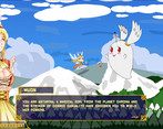
The game loop is there, you definitely have a complete game. The art is pretty nice, the chibi girl is really cute looking. Music is pretty good too has a fantasy feel to it.
If squash and stretch could be added through code to the portraits whenever they change from one image to another, that may add a bit of life to them. The magical girl could use a bit more animations and or some kind of procedural ones that add some overlapping animation for things like the cloth and the ponytail, will make it look more dynamic/alive.
Audio and visual feedback could also use a bit of work. When the waves/bullet hits the player and or the enemy, there should be something shown visually or a sound should play to indicate that the reaction. There is already red flashing on the enemies on hit, but maybe it needs a bit more. Things you can consider adding are things like stuttering, particle effects, Hit sounds, screenshake/sprite shake.
Scroll wheel controlled aiming is a bit awkward, might be nicer if the aim is tied to direction of where the cursor is.
Other than that, the game is pretty good, as brought up at the start of the review/feedback.
Hi KingdomPots, thank you so much for checking out my game and for leaving a feedback as well.
Good suggestion about adding a layer of dynamic animation to the current static character sprites during the story session (like the animated 3D characters in your game right (^_<)〜☆) as well as the adding more visual/audio feedback to when enemies get hit as well. I will definitely take them into consideration in a much later update as it would be part of a series of polish update.
Yes, I can agree that the aim with scrollwheel may feel awkward at first and it does needs some getting used to. However, initially the aiming system I designed was a free aiming one and it follows the mouse pointer at first. After realizing how
"dumb"the Unity WebGL build does not contain the mouse pointer within the window (both in full screen (if you have more than 1 monitor) and windowed mode), it can get a little frustrating trying to keep it within the game window for the aiming to work. I could include the free mouse aim system back in as an option in the settingsbut it will raise a few issues that can't be fixed since Unity WebGL build is unable to contain the mouse pointer within the window even with Cursor.lockState = CursorLockMode.Confined. As of writing I actually just thought of something that could work as a workaround/solution to this Unity WebGL problem 「( ̄- ̄*)...Anyway, thanks once again for checking out the game and spending your time giving me a neat feedback.
I think the best way of summing this one up is short but very sweet.
It's definitely the most polished game I've seen in the jam so far and will probably remain that way, with well-done menus, fantastic attention to detail, and an air of professionalism in everything. It's also the best use of the themes I've seen so far; they're implemented into the gameplay and in a way that makes a ton of sense. The music is excellent, the graphics are very nice... yeah, it's really hard to find fault here.
The mechanics there's less I can say about because I don't really play bullet hells. This one didn't make my eyeballs bleed which is good (bullet hells give me eyestrain, I have no idea why). They were decent, and like I said the use of themes was pretty cool. Scrollwheel aiming worked better than I thought it would, though I still didn't think it was great. I did, however, run into major issues with movement in the mouse control scheme. Mouse movement only felt vaguely correlated with character movement; it would lag and randomly speed up and slow down. I'm assuming this is a bug- I'm using Chromium Edge 89.0.774.54 if that helps track it down.
While I liked the VN-ish dialogue sections a lot more than I thought I would, they still felt excessively long and it was pretty intimidating to be introduced to all the mechanics at once. I think this would be less egregious if the game was longer overall, but I would have preferred a slower, steadier introduction interspersed with gameplay sections.
I can tell from all the dummied out stuff that this is an ambitious project. It's very short- honestly, really kind of a tease it's so short, it ends just as it gets going- at this point but there's a lot of stuff greyed out and laid out. I'm definitely looking forward to future releases!
Hey XCVG, thank you for trying out the game and posting a feedback about the game. Knowing how busy you are, I really appreciate the time and opportunity you have taken in writing this feedback.
I highly regard your comments about the graphics and music that my team had put a lot of effort and attention into, and as such I will pass on your comments to them. Frankly to me, without them the game wouldn't look this good from the start and I am very thankful for their contributions.
I guess paying attention to some early chatter in the discord help, since I have taken into consideration some early gameplay feedback from other games and that includes yours as well especially when you pointed out about the background scroll speed in another bullet hell game.
Yes, I'm glad you mentioned it because I do find the mouse movement at times a little clunky since its currently being handled by the Unity New Inputsystem and seem to respond differently with browser type. Its good that you highlighted it so I can tweak the setup to correlate with the player character movement and make it feel a lot more smoother and natural at best. Besides that, thanks for the extra info regarding your browser as well since it will definitely help me with my test workflow for this and other WebGL games with regards to input control.
Its true that the tutorial dialogs are longer than expected (^_^;) and I really do apologize for that since it was rushed for the deadline. Don't fret since I have plans to streamline the tutorial in the pipeline for the final release. So do expect dialogs and and story to be a lot more ironed out over the entire game.
Its good you took notice of the dummied out stages and to be honest, its now rather an over ambitious project which I wasn't expecting when I first started the idea. However, what's left in the development is the story and level building and apparently a ton of tweaking for the bullet hell community (O_O;).
Anyway, thanks a lot for taking the time and effort in reviewing the game and I'm happy to know you will look forward to the future release of the full game! So do follow and expect lots of exciting changes and stages coming your way d(>_< )!
Since you noted on Discord that it might be awhile for the final release, I went ahead and tried the current version.
First off, really great menu and title screen! Gives a great first impression, tons of options, all slick and professional looking. I tend to neglect this in my games... this menu makes me want to try harder.
The artwork in game is nice! I like the character sprite in particular. Her "defeat" is hilarious! (I saw it plenty of times, even in baby mode). The backgrounds combined with the sprites give a cartoon look that I like. The brightness of the colors don't bother me, but it is maybe a little busy during the dialogue scenes. My only thought/suggestion there would maybe be to dim everything during those parts, except the dialogue and big character portraits? Even just a touch might help. Kind of like what it does when you access the "pause" screen, but only on the stuff behind the story elements.
The music was all great, enjoyed that a lot!
The tutorial was thorough, but it was a tad confusing at times. I really had to get into the game to "get" it. But I still prefer this to a controls pages, so it's a plus. The dialogue was good, but maybe a little dense/long. Story-wise, I'll need more to really judge it... but it's off to a good start! One other tiny nitpick on the story scenes, the whole dialogue box blinked every time I advanced text. Hardly a huge issue, but it did catch my eye.
The gameplay was solid and enjoyable, even though I stink at it! I'll admit, I have VERY little experience with bullet hell. I played Ikaruga years ago, and gave up on the first stage I think.
The mechanics were interesting. At first, I barely used them, but with practice they did become helpful. The tunneling in particular I used a lot. I found the "wave" attack only useful on the bees, but perhaps it continues to be of use in later levels. One thing that took a lot of practice was using the mouse wheel to aim... I got better at it, but can't say it felt natural. I would have preferred just using the mouse pointer to aim. However, I didn't realize that there might be a control scheme I like better until after completing the demo. I did go in for another round with a different one selected, but the game crashed at that point. (Ok, I did go back and try one other control setup on a fresh start, but it still required the mouse wheel. I did way better on the second run though!)
I'll definitely be back to play the full version. Looking forward to it!
Hi ShibeyFaceGames, thank you very much for trying out the current game and taking such lengths providing me with a feedback as well as an error report! I appreciate the help and feedback you provided so that the game experience can improve for everyone's enjoyment d(>_< ).
Your suggestion for dimming the background during events is a really good suggestion, I will definitely add that into the next update for the game since its would really help players to focus on the events being played during the stage sessions.
I'm glad to hear you like the music in the game, there are more track in the game but locked out until the next few stage updates are up. However you can listen to the entire game OST album at Bandcamp, maintained by our talented music composer. I would also appreciate any support provided to our composer as well (^ω^).
I do apologize for the long tutorial dialogs (^_^;) but I will keep your concern in mind and be sure to streamline it in a future update.
Frankly, your description "The tunneling in particular I used a lot. I found the "wave" attack only useful..." tells me you are using one of the few best strategy for playing the game. Anyway, I am investigating the report you sent for the crash and try to do my best to fix it so that others won't experience the same issue you had.
Thank you very much once again, and I'm really happy to hear that you will look forward to the full game! Please do expect new and exciting content coming out with each major updates along with some game balance/difficulty adjustments for casual mode.
This is the most complete game I've played so far, and I have to say, it's nice to have a proper tutorial! All the elements are there as well. I like all the extras in the menus, all the settings and all the options like skipping cutsceens. And an OST with several themed songs (nice!)... It just makes the game have so much more depth to it, even if seemingly inconsequential. From the gameplay side of things, I think both difficulty modes were nicely balanced. It was quite relaxing on casual, reasonably more difficult on hardcore, it's what you'd expect and I like that aspect. The game design was well planned out and I though it was also executed well.
Still, some combat elements may need adjusted in future updates. Some moves don't behave as you might hope (like the teleportation not having a momentary shield or a tweened slow motion to cover the player against projectiles whose velocity they cannot determine), and the wave attack's dubious usefulness except in certain circumstances. Also regarding other aspects, while it's nice to see another game really try and tackle the theme element of the jam, perhaps this is too pronounced in things like the tutorial (and throughout the game) that it was hard to figure out what it meant—this confusion being resolved after properly starting the level and testing every button, it still felt like I left the tutorial knowing less than I though I did when I looked at the control map initially. The most concise reason for this feeling: too much text. Too much dialog intermixed with not enough gameplay made me forget the controls I was being told whilst trying to absorb to the story as it came along. In general, tutorials are far less important than gameplay so this is not any major detriment to the game, but since the tutorial has actually been implemented to this degree it is worth noting.
The story is hard to judge without more content, but the set up is there and it looks like it will be quite nice. Given how much effort the developer clearly continues to put into the game, I have no doubts it will also be substantial. "The setup is there" really is the best way to put a lot of things positive about the game, but on top of that 'the actual game' is there too. It's just really nice to see that planning... it comes through on every element. And the fact the team were able to pull through on delivery, even if there's still more they wanted to add (think of it as DLC, no?) , it's still quite fun even at this stage, so really nice job on it.
Hi Yuminous, thank you for the compliments and for trying out the game. I'm really happy to hear you enjoy the game even for its lack of content.
Also, thank you for the detailed feedback, I appreciate the time you have taken to provide a deep evaluation of the early phase of the game.
Yes, its a good point to note regarding the projectile trajectory when teleport is being use, since when activated, all movement is halted making it difficult for players to predict where the next projectiles are going too. I do apologize for the lengthy tutorial trying to explain the game's mechanics (^_^;) and I will take your concern into consideration in a future update by streamlining the tutorial.
Its true the story is hard to judge with just one level (the tutorial level) so no worries there will be tons of more story coming in each stage release.
Once again, thank you for taking a thorough and deep interest in the game. I hope to have more feedback from you when the full game is out!
nice little 2d shooter, little confused on the controlling but I eventually got it, though I could not do everything because I don't have a mouse (laptop user here), a nice game none the less.
Hi jnpickee, thank you for checking out the game and I appreciate the feedback provided. We provided 4 sets of control layout and the "Touhou" keyboard layout would be your best choice which does not require a mouse to play.
Don't forget there will be more updates and gameplay tweaks going on behind the scenes so be sure to follow our dev log updates .
okay, my bad, I just zoomed into the game, I should have checked the options first.
No problem and thanks for letting us know about it.
okay, I’ll say the UI Art and portrait is good, but the game itself hurt my eye, the color of the background seems to have very high saturation. and in the chaos of bullets, I keep losing sight of my own characters, especially in focus mode.
Next, the tutorial, It’s nice that you have tutorial dialogue, but It’s a bit much of an info dump,
Most of the word just means nothing to me especially when the player doesn’t even know what they’re getting into, now the stage start, and holy damn why is the first stage so difficult. the enemy is just never gonna die, I have to go upgrade the heavy quark so can stand a chance.
and every time I die I have to see that mascot tell me stuff again, I could skip but I still have to follow it’s instruction when it tells me to move around, There’s also one time I skip the dialogue, It somehow also skip past the part where it tells me to try to move around, I thought that’s great until I beat the stage and it shows me dialogue that supposed to show after you move around as it said, And after that, I’m just stuck there and the stage isn’t finished, so I retry again, this time it works properly.
There’s also other bugs, When I used teleport sometimes it forces me to move forward and I lose control of my character for a while and I go straight into a bullet multiple time so I’m kind of hesitate to teleport at all.
There’s a lot of ability you could use which is great there’s an approach you could take when fighting, And the dialogue is funny I think, The upgrade is great I like how the UI and character looks
Hi Chavafei, thank you for checking out the game and providing us valuable feedback on the bugs. Also I am glad that you like the upgrades and character designs.
I will look into the two bug since these two are pretty new to me and especially on the event skip since it is a game breaking bug. Also your concern for skipping the movement event in the tutorial will be noted as well since other players have also mention how it is tedious to do it all over again and how it breaks the game flow after skipping the dialogs.
As for the sticky movement key - teleport bug, I will try to recreate it on my own accord but it would be great if you can share more details on how it can be recreated.
okay I tried to recreate the teleport bug, it turn out the problem is with the browser not the game itself, since pressing ctrl and was short cut for function on browser so I lose control from the game
Hi Chavafei, thanks for the clarification! Yes, we identified the chrome browser ctrl shortcut key to be an issues with the current keyboard input layout and will be remapped in the next minor update.
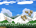
The mechanics are awesome, although a bit tricky to understand at first. My only gripe is that the clouds really obscure the enemies up there. Overall really solid, I ended up replaying the tut a couple of times because I really love the mechanics
Hey Alien Kat, thank you so much for the feedback, I will definitely make QOL changes to the game as I am adding content to the game. I'm glad to hear the mechanics are to your liking :).
There will be lots of major game changes and game play balancing involved as well. So expect some new experiences each time there is an update!