Play game
Life-Limiter [MGGJ3 Prototype]'s itch.io pageResults
Criteria | Rank | Score* | Raw Score |
Magical Girl Concept | #14 | 3.920 | 4.333 |
Originality/Creativity | #14 | 3.819 | 4.222 |
Theme Interpretation | #20 | 3.518 | 3.889 |
Overall | #22 | 3.578 | 3.956 |
Engagement/Fun | #23 | 3.417 | 3.778 |
Graphics, Audio, and Polish | #26 | 3.216 | 3.556 |
Ranked from 9 ratings. Score is adjusted from raw score by the median number of ratings per game in the jam.
How does your game fit the Magical Girl Genre?
It's mostly a darker version of other Magical Girl stuff, but its still a magical girl thing as magic is still in play, even though its mostly blood magic
Which theme(s) do you pick?
Conservation of energy
How does your game fit the theme(s)?
You need to save as much HP as you can as spells uses HP, but to get it back again, you need to attack physically
Are all your graphics assets made by yourself during the duration of the jam?
all of them were made during the jam period
Are all your audio assets made by yourself during the duration of the jam?
a good chunk of them were purchased
Leave a comment
Log in with itch.io to leave a comment.
Comments
btw playing on mac, you need to chmod -r 755 the whole folder and force play the game (known issue with game maker games when bundled for mac)
concept wise: the game seems interesting and has potential.
gameplay wise: its missing a lot of quality of life stuff:
I think one of the most needed pieces is being able to always see your characters HP ... and making some way to understand what happens in battle.. its a bit fast, could slow down a tad bit and add some texts like "parried" "defense attack" or maybe instead a battle log which is just a stream of what happened that you can see at your own leisure.
Overall I didn't connect with the characters and I kept on reading the magic spells over and over cause I forgot who was who. Maybe add very distinctive something so that the character stands out and I can get what their main role is supposed to be.
Story wise: You might need someone to look over the whole script and fix grammar / typos, it had a lot of them, I see some people pointed some out already, but I think there are several more.
Keep on going ! Great job with limited time!
Understood! The next upcoming update will fix what I could later on! Also, thanks for telling me about the mac problem too! I'll see what I can do with that too later on!
Another really interesting entry- most of the ones I've been playing today have been pretty intriguing. I'm not really a fan of the dark storyline, but it is an interesting departure from a lot of the other games in the jam.
It's definitely rough around the edges. There's some very slow scrolling text at the beginning, and I accidentally skipped most of it entirely trying to speed it up. Calling out each character before their line is necessary in context, but super awkward to read. There are a few different art styles- the main one seems to be the mostly monochrome sketch one, which isn't really my style but looks good and works for the game. The pixel art in the menu screen is also nice, but doesn't mesh with the other style. The solid colour used for the tileset just looks bad and makes it impossible to tell wall from floor. There's also one stock animation which looks incredibly out of place.
Seeing a tactical battle system in RPG Maker was super cool, but the implementation is pretty flawed at this point. It's not clear why you can move to some squares and not others; I'm not sure if the overlay is actually broken or if it's just a contrast issue with the (temporary?) tileset. Mixed keyboard/mouse control is awkward, it's not clear who is doing damage to who when you attack, and some of the iconography is confusing. Similarly, it's not clear what "line of sight" means when the second enemy type is introduced. The screen that shows up just before an attack feels unnecessary and is serious information overload. Finally, some of the magic seems useless or at least not worthwhile, though with harder battles that might change things.
That being said, as a proof of concept it works. The tactical battle system is super cool and a major point of differentiation.
The anti-climactic ending and leaning on the fourth wall with missing features and testing stuff is not amazing, but it makes sense in context.
All in all I think there's a ton of potential here and I'd like to see it continued.
Thank you for the criticism! Yeah it's pretty rough ngl, I wish I could've done more but it's a fun experience when making this prototype. I will take all of this to consideration and make sure I can make everything works well in a proper future demo that I'm working on right now. Thanks again!
liked that you went with the advanced wars style battles (I think it's called tactical RPG?) rather then a simple turn base, the art style is something, giving a sort of reverse noir feeling for some reason, anyway, nice little game, I enjoyed what was present.
Thank you so much for trying it out! I will try to iron out any problems for a future demo/full release since I'm still working on it!
Thoughts recorded during my playthrough
+ = I liked it
- = I didn't like it
* = Neutral/suggestion
=======
+ Custom title screen; only has what is effectively a "start game" option
- Would be nice to have access to sound & gameplay options
- Opening quote plays too slow
- "But there's something's off." Change to "But something's off" or "But there's something off."
* Characters are presented by name instead of by portrait or bust. Not sure if this is a good thing. Normally I'd advocate for a portrait, but given the style maybe it's better this way?
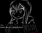
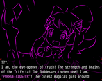
+ I like that the intro is presented with full-screen pictures instead of standard walk sprites. It makes for a better presentation. I can see the characters' unique features and body language.
- "Purple Cluster, poofs away." You don't need the comma.
+ I love the custom artwork. The sprites, tiles, and menu UI are all custom!
* I can get to the options menu after the intro cutscene. Could you make that accessible on the main menu?
- "All right, let's go" appears on the same line as the character's name.
- Got an error when I went to "Keyboard Config." This error also appears if I try to exit the options menu.
- Land, not landed.
- I had to press the action button to enter the battle area. I think it would be better if it were activated by "Player Touch."
+ A tactical battle system? Bold choice. Different, for sure!
- I appreciate that the system gives me an indicator of where I can move, but I don't like how the color of the indicator occasionally clashes with the floor color. It makes the indicator confusing.
- I got this error by clicking away from the app to write some more in my review notes, then moved my cursor back to the app window to start playing again. I think moving the cursor over the character's status window at the bottom triggered the error.
* I can enter the battle room without talking to Purple Cluster. I don't know if that's intended or what effect that will have on the game down the line.
+ I like how each character has her own set of skills. Good variety, well explained.
- I think this should say "That's stupid. Why tell us this if it can't even be used yet?"
- The sentries in the second battle disappear after I hit them. I thought this meant they were dead, but they were still considered "alive" and still had HP remaining. I hit them a second time to fully kill them.
- Do the sentries not do damage? Seems like they don't.
Summary
The story and battle system are well thought-out. There are bugs, but this isn't even an alpha version of the game so it's understandable. I enjoyed this game (when I wasn't dealing with bugs). Good start!
Hmmm, yeah now that you mentioned it, there are a lot of english mistakes. Sorry, English ain't my forte, but I will try to fix whatever I can! I will see what I can change later on too and list it down so I won't make the same mistake on the future demo/full release of the game that I'm working on. Thank you again for giving bold criticism! I appreciate it a lot!
I'm a fan of grid-based RPGs, so I was happy to see that was the direction your game went!
I liked the idea of a risk/reward system fueled on the characters' HP. It definitely made using magic something that needed to be carefully planned and assessed. Neither of the battles were terribly difficult, but then again, they were tutorial stages.
The premise of the story has a lot of promise! I like the idea of a menacing magical girl forcing the characters into succession for her. There's not much there yet beyond that, but it's definitely off to a good start. Also, cool to see the theme integrated into the gameplay mechanics!
I like the art style of the characters, and the in game sprites. The UI looks good and works well too. The backgrounds/levels are a bit on the sparse side. Not sure if that's the plan, or a limitation of the jam period.
Overall, really nice work!
Thank you so much! Yeah the background is kinda like a placeholder thingy for the jam because, again I came in REALLY late to the jam. But thank you so much for trying it out and I am happy that you enjoyed it!
It didn't pin me down on the ground like I always thought turn-based RPGs would.
On a serious note, the aesthetic has a lot going for it and I hope the writing expands itself into something better. The intro part manages to introduce the characters, but after that it's just gameplay that I felt too scared to fully dip my knees in (didn't try any skills at all). Gonna blame the "PermaDeath" title for that :P
While it seems most issues are by coming into the jam late, I'm glad atleast the jam made you get something out. That's spectacular, it's a magic of every game jam on this website.
Thank you! Yeah, the PermaDeath name is just a placeholder name before I went for "Life-Limiter". Sorry for that.
Also yes, a proper demo (and from there, building up to a proper full version) is in the works with expanded writing, new stories and I'll try to redo and balance out the skills so there's a risk and reward thing for using skills/magic since using those costs HP.
Thank you again for giving it a try and giving your thoughts on it! I appreciate it so much!
I'm a big fan of ARPGs and health instead of mana is a pretty interesting concept, so I'll be looking forward to future updates
Yoo thank you so much! I will post more future updates once it's all ready since I'm working on a proper demo right now! Thank you again!