Play game
Lovely Fracture's itch.io pageResults
| Criteria | Rank | Score* | Raw Score |
| Originality/Creativity | #1 | 4.364 | 4.364 |
| Graphics, Audio, and Polish | #5 | 4.364 | 4.364 |
| Overall | #5 | 4.073 | 4.073 |
| Magical Girl Concept | #8 | 4.182 | 4.182 |
| Engagement/Fun | #10 | 3.909 | 3.909 |
| Theme Interpretation | #17 | 3.545 | 3.545 |
Ranked from 11 ratings. Score is adjusted from raw score by the median number of ratings per game in the jam.
How does your game fit the Magical Girl Genre?
The main character is turn into one for a limited time.
Which theme(s) do you pick?
Spacetime Curvature and Spooky action at a Distance
How does your game fit the theme(s)?
The plot starts because of a Bend in spacetime
Are all your graphics assets made by yourself during the duration of the jam?
Yes
after the themes were revealed but before the start of the jam submission period
Are all your audio assets made by yourself during the duration of the jam?
No
some of them were purchased; but most are stuffs made during the jam
Leave a comment
Log in with itch.io to leave a comment.


Comments
This game is simple and straightforward. Here are the things I liked:
I do have some criticisms as well:
The limited move set is kind of a mixed bag. I liked it because I didn't have to read through a bunch of skills to figure out which ones were for what purpose (or are useless), but it also meant I just spammed Reflect most of the time. The boss battles added in the need to use Hope, but it just wasn't enough variety after the first boss.
I am also mixed on my feelings about the text that appears after each attack. If it were to indicate what the enemy was about to do next, it could be a cool part of a system that would allow the player to plan their next move accordingly; right now it only seems to be flavor text that slows down the progress of the battle.
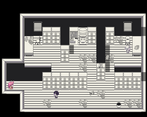
This has been mentioned before, but there are some tile passability issues with the papers in the office on the tables:
Ultimately I feel that this is a good game jam game. It has its flaws, but it's still a fun, quick experience. I look forward to seeing your next project!
I noticed that you want to have grammar errors and typos pointed out. I found a number of them, and in the interest of not making this comment even longer than it already is, would you mind if I sent it to you in a document file? If so, where can I send it?
Nice work! First off, I always appreciate RPG maker games with unique custom artwork! I liked the overall look of the game, especially the character portraits and battle sprites. The music and SFX all fit well.
I enjoyed the unique and interesting story, probably my favorite part after the artwork! The incorporation of the jam themes felt a little less strong than the story as a whole, but fit well enough.
The gameplay was interesting. While there weren't a ton of skills or actions to work with, there was definitely a strategy to most of the fights, especially the mini-bosses and end boss. The challenge was about right. I had a little trouble with the harder enemies, but figured it all out by the end.
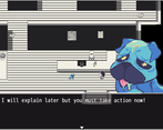
One thing I did initially have trouble with was that I didn't see the hallways at all. Took some bumbling around after the cat told me to find the objects and save all my coworkers before I found those passages.
This is definitely a memorable and unique entry, and one of my favs!
Definitely one of the more interesting entries, with a unique storyline.
I liked the monochrome-with-limited-colour art style- normally I like colours everywhere but it fits the themes of this game really well. The transformation sequence bears calling out- it is very nice and a great use of colour. The battle mechanics also fit the tone and themes well.
There are a few minor issues I had with the gameplay. The battles are really cool at first but do start to get tedious toward the end. More variety might have helped here. I also didn't realize there were more screens at first- it's not clear that the hallway leads to other places.
I thought joking about the keycard was a weird shift in tone, but other than that the writing was solid. It's short and a bit minimalist, but neither of those are a bad thing.
I wasn't a huge fan of the ending- I felt like the game was set up as satire and then backed out of the point it was trying to make at the last minute- but it works well enough and I'm probably reading too much into things at this point.
I'm kind of on the fence about the theme implementation. It kind of makes sense, but also feels like a bunch of words are just thrown in without context and maybe used incorrectly to seem relevant. I'm not an expert on the subject, though, so I'm not going to judge too harshly here.
The artstyle was way too cute to be a horror game lol. This reminded me a lot of Earthbound. Hope is pretty op but considering how strong some of the enemy attacks were It's probably better that way. I had to redo the final boss battle because the snake died the first time.