Play game
Magic Unlocked: Chloe's itch.io pageResults
Criteria | Rank | Score* | Raw Score |
Genre Mashup Incorporation | #18 | 2.828 | 4.000 |
Magical Girl Concept | #19 | 3.064 | 4.333 |
Audio | #20 | 2.828 | 4.000 |
Polish | #20 | 2.593 | 3.667 |
Graphics | #23 | 3.182 | 4.500 |
Engagement/Fun | #24 | 2.475 | 3.500 |
Overall | #24 | 2.795 | 3.952 |
Originality/Creativity | #25 | 2.593 | 3.667 |
Ranked from 6 ratings. Score is adjusted from raw score by the median number of ratings per game in the jam.
How does your game fit the Magical Girl Genre?
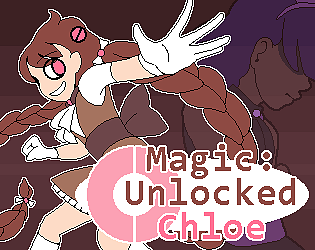
Chloe is a magical girl with earth/rock related powers, but in game this is simply represented by her shooting "magic bullets".
Which genres from categories A and B did you choose?
Platformer and Ren'Ai!
How does your game mash those genres?
It's a platformer dating sim! You hop around various platforms to explore the world and fight monsters, and interact with your friends enough to trigger one of several (2) character routes. (the routes are romance-aligned, but dont necessarily have happy endings.)
Were the graphics/audio assets for your game made during the jam?
Yes, the graphics and audio were made during the jam.
Leave a comment
Log in with itch.io to leave a comment.
Comments
Adorable artstyle and animation. I admire how well the cutscenes work as well. Good music choices too. The writing and character designs are very charming. The loop of going through a level and then speaking to friends is a solid idea. The platformer is functional and obviously needs a lot of polish and juice as well as interesting enemies. The only fundamental request I have is the ability to control the jump height based on how long the button is held. Rocketing through the sky at one press made things feel quite slow.
I was pretty excited by the key art and description, and there's a lot of promise in this one although it's pretty rough in its current state.
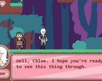
I think the style will be somewhat divisive, but I liked the art a lot. I especially liked the little idle animations each character has. I liked the detail in the environment art and the bright colour palette as well. I do wish Chloe had an attack animation. I think there were a few other animations that were missing or underdeveloped, too, but that was the most jarring one.
The music is good, but the lack of sound effects is pretty disappointing.
The platforming is really clunky. It definitely has that prototype-y, game jam feel. It feels loose overall, jumps are somewhat glitchy, and the camera doesn't move in a way that shows you where you need to go. The zoom feature feels unnecessary; I never zoomed in.
The boss was a big bullet sponge that doesn't really react to your attacks at all. Just very basic and not very fun.
Maximizing the game puts all the HUD elements in the upper left corner and I played most of the game like this. I'm assuming this is a glitch, though, since none of the screenshots show this.
I'm not sure if there's more in the current version than the first forest level and the house; I wasn't able to go anywhere else. The narrative is the part I was most excited for, and it certainly has promise, but there's not a lot I was able to actually experience.
thank you for the feedback! overall there was a lot more that i wanted to do but wasnt able to yet, which i think definitely shows. ill take everything you said into account and try to improve it a little more, since i want to do more now that the jam has ended.
the HUD elements all being in the top left is a glitch, yeah. unfortunately i didnt discover it until after the jam was already over, so i wasnt able to fix it for the jam version.
Any chance this could be made playable in the browser?
ive been trying to make a browser version work, but the script i used for the dialogue is apparently incompatible with html5. hoping to find a workaround soon though.
The artwork is amazing. the color tune gives me a vibe of candy. the character design is very cute, especially the idle animaiton.
the battle part is okay. but it seems there is only one stage. and the game forces me to repeat it. As i am not a fan of Ren'Ai, i haven't finished the game.
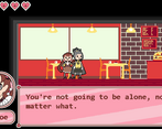
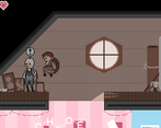
The graphics are very cute, and those little animations are done superbly. The hub design is really nice, and each room is also color coded to the character that will house that particular room, which is a subtle but smart design choice in my opinion. I also really liked the Mia level and the cupcake shop level, the colors and setting is very well done and deserves praise. The characters are all varied and unique in their own way, and Ari was a pleasant surprise. Music is also relaxing and suitable for the theme, good job!
I managed to get Level 4 on Izzy and Mia but couldn’t progress after that (game jam version), it just says they are not ready to deepen the relationship. At first I thought the missing text on Izzy was a bug, but it turns out that it is part of the story. Nothing wrong with that, but perhaps some kind of black bar or indication that it is censored would be better, because it was just empty spaces when I was playing it.
In terms of gameplay, it is quite grindy which I’m not a fan of. I didn’t manage to find a way to go to other locations other than the Lush Forest, and I had to play the same level many times to get enough hearts. I understand that this is probably the way it is because there’s not enough time for the game jam, but in that case it needs to be tweaked for the game jam, and not allow it to be as is. The level design of the Lush Forest is not particularly great when tied with the platforming controls and here’s why:
There is also a UI bug when the window is maximized. The volume controls and black bar transitioning stays on the upper-left corner of the screen.
Overall, despite some problems I have with the gameplay, I quite enjoyed my experience with it. While playing, there’s so much to imagine. It managed to keep my sense of wonder and fascination on wanting to see and know what’s next. I think this game should be worked on further and it has so much potential which I look forward to seeing. Keep it up!
Thank you for the feedback! I'll keep working on improving it. I'm glad you let me know about the UI bug, too. I hadn't run into that one while testing, so I'll look into it and fix it.