Play game
Tricolor Wonders's itch.io pageResults
| Criteria | Rank | Score* | Raw Score |
| Engagement/Fun | #9 | 3.382 | 4.429 |
| Polish | #12 | 3.164 | 4.143 |
| Overall | #14 | 3.117 | 4.082 |
| Graphics | #14 | 3.710 | 4.857 |
| Genre Mashup Incorporation | #17 | 2.837 | 3.714 |
| Audio | #19 | 2.837 | 3.714 |
| Originality/Creativity | #22 | 2.946 | 3.857 |
| Magical Girl Concept | #22 | 2.946 | 3.857 |
Ranked from 7 ratings. Score is adjusted from raw score by the median number of ratings per game in the jam.
How does your game fit the Magical Girl Genre?
The trio can cast magical spells from cards they collect
Which genres from categories A and B did you choose?
Card // Turn Based
How does your game mash those genres?
It should be obvious
Were the graphics/audio assets for your game made during the jam?
All graphics etc were made during the jam. Most SFX were made during the jam. The music and voice acting are royalty free assets that we did not produce ourselves.
Leave a comment
Log in with itch.io to leave a comment.


Comments
I figured this one would be quite polished and quite long, with a lot of content, based on the screenshots and description. Unfortunately I didn't have time to give it more than a brief try.
The main menu is very nice, I like that it shows a bit of the world, and the music goes well with it. It did make me dizzy when I stared at it too long, but it definitely contributed to a positive first impression.
The initial transform animation is also great. I don't think we've actually seen many transform animations this MGGJ... kind of odd for a magical girl themed jam.
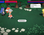
Clicking on cards to perform actions didn't seem to work quite like the tutorial suggested; I had to double-click sometimes, and I attacked immediately after selecting a card before actually clicking on the enemy. But it was sometimes hard to tell what was selected, so maybe that's what was going on.
I'm not a fan of the dialogue style, and I have mixed feelings about the overall visual style and presentation, but it's all very well done.
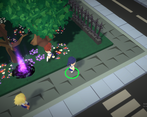
It took me a while to realize that movement in the overworld is RTS-style (click to move). I think this could have been better indicated.
There's definitely some depth and complexity to the card battle system, but I didn't really spend a lot of time exploring it. I'm just going to assume it's all there and working and not actually smoke and mirrors. I did find the complexity of the battle system intimidating at first. I think the UI could be tightened up, and maybe the tutorial improved.
I think the turns should advance automatically, and you shouldn't be able to select girls that can't perform any actions. What confused me was that it wasn't clear when this was; I was able to do two actions per turn, but only sometimes, and it didn't seem to be based around available mana.
I do wish the cards were more visually distinct from each other, but I did get a hang of them pretty quickly.
All in all this is an impressive game for a one month jam. It's one of the few that hits all three areas of large scope, high quality, and significant complexity. Most jam games (and every one I've ever done in a jam) only hit one or two of those points.
Bonus points for including a readme, and a custom icon. Polish!
EDIT: I thought Chameko looked a lot like Yang Xiao Long in the screenshots, though the resemblance is less in-game.
Amazing entry, it reminds me of For The King. The 3d environment is really cool and the characters are absolutely adorable. There seems to be a large amount of content and cards already, really well done! The music fits as well. I liked that there are mechanics resolving around refreshing allies and also apparently very powerful cards.
Some suggestions:
Max C was my favorite reference, please keep it unbanned^^This game looks amazing. Excellent graphics. I recognized the tune in the intro from soundimage, good stuff there.
Character models look great and have a ton of personality. They have different poses for their various states, actions are clear and don't last too long, and even the backgrounds look good without being distracting.
Selecting and playing moves is a little janky. It doesn't work the way the tutorial says it should. In order to use a card I had to:
I recommend finding a way to drop either step 2 or step 4. I can see that you're trying to make it easier to see the full text of the card with this method, but it's just not intuitive.
Kinda funny that Chameko, the "Dark" type character, is brightly colored. Seems a bit counterintuitive. I guess it's a Naruto-esque reference?
I didn't know I needed to right click to move on the overworld. There should be a popup or tooltip for that.
I didn't realize that right click cancels a card selection until I tried doing it.
I really like that the type chart is accessible in battle and that you can see the enemy's type by selecting them.
It's also pretty cool that you can see the "types" of the cards each character is holding. It helps with strategizing.
Some enemies attacked Tetsuko and made her go into her "exhausted" animation. I used a card to refresh her but it just wasted my move. Either there's something not working right with the move or states need to be communicated better.
Cards mention doing X number of damage but health indicators in the top of the screen are presented as bars. I think segmented health bars like the presentation in the lower left would work better with numbers this low.
Another thing that could help improve the UI is displaying the types of each character in the box that displays their name, HP, etc. I know you can get that info by hovering over each character, but it would reduce the amount of mousing around that I need to do and would make it easier to understand the battlefield at a glance.
I like that I can adjust my deck in between battles.
I like the UI for deck adjustment overall - I can see what cards are in each girl's deck, I can see their special attributes, I can even review what each card does pretty easily. There does seem to be a little bit of an issue with how I would expect to move around the screen for adding and removing cards: I want to click the card I want to remove and click the button at the bottom of the deck to remove it, but that's the "Add card" button; the "remove" button is under the card preview. I understand why it is the way it is and it works well enough, but I feel like something about the flow of adding and removing cards needs to be adjusted to make it feel right.
When presenting new cards, there should be a way for the player to review what those cards do. Maybe instead of presenting them in the compact "in hand" format, show each card individually side-by-side?
I would like some additional popup or way to get info on the different states like "haste" so I can understand what that means.
"Australian Spidfrit" 😄
- It's a little hard trying to target this enemy. The hitbox for clicking it needs to be bigger.
One thing that I'm going to nitpick is the motivation behind these characters. Who are they? Why are they magical girls? It's not explained well in the game. Just a little more backstory at some point (either in the intro, scattered through the game, or both) could add depth to the story.
=Summary=
While I didn't have enough time to play through the full experience, what I did see I liked a lot overall. There are some heres-and-theres to polish up, but overall this game is very well done.
Thanks for playing! Several of your complaints are handled/explained by the buff icons attached to the unit status panel in the bottom left. I think there needs to be more attention drawn to that in tutorialisation but I lacked time for a thorough explanation, and didn't want to bog the tutorial down too much.
The other feedback is very helpful and if we move forward the game will try and address them all, thanks!
Wow the screenshots are beautiful! I'm afraid to download things, is there any hope of publishing a web playable version?
Did a dungeon, pretty blue dots meant additional mana cost, but at times I am able to use two cards with 1 character and then other times I'm not, pretty sure I used corruption that costed 1 mana and tried to use a 3 mana costing spell on chameko it didn't let me but overall game's decent it has much content within, I think it could have more smoother transitions for using spells/attacks, the elemental affinity chart needs to be accessible before/during the fights instead of after the fights, and needs a much simpler and faster to digest explanation on elemental weaknesses, basically using a spread sheet to explain elemental strengths and weaknesses, was kind of weird since it wasn't as intuitive as how most elemental affinity concepts would be, like wind is strong vs water? I think the game's weaknesses is mostly just the User experience can be rather lacking but easily improved with some more simpler explanations or dumbing down of the elements and there is alot of elements to look at especially when there isn't scaffolding involved for players to be introduced to the elements and sure theres pokemon with many more elements and what not but not for something someones whos going to pick up and play for like 1-2 hours.
Otherwise the game definitely did well in my books. Models low res, cute, simplistic and consistent art direction , opening animation, much experience shown.
I had a blast playing Tricolor Wonders. It is a very polished and nice looking game, complete with transformation animations and such. To be able to reach this kind of level in only a month deserves high praise. If I didn’t know, I would be very surprised if someone told me that this is a game jam game; if this was released on Steam right now as a full game, I wouldn’t even question it.
Having some exploration bits to pick up some cards was a pleasant surprise; I like the fact that each girl is unique and different (and can even pick up items for you), and I noticed the faster running speed on Chameko. I played until the end and defeated Elizabeth because it was very engaging and enjoyable to play. Changing my deck to prepare for fights, before and in-between feels good and there’s a good amount of planning and strategy involved. I also appreciate some of the puns and references.
For criticism, it could use better writing/story for a more proper goal or motivation to defeat the monsters. It needs a little more emotion. Although few, the Elizabeth voice lines are quite distracting for someone who understands Japanese; it needs to have some relation to what is being said or it will feel disconnected. That being said, the others are great. Each girl has a passive ability, but this is only shown during the rest sections between fights - which made me confused why Chameko’s cards are suddenly different at first. It should be shown in the inventory menu. I also feel that the 2x damage needs some balancing, some cards that deal high damage basically become un-defendable/insta-death for both the player and the enemy. Try fine-tweaking them like 1.1x, 1.2x, etc. The total immunity can make me feel like a god just because my character is of a particular type. In terms of UI, there needs to be a clearer indication when a girl is exhausted or downed, because my eyes are on the cards most of the time, it’s hard to notice the animation or namecard at the top. An extra touch to pull the card out and make it on-top on hover would be nice too, so I don’t have to select it to view the full text all the time.
Overall, I genuinely had great fun. Amazing work!
Thanks for the feedback, I'm really happy to hear you played it the whole way through!
The story didn't really get much attention, it was mainly a contrivance to give at least some motivation to the gameplay. I'd like to give the story a bit more love, but I'm not sure what's next for the game, we'll see I guess.
Thank you for playing!