Indie game storeFree gamesFun gamesHorror games
Game developmentAssetsComics
SalesBundles
Jobs
TagsGame Engines
A jam submission

AekiroView game page

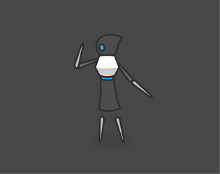
One button boss fight
Submitted by Zitta — 11 hours, 27 minutes before the deadline
Add to collection

Play game

Aekiro's itch.io page

Leave a comment

Log in with itch.io to leave a comment.

Comments

Submitted

Aesthetically speaking, as Phive has pointed out, you have really pursuit your own style here. You must be very proud when someone can say that to you, it means that your name now embodies something, and the game itself brings an signature to enhance what you already offers.

From the standpoint of mechanics, I like how difficulties are slowly being introduced. Though, I hope there would have been some sort of screen shake or effect to comply with the "cling" sound effect.

If you do get a chance to read this, may you teach me how you've made the banner disappear? Did you use any form of shader or procedural scripts to make that happen? Or just plain animation created from another software?

Looking forward to get your response.

Developer(+1)

Thanks for the comments!

As for the banner, it's just a frame by frame animation.

Submitted (1 edit)

Still amazing! I think your art skills are equally as impressive as your coding skills. I hope I can do something like that!

Submitted

+ very interesting gameplay

+ nice animations and sprites

+ mechanics are introduced gradully, reasonable and friendly

- would like more feedback when hitting the enemy tho, just to make it more juicy and more noticable, right now I would not pay attention to the health bar, or maybe the health bar is not that important, in that case just take it out I guess, I don't know

- would have a better pacing if mechanics are introduces faster and a longer final stage with all the mechanics, i guess, like in Super Mario levels.

Submitted

WARNING this review contains major spoiler so I suggest you to try this out first and then read my review if you want to.


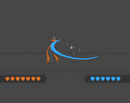
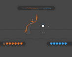
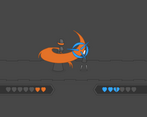
"Yup, its Zitta and I don't even need to look at the username. " and that's what's successful about the athetics here. Gameplay wise, the statsis mix up attacks, and the phase change (espeically when the boss goes giraffe) really caught me by suprise, they were unexpected but still feels fair, and understanding the extra works and time on designing under this is impresses me.

I would prefer more responses upon hitting the boss though, because I didn't even notice I was dealing damage before I'm like a minute into the game. A stagger, a short "oof", or even just a white flash on boss would do. The steps back is indeed a nice touch but when paired with the air slashing sound, it's even kinda misleading because I really thought I was missing those attacks.

And if you wanted to go an extra mile in Miyazaki-ness. I suggest making the charge attack manuelly released (so basically you charge as usual, but the attack won't be released until you release the key), so people would have to time it correctly to interupt with haste. That does adds a little bit of diffculty but it's going to raise the tention of battle even further in my believe.

Submitted

This is a very interesting game, I really love this aesthetic and the fact that I can recognize it back from your work in intro to vis comm shows that it's a very exciting style. The animations are incredibly well done on their own, but I think within the game there are some instances where the attacks are not well enough marked to react. Some of this, I think could be easily solved by adding some additional sound effects. Most needed areas for that would be when the boss begins his charge attack or a stasis attack. There were some times when the boss would do a triple slash, and on the third motion when he raises his arm there seemed to be around a 50/50 chance that it would be a charge slash vs. a slash. I'd take a lot of hits there because I either assumed to block or assumed to start charging my own counter slash. The other difficult read was the double arm attack, where one is stasis, while the other isn't. I didn't know which was going to come first necessarily, and up until seeing that, I primarily assumed that "seeing purple = spam spacebar." Maybe making both arms purple even if just one is stasis-attacking, or when there is the one orange/one purple situation, having a clear visual or sound effect to dictate which arm is going to attack first would resolve this.  Overall, this type of dodging/fighting game is really difficult to create well (especially when you're only given one button) and I think you managed to get a lot of depth out of it. Great job :)