The visual presentation is elegant, and the game is an interesting take on the snake genre, I don't think it would hurt to let the player know the AI's dice numbers. That would allow the player to effectively play aggressively instead of constantly waiting for the AIs to corner themselves. The AI tends to kill themselves a bit too much but since this is a jam game, the fact that you even have them up and working is impressive. Great job!
Yuanhao Wang
Creator of
Recent community posts
Yahtzee, with two twists. The play on gambler's fallacy is indeed pretty funny and brings different choices.
I would personally prefer to have the "Law" toned up a bit. Unlike traditional Yahtzee, the Law was the only mechanic I could strategize around if my ability to pick boxes after the roll was taken away. But the game works the way it currently is as well.
Cool game.
An interesting take on the "rolling" mechanics of traditional top-down shoot'em ups complimented with solid arts and animations.
Getting attacked by lingering enemies can be a bit frustrating, but I'm assuming that's because there was an incomplete "hit-stun mechanic," as I can tell that enemies get this "stagger" animation when hit and upon death.
Design-wise, I would like to be motivated to swap weapons constantly, as this seems to be the game's gimmick. Adding ammo system, having range-immune enemies, you name them.
Would gladly see a complete version of this.
Lol, we've over-scoped the project by quite a lot, and we've had lots of ideas back then. The general crashes head-on into enemies, the rogue was supposed to attack by running around and parry with side numbers, and the archer was gonna shoot arrows by moving oppositely. It's a big bummer that the other two characters and the talent tree didn't make it into the game. But hey, if people liked the idea, we're gonna try to finish it as we liked the project as well.
Light hearted and relaxing. I would say having no scope is a good call here, as it will be both uncentered, and taking away the game's fundamental playloop, which includes learning where the hook would land. However the slow retraction speed when missing a fish felt seriously punishing, especially given that this is supposed to be a relaxing game I suppose. IMO making the line retraction much faster would definitely reduce the frustration for the sake of this game's relaxing tune.
As cute as the concept and the hand animations are, it feels weird that as a concept game, there isn't any audio/video response for hitting notes besides the arrows disappearing. I would even argue that it’s very crucial for rhythmic games to have strong input feedback. A "snap" sound, a burst of particles, or both... it can take any from but there just has to be more responses.
IMO rhythm games shouldn't just be the player listening to the music while hitting the falling notes as if the music is merely a background. It's the input responses that makes the player actually feel participated in the playing of the music. It is not just about hitting buttons at the right time while the music is playing in the background, making the player groove with the beats made by themselves is the key to a satisfying experience.
But then it would be another story if the point of the game is meant to be humorous about how the dog being forced to dance in the arcade felt.
I've always struggled on writing enemy AIs and the way you managed to pull this off and even letting them navigate through the gate is quite impressive to me. However, I’m kinda surprised that there isn’t a pounce system which basically means your jumping force is semi directed by the pitch of your mouse. IMP this would both add a layer of skill expression, and make the game more realistic.
The concept is cute, and the experience of making five of your fingers actually represent you five fingers is quite a unique experience. However, it's kinda uncomfortable to control what seems to be your right hand (wing) with your right hand. The thumb gets controlled by your pinky and pinky gets controlled by your thumb if you naturally lay your finger on the keyboard, simply mirror the controls around would've made this much more enjoyable without what seems to me to be unnecessary challenge.
A lot of this kind of game's hook for player to continue playing is to give them a peek into what will they unlock next. The sheer curiostiy is enough to drive players through the entire game and it can be evoked better by simply giving player what it takes to unlock the next "tech" but not what it does. But anyway, I enjoyed the surreal salmon herding experince, so good job.
This is certainly on the more challenging end of the spectrum. While I get how the game is meant to be intense and leaves little window for reflection, it would honestly feel fairer to have the balls either change color or be highlighted in some way because honestly, having to figure out when is the ball clickable feels a bit like a redundant difficulty to me. Also, a bit more reaction on destroying a ball would definitely boost the experience, as I understood this game is meant to have a cheery, sporty vibe with vividness to it, even just a screen shake would be enough.
While this is a creative take on the project, it feels a bit counter instinctive that the re-roll does not cost any money as you want to be managing the potential cost. While I'm not telling you to basically make hold'em, but it does feel a bit weird having free rerolls which basically defeats the risk managment aspect.
I was not expecting a point and click adventure game in this Jam and this certainly opened my eyes for possibilities. Loved the Rusty Lake-ish vibe with the bizarre & surreal use of assets. However, while I totally understand that the time budget is a thing, I don't really see any suggestion or even hint for me to click on the banana for the Sprite, and the fact that the clock also ticks at 10 made it extremely frustrating, because It just suggests its 5400 or 5412 .etc so hard. Unless it's an intentional design decision to frustrate the player, I would suggest removing the clicking sound when the banana hits 10.
It's totally okay to make a simple game with few actions to take, but then it would have to rely on those actions feeling really good to do its magic. While I understand how making pixel arts are time consuming, there are some polishes that take a matter of minutes to make. Simply making the cat bounce/jerk a little when its mood changes adds a lot more vividness to the interactive experience, and it literally takes 2 lines of code to do that with the animator. This would be a really time efficient method of polishing this game.
Beautiful art, and solid gameplay. I have two criticisms about this game but both of them are sorta cherry-picking, i.e. this is still a great work in my opinion.
First, as a reflect based game, having to actually click on the sprite of the item rather than the button is quite frustrtaing for a light hearted experience. I think the game can still be just as challenging if you make those square frames buttons, but feels a lot more fair to the player.
Secondly, the purple scorebox kinda feels outta place compared to the other parts of the UI. Maybe consider a solid box that looks like the item box on the left side instead?
The part that interests me the most is actually your take on the UI cursor. The way it hints for interactable object with a natural transform in shape without having to change color or shape just feel oddly smooth. I can see how this design wiil be even more useful in games that uses single color aesthetics.
However, while I get you might be making this decision for the perspective (the closer the bigger), it feels a bit odd to have the dot "unfocus" to suggest interactablity while you are supposed to have your attention focus onto an object.
Also, putting the cursor as an actual game object in world space causes it to disappear if I run into walls. I suggest putting it into the actual UI Canvas if that's not intended.
A cute little game, with cute little sprites. However, I noticed a bug that made the game quite unwieldy.
If I guessed correctly you are using colliders for both the bamboos and the panda and you have an OnCollisionEnter2D script to detect the "eating", which is a fine method.
Meanwhile, instead of spawning bamboo clones, the bamboos is the same gameobject that teleports around every time it gets eaten, which is fine on its own too.
However, with these two features togther, and no method of preventing the bamboo from teleporting to a place too close to the panda caused a bug that prevents me from eating the bamboo if the bamboo teleports right next to me. And on top of that, you seem to have no restriction on panda's rb rotation which combined with the bug above, would make my panda (and the camera attached to it) rotate if I run into the corner of the bamboo.
Use OnCollisionStay2D, or simply putting a code that checks the distance in x axis right after the teleporting method and re-teleport until the is enough would do.
The experience is truely stunning and I've always been facinated by your elegant utilization of particle emmitters. As for the critiques, I would say that despite how "gaseous" the game is meant to feel, I would still prefer to have some visual or audio response to guide me through the game. When I was first feeding gas clouds to my brown dwarf, due to the way the the particles are behind the star's sprite, I failed to notice that I missed the star slightly and the cloud was half-coverd by the star. I figured that out int a minuite but still, it was a bit frustrating. I would say having some response when the cloud is being dragged to the right place would've helped. Even an etheral "bop" sound or a simple ripple on the star would've helped, because an absence of response would automatically hint the play er that something is not done yet.
The doodlely artstyle is cute, and I did manage to collect them all and having the little conpanions spin around you is certainly an adorable touch. However, due to the way they are seemingly attached to our hiker by spring joints, they would fly toward the hiker when he teleports to the bottom of the stairs, which kind of breaks the fantasy of the player constantly climbing upwards. Making them child of player GameObject after picking them up could probably solve the that.
Gently satisfying, and enjoyed it I was. The nut smashing sound is different but actually better than the celery twisting sound I expected.
However, as this game is supposed to be relaxing and never punishing at the slightest, the unexpectable jerky collider-driven movement of the hammer can still sometimes be frustrating. I'm not against making it hard to get all combos, but it feels kinda unfair to have my combo broken by pure RNG when I’m like 2 rows in. It not just about expecting players to set their own goals and finding their fun, you also have to allow them to do so.
But if you can somehow convince me in the game that it's part of the underlying struggle to overcome for nut smashing zen, then I guess that’s ok.
But still, If I've cleaned plate, i.e. finished the game, then I guess its a good game overall.
As far as the arts go, they are adorable in their current form.
Due to the habits earned from playing Pokemon and Chinese bootleged Pokemons, I was able to regconize my head fairly quickly, but yeah, a bit more hint would really seal the deal.
You are probably doing this alreay since the status bars are on the bottom and the player controled head is "closes to the screen". But simply moving your status bars to the leftside would definitly make a better use of the space relations in terms of graphic design .
WARNING this review contains major spoiler so I suggest you to try this out first and then read my review if you want to.
"Yup, its Zitta and I don't even need to look at the username. " and that's what's successful about the athetics here. Gameplay wise, the statsis mix up attacks, and the phase change (espeically when the boss goes giraffe) really caught me by suprise, they were unexpected but still feels fair, and understanding the extra works and time on designing under this is impresses me.
I would prefer more responses upon hitting the boss though, because I didn't even notice I was dealing damage before I'm like a minute into the game. A stagger, a short "oof", or even just a white flash on boss would do. The steps back is indeed a nice touch but when paired with the air slashing sound, it's even kinda misleading because I really thought I was missing those attacks.
And if you wanted to go an extra mile in Miyazaki-ness. I suggest making the charge attack manuelly released (so basically you charge as usual, but the attack won't be released until you release the key), so people would have to time it correctly to interupt with haste. That does adds a little bit of diffculty but it's going to raise the tention of battle even further in my believe.
I was about to complain about how headshots don't reward you more so why not just go for bodyshots, but then I realized that they do by looking at the points, and it surprised me even more when I realized that there's even hat shots on top of that. So I guess a simple solution to that would be to add "Bodyshot! +100" like pop up texts when you score. Thus, even if the player didn't get a headshot, they would've noticed that there might be one and proceeds on playing to get it.
Adding progressing difficulty would be nice, or maybe there just happens to be one and I didn't notice, but I enjoyed this the way it already is on hard mode, so I wouldn't complain.
From my experience, one key actions games ususally focues more on "how good does it feel to press this key", and this game definitly excels at this perspective. The shake, the blood, the sparks... together they were so harmoic and sitmulating that they kept me playing till the end.
I do, however, want to briefly talk about the hit responses and design language though. As crisp and impactful as it sounds and looks, I would personally suggest a diffent sound and FX to go off when I'm blocking/side-stepping the soldier's attacks. This is because I've never noticed that I had to be blocking them, instead of simply stabbing them at the right time for a parry, which I never noticed to be wrong until compeleting the game and scrolling down. On the contrary, I noticed how the tank holds its shield with hinge in first sight, so I knew what to do with them the moment I saw them, this is a much more successful use of design language to me.
PS: I noticed z-fighting issue with the tank but there's a simple fix to that, which is to simply decrease z-position of the shield by a bit.
But yeah, over all, this is a great experience that distracted me from finishing my reviews before deadline for like half an hour, so I gotta give it a thumbs up. I do regret procrastinating, but I don't regret completing this game.
The sprites are stylish and creative.
Awesome screen shaking animation, probably the best one I've ever seen in any class projects. That slight amount of vertical movement really added a lot of impact to it.
While having sound would definitely make it better, I totally understand how it won't be unnoticed by the creator so it had to be an intentional trade off and I can respect that.
I would personally like a bit more trees as the game would be too easy if you are not making them magnetic like the orignal game does.
The trees look great, the controls are sharp, the rest feels fine and a solid build it is. However, the player's hitbox (IMO) could have been half the size as it is now, because the way I lose lives feels a bit arbitrary.
One mechanic that I've noticed however, is that everytime I shoot, the bullet's collider will squeeze me back a little and I can eventually push myself off the floor-plane from the back thus falling into the void. Might wanna check that out.
The movement of the trees (which in my belief, was the core of the original game) is authentic, The slightly increased speed with the slightly less “magnetic” trees definitely made the ride more enjoyable.
But then again, I’ve encountered the same problem as Hank did, my bullets are either too slow or too short-lasing that they can’t reach the enemies at all. Wonder if there’s a quick fix to that.
Irratatingly hard (to aim) yet fun, and it's suprisingly bugless (Robert just might be too unlucky) considering how many rigid bodies are flying around. They way each campers has their own pathing logic creates enough variety that it actually feels like I'm playing dodgeball. The fact that pitch dosen't matter in this game might need some more explaination. But its other-wise a great game.
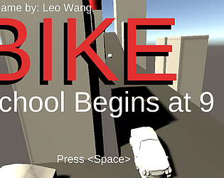
This is a game where you have to ride your bike to school and not be late. What sounds like a simple task might be a compressed experience of an hour of desperate pedaling to drag your (my) 250-pound fat ass uphill, with a time limit. I picked the topic both for the sake of absurd humor, and memories I've had for my high school days.
My favorite moment in developing this game is definitely the development of bike physics. To simulate the pedaling, I decided to actually use the back wheel to send my bike forward physically. Which resulted in the fact that I can't lock any dimension of my Rigidbody. And deciding to use physics caused a chain of technical bottle-necks. And guess what's my solution after a bunch of failed coding? MORE PHYSICS. I actually opened up "Besiege" (a physics sandbox game about building machinery), and made models which eventually led me to my solutions. My bike ended up as a Merry-go-around with a bunch of hinges, which looked hilarious in the scene mode but actually feels like a real bike. Not to mention how I originally wanted to make the NPC cars move according to logic and animator but ended up simply making them mini 4WDs, like the toys I used to play. The making this game ended up as a crazy lego building experience which is the most hilarious because of this absurd mechanicals actually works.


