I'm sorry to hear that, I hope you are doing well
A member registered Feb 13, 2019 · View creator page →
Creator of
Play in browser

Play in browser
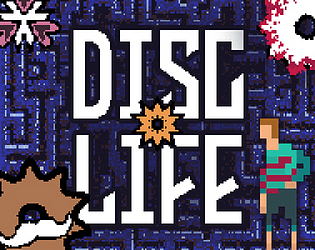
Papa Disc has fallen ill, and now you must be the blood provider for the family.
Action
Play in browser
Play in browser
Play in browser
Play in browser

Play in browser
Play in browser
Play in browser

Play in browser
Play in browser
Play in browser

Recent community posts
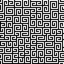
Thanks for the feedback! I definitely need to find a way to spawn obstacles in such a way that there are fewer random difficulty spikes, while also expanding into more diverse obstacles. I've been obsessed with making seamless loops, so the background was made in After Effects and exported as a png sequence for Unity's animator. I took the image below and added a kaleidoscope effect, then just did a little transition (that circle that "wipes" inward) to have it start over at the beginning frame of the kaleidoscope movement. If you ever need one for a game let me know, they're quite fun to make :)