Play game
Depth Treader: Prototype A2's itch.io pageResults
| Criteria | Rank | Score* | Raw Score |
| Visuals | #30 | 3.719 | 4.111 |
| Originality | #32 | 3.317 | 3.667 |
| Overall | #73 | 2.513 | 2.778 |
| Fun Factor | #77 | 2.111 | 2.333 |
| Audio (Does not apply for Physical Games) | #96 | 1.106 | 1.222 |
Ranked from 9 ratings. Score is adjusted from raw score by the median number of ratings per game in the jam.
Is your game a video game or a physical game?
Video Game
Was your game made solo or in a team?
Team w/ https://stotty.itch.io/ covering visual assets
Did you use any third party assets, if yes what assets did you use?
Floating Dust Particles by Rivermill Studios
Did you use choose from one of the optional secondary themes?
no
Does your game contain 18+ content (Nudity, Gore, Language)?
yes
Leave a comment
Log in with itch.io to leave a comment.


Comments
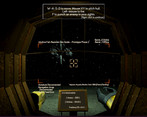
I love how it looks genuinely retro, like I just booted it up on my childhood computer. Also love how claustrophobic it is. This could become a really good aquatic horror game, I hope you keep working on it!
Nice start to a cool game! I like the under water aesthetic a ton and the visuals were great. My only issue was that the enemies kept coming up behind me and i would struggle to turn around to see them. But with some tweaking and polish this could really be something. I like how the controls feel, what you have so far there is real nice. Good work!
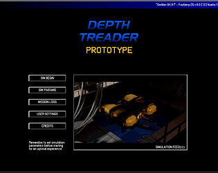
One of the best looking main menus I've ever seen for a Jam game, and the visual elements in general are fantastic.
I did have some problems with the way the aiming works, the fact that it keeps recentering makes precise shots impossible and the railrods don't seem to always hit the centre of the target icon, going slightly down and to the left a lot for me. When your enemies are so small, this can be quite frustrating.
I know you ran out of time to add sound. Which is a shame as it's hard to tell where enemies are without some kind of audio or visual indicator.
Still the game functions and runs very well, I found no bugs and it's a great accomplishment on a technical level.
I'm looking forwards to seeing how this project progresses in the future and I hope you guys feel proud of what you've achieved.
Thanks for the detailed feedback, much appreciated!
I can assure you, Stott and I will not develop this in the dark and will post updates when we've made progress worth sharing.
Early on, we'll perhaps stick with itch.io.
the rotating is too slow
thanks for the feedback! Will keep in mind as we continue this project.
Great atmosphere and I will definitely play it again and reach that ending cutscene.
Thanks! I commend you for your bravery and boldness. Getting that cutscene for the first time is no easy task (and is not as difficult once you figure out how to beat the level).