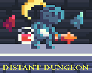
Cool game! I like the combat. There are some neat enemy designs like the little guys that run away and the big skeletons that wind up an attack. The platforming felt a little wonky though. The jump is a lot shorter at seemingly random times. The dash ability is really fun, so it's a shame you don't get to use it much before the game is over.
Play game
Distant Dungeon's itch.io pageResults
| Criteria | Rank | Score* | Raw Score |
| Design | #18 | 3.250 | 3.250 |
| Enjoyment | #23 | 2.875 | 2.875 |
| Overall | #24 | 2.906 | 2.906 |
| Presentation | #28 | 2.875 | 2.875 |
| Metroidvania | #30 | 2.625 | 2.625 |
Ranked from 8 ratings. Score is adjusted from raw score by the median number of ratings per game in the jam.
Engine
Unity
Team/Developer
Ven, Noha, BurntRobot
Comments on the jam
Any feedback is greatly appreciated!
Comments
Thanks for the feedback!
the game actually has a double the enemies but since i was only able to add the first are they didn't have any place to be, so they will come in a later update.
jumping works by holding, so the longer you hold the higher, is there something am missing?
the game is really short and i'm sorry about that, but i already have designed a second area but i couldn't implement it in time, so you can expect it after the jam ends.
Neat start to this project! Interesting note on how pace is a tall jump and X is a shorter jump. Was that intended? Visually speaking, I have two comments on the slash of the character's sword. Its look doesn't really match the rest of the pixel aesthetic, and the animation is a bit slow, I'd make it faster so that it looks snappier. Other than that, it might be the lack of animations, but the controls felt a bit sluggish.
Thanks for the feedback!
I think I forgot to properly setup the x to be the same as the space, I will make sure it's fixed.
The slash is indeed not pixelated, and the reason is I just didn't make a new pixelated slash in time, so I will change it as soon as possible.
And finally the walking animation really dropped the quality of the movement smoothness, I hope once it's done it will feel better
Some cool atmosphere and visuals in this game. I really liked the visual effect on the jump and the dash ability, as well as the little light motes floating throughout the screen. The text overlays on power-pickups were pretty smooth as well. I also liked the bit with like 5 of those little running guys on one screen - I secretly hoped they were going to run away and then merge into a larger boss as I was chasing them. I appreciate that dying just let me reset the current room.
Some general feedback:
- It was fairly difficult to build a mental map of the whole dungeon because it all used the same tileset. There were some areas that were easier to remember because more personality had been injected into them (such as the room with all the hanging people), and it would be good to see that sort of approach applied to some of the important pathways to make them more memorable.
- The dash, while a favorite of mine, could be unwieldy at times due to its unusually long range and the game's very fast fall speed. There was one particular room where I had to fall down and then dash through a gap while falling that took multiple attempts.
- Some of the gate positions felt unnecessary and took away from the impact of finding other gates; it's hard to remember which gate is important when you encounter so many in a short amount of time.
All in all I liked the atmosphere presented in this game and enjoyed the movement and combat in general. I would be interested in seeing a version with a bit more background/room differentiation and a bit more guidance in terms of player pathing. Good work so far, keep it up!
Thanks for the feedback!
About the the map, it's actually a lot smaller than it should've been since I wasn't able to finish all the area, and because of that I didn't make a mapping system for it yet, although I will add it later, and I will of course add more personality to the rooms, I just didn't have enough time.
I did notice that the movement is a bit too fast, so I reduced the player speed a bit and gave the player more air time, I also reduced the dash length without it affecting the overall level design.
All of the gates guard an item behind them, however since (as I said before) the game isn't done, I had to block some of the areas but I kept the doors at that place, I will make sure to make the doors more memorable.
Stay tuned for the 2 areas that I will be adding soon, along with bosses, more collectibles, more polish and maybe some NPCs :)


Leave a comment
Log in with itch.io to leave a comment.