Indie game storeFree gamesFun gamesHorror games
Game developmentAssetsComics
SalesBundles
Jobs
TagsGame Engines

Veralos

290
Posts
50
Followers
2
Following
A member registered Jun 18, 2017 · View creator page →

Creator of

Recent community posts

Super cute game! I love the isometric pixel art style, especially the kamos. I like the sleeping animation and the way they cry when getting hurt. Leading them around with a cookie is a funny concept. Having Kanna as the level goal is also a very sweet idea.

It's fun commanding the kamo army. Trying to manage them when you have a lot is a bit tricky, but I think that's the point. I like how each stage introduces a new obstacle to deal with. Having different objectives to go for is a nice touch, though needing to achieve all 3 in one run to reach 3 stars seems a bit harsh. That said, the hub world is super cool with how it gives you options about which objectives you complete to progress.

Clever idea for a game! Even though it's a very different style, it still has the classic metroidvania sense of progression. It was very satisfying going back through the early bits that gave me trouble, now with several extra strokes that let me fly over everything.

There were some issues things being off screen though. In some areas the camera is locked and you need to shoot the ball past the edge of the camera to move it. In the later parts of the game there's also the issue of being able travel so far it's hard to tell where you can go. It took me a while to find the final stroke upgrade because of this. Perhaps some way to zoom the camera out could have helped.

It definitely wasn't just you. Looking at some of the larger rooms in debug mode I was getting around 100 fps, which is a lot lower than it should be and could easily go under 60 on a less powerful machine. Thankfully, there was a pretty obvious optimisation I could make - after doing that it's getting around 5 times the fps. Could probably still optimise further, but it should at least address your issues.

I uploaded a new version with this fix. Since there's no visible difference I also added a version indicator. As of this update, the game is at version 0.1.3.0

The gameplay seems like it could be very fun. The gun is satisfying to use and the levels are pretty well designed. There one thing holding it back though: The jump physics. You have little air friction (if any) so trying to move while jumping feels like being on ice. The jump height is also fixed (as opposed being able to release the jump button for a lower jump). This isn't too bad in some games, but in this one - where you're constantly jumping to dodge projectiles and fight enemies at different elevations - it's glaring omission.

That complaint out of the way, I love the presentation in this game! The cyperpunk aesthetic is super cool, and utilised well. The art in general is very well done, as is the animation for everything. The music also helps to give it that cyperpunk flair. One bit of the presentation that stood out was the hud bar. It's very detailed, but also very readable. I like the little meter for the gun capacity. Having a mini-map built until the hud is really cool, and something I don't see a lot of - even in commercial metroidvanias!

Sorry, I didn't consider that someone might want to reset their save! If you download the new version I just uploaded, it now gives you the option between New Game and Continue Game on title screen. This new version will still be compatible with your existing save.

There's certainly things that could be better optimised, though I haven't encountered slowdown myself. What area/s gave you trouble?

(1 edit)

I had to restart the game several times because of softlocks, and eventually gave up because of this. The first is a pit in the central area (just after the starting area with the gun/dash) that drops you below the screen instead of killing you. The other is when you die after getting the grapple, but before getting the teleport. You get sent back to the central checkpoint, but now you're locked out of the area with the teleport. This is fine for most of the game, but as far as I can tell you need the teleport to leave the area down below after getting the key (the collapsing platforms respawn too quickly to super jump out).

That aside, this is a fantastic game! The art style manages to be super goofy and charming despite the low resolution. All the areas felt distinct and it was generally easy finding my way around. The music and sound effects are enjoyable too. I like the variety up upgrades on offer. The grapple was a bit tricky, but the rest were all really fun to use. My one complaint (softlocks aside) is not knowing which pits are deadly and which lead to other areas. Other than that I really enjoyed the game 

Cool game! I like how it goes for a different style than the typical platformer, with more of a shoot-em-up vibe instead. The underwater setting is neat as well, and it did a good job of feeling like a deep sea adventure with fitting music and visuals. I liked the detail of things getting darker as you descend. The scenery was a bit samey though, and as a result I found it hard to orient myself in the world. Regardless, there's a nice variety of enemies, and even some pretty cool bosses!

The one thing I struggled with most is the controls. My keyboard doesn't have a numpad, so I had to get an AutoHotKey script to rebind some keys to actually control the game. It really should support WASD or directional keys. Sometimes the ship's movement would get "stuck" so that when I released all the movement keys it would continue moving in certain directions. Not totally sure if that was the game or the script, but it definitely made things awkward.

Oh, you can dash vertically! That's what I missing.

I managed to make a quite a bit further. I got up to a point where the only way to proceed seems to be by beating a multi phase eyeball boss. Unfortunately it's a bit too tough for me, and my finger was getting sore from hammering the shoot button, so probably going to call it quits there.

Regardless, a very well made game! I can tell that a lot of time and effort was put into it. The story is nicely presented with the occasional animated cutscene being an extra cool addition. I especially enjoyed being to walk around and talk to all the villagers near the start. The environment looks nice - especially the background - and the characters are well animated. The music and sound effects are also great.

The basic platforming movement feels quite good. The dash is a really fun ability, but some aspects of it are a bit unintuitive. The vertical dash thing was mostly on me, but it could have been introduced better e.g. by doing the classic metroidvania trick of trapping the player until they learn how to use their new item. It also felt a bit weird that you can travel so much further by starting a dash chain from the ground. I'm used to jumping before dashing for extra distance in other games, but here that's the wrong thing to do. I did like that character changes colour to indicate whether you can dash, which alleviated some of the issues.

The combat is solid too. The gun is pretty fun to use - I like how you can shoot in 8 directions, and have a key to lock the diagonal aim. That said, I'm not really a fan of the "shoot as fast as you press the button" thing since it gets quite tiring to constantly mash - especially when most of enemies are quiet tanky. Using dashes to dodge attacks is cool, but I couldn't seem to get a hang of the parry stuff. The Undertale-style side of the combat system is really neat, with some cool attack patterns to avoid. I only saw a couple of those, but presumably there would be more if I got further into the game.

Overall though, fantastic job!

(1 edit)

Thanks for playing! Having a bit of knockback or something for the sword is a good idea.

I was going to point out that energy gain rate was based on Hollow Knight, but after going back to check the values for that game I'm realising that I must have mixed up the hits to fill a soul vessel with the hits the to fill the soul meter. Which probably means nothing if you haven't played it, but the point is that the energy gain should be a lot higher. Will have to try increasing it in future updates.

Thanks, glad you enjoyed it!

Story is something I plan to work on more later, but yeah the game is kinda lacking context right now.

I've returned to give this a proper rating now that my queue's clear. 5/5 enjoyment, as Alice asked.

I played it again, and my thoughts are basically the same as before: Cool atmosphere, nice gameplay, maybe a bit too much variance in the time scales.

I like the concept, but the scaling of dragon seems way too fast. After a few upgrades and some food it was so big that all the enemies just walked under it.

The graphics are really cute though! I also like the goofy sound effect when the enemies die.

Neat little game. I like how you used a dual meaning of the theme. The box placing idea is interesting, but probably needs some limits to make it require more thought. I started off by carefully crafting box stacks to reach each next platform, but eventually realised you can easily ascend by just jumping and placing boxes beneath you. Perhaps there could be a limited number of boxes on screen, or maybe you could only be allowed to place boxes while on solid ground. Still, not bad for your first jam game!

Very charming little tower defense game! The art style and overall presentation is wonderful. Since you had the bug I can't really comment about the balance, but it was kinda fun just completely demolishing the ants.

I'm not sure where to go after getting the dash. There's a tree ledge that's too high to reach up above, some rocks blocking path to the left, and seemingly nothing useful back in the town. Any hints?

I really like what I've seen so far!

Interesting concept! It seemed simple at first, but once the concept of pushing the player was introduced it became a neat challenge trying to figure out how to proceed. The trick for the last level seems a bit unintuitive, but it was easy enough to figure out through experimentation so it's not a big deal. My one complaint is that the fixed camera angle can sometimes make it hard to figure out the relative depth of objects,

(1 edit)

I really dig the vibe of this game! The mish mash of real photos, textured tiles, and bright cartoon characters is a bizarre one, but it somehow works to give the game a unique flair. I was excited to keep playing just to see what weird background or goofy character I came across next. All the music you can listen to adds to the strange yet compelling atmosphere.

Unfortunately the game is quite glitchy and unpolished. A lot of the things in the world that had an interact prompt simply did nothing when I pressed the button. For example, I found 3 different bean converter places, but the machine only worked in one of them. The save system doesn't seem to work right, as every time I left the game most things I collected respawned and I seemed to randomly lose some of the midis I collected. Speaking of leaving the game, I had to do it a couple times because there are some places where you can clip out of the world and get stuck in the void. I ultimately had to give up entirely after one save point sent me to the void whenever I reloaded (it was in the area you get to by blowing up a floor in the deep woods).

Even if it was rough around the edges though, I did genuinely have a great time exploring this wacky world.

Interesting idea for a game! I like the metaphor of facing challenges to overcome your worries. Having  a fully customisable mode is a really cool option. The gameplay seems a bit imbalanced in that it's super difficult at the start but becomes trivial once you absorb a few things. But perhaps that was meant to be part of the message?

(1 edit)

It's cool to see a 3D metroidvania in a jam. And this one is pretty well executed to boot!

The combat works well. At first I though the basic enemies were a bit too easy to stun-lock, but once you have to deal with multiples of them and turrets it can make for some tricky fights. The roll feels like it could have a bit less distance - it was often disorienting to use and was hard to avoid rolling off ledges. The lightning (?) power trivialised combat, but I think that was the point. It was fun being able to just blast enemies after I got it.

The platforming is pretty good too. Having a double jump as an early upgrade is nice to give you a bit of extra control in the air. The wall run is neat as well, if a little finicky. The one platforming bit I didn't like was the first wall run you have to do after getting the power. Landing on the platform requires some precision and took me a lot of tries. The rest of the wall run bits in the game were way more lenient - it's weird that the first one was the hardest.

The presentation is also solid. The music and sounds effects are fitting - I like how it fades between the normal music and battle music when you fight an enemy. The character are models are simple but charming, and nicely animated.

I managed to reach the end, though I'm not entirely sure I understood what was going on in the story. The gameplay is a little confusing as well - there's barely any feedback when landing a hit, so it's hard to tell if your attacks are doing anything or not. The idea of choosing different options on the scales to have a different playstyle is a neat idea at least, and the character sprites look nice.

Wow, I can tell there was a look of work put into this! The interface looks very clean and professional, with some nice 2d art. The 2.5 style of the gameplay also looks great, with some cool character models and animation. The game controls fairly well, and having several characters + a bunch of items is quite impressive. The music and sound effects are  good, though it feels like the game is missing some sound effects.

Unfortunately, there are several aspects that are a bit broken. It seems the intent was to unlock Felix by beating the evil Felix boss, but instead you just start with him. Speaking of bosses, neither of them seemed to do much and I could just wail on them. The save system is also janky: It saves your location and inventory, but event triggers (e.g. for the bosses) are all reset.

That said, there seems to be a lot of potential here. It would be cool seeing what more you could add to the game to flesh it out.

Very cute! The idea is creative and I like how many different games there are for the mouse to play. The art is very charming as well. Having the CRT style affect on the screen is neat, and it's nice how there are even a few additional details in the background.

The controls are quite tricky, which is part of the point, but I thought the joystick in particular was maybe a bit too difficult to control.

I really like the presentation here! The art is very nice and I enjoy the gameboy style colour palette. The music and sound effects are great too. Having a introductory cutscene is a cool touch as well, though I wish it could be skipped after you die.

Unfortunately, I'm a bit stuck. I got the double jump on the left, then went right and found what looks like a trophy and shield. I'm not sure how to use them or what to do next. The only other place to go is this gap in the starting room, but that seems to be too big to get across with just the double jump. Am I missing something?


Interesting game! There's some neat concepts. Getting bigger the more health you have adds a sort of automatic difficulty scaling to the game. Keeping track of blocking the blue circles while moving the barrier away for the reds is fun challenge. I do feel like it gets a bit too hectic too quickly though. Maybe the circles could spawn in waves (rather than constantly) so there's a chance to catch your breath occasionally?

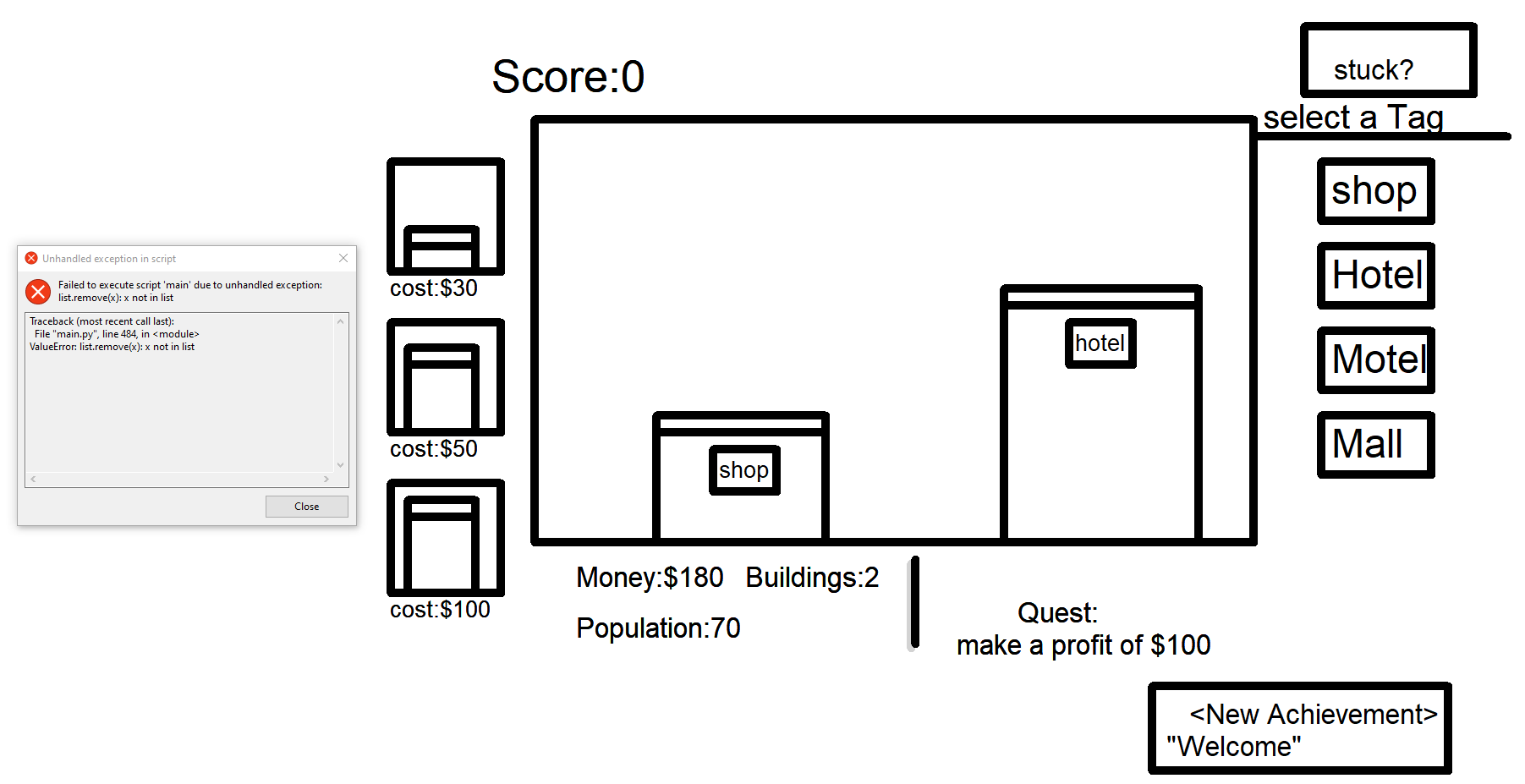
Thanks, pressing e after selecting a tag works to place a building.

Unfortunately, after placing a couple of buildings and waiting a bit to see if my money would reach $200, the game got an error:

Cute game! I had fun exploring the world. I like how's there's some non-linearity with the order you get the upgrades in, plus some secrets to find. Speaking of the upgrades, they're pretty fun too. I was expecting maybe a double jump, but getting a triple jump as potentially your first upgrade is wild.

Unfortunately, the game is a bit janky in some areas. Not entirely sure how the health is supposed to work, but I didn't seem to be taking damage from enemies, or gaining anything from the health pickups. The save/load also has issues. Loading restored my location and upgrades just fine, but it also respawned everything I had picked up and reset certain events e.g. the triple jump boss and the swarm of birds.

Regardless, still a fun and charming game!

I couldn't get the tags to work. I chose a building, it showed a faded version in the main area, then I tried clicking the tags (as suggested by the instructions) but none of them seemed to do anything. I noticed that the faded building can be moved with the left/right keys, but couldn't figure out much more than that. I tried restarting and choosing different buildings but all of them had the same result. Please let me know if I'm missing something.

Other than that, I enjoyed the music choice, and the simple monochromatic style has a certain charm to it.

This feels like like an I Wanna Be The Guy style rage game with the amount of stuff trying to kill you and how long the levels are without any checkpoints. I'm not sure if that's what you were going for or not though. If you weren't, some checkpoints throughout the levels would be welcome. I couldn't even beat the first one!

The graphics are quite nice, and generally make it easy to see upcoming obstacles. The audio is solid too. The controls mostly work well, though it would be good to have them somewhere in the description (as far as I can tell it's WASD or Directional Keys to move, Space to jump).

I really like the idea of the game here. The tower stage is pretty basic, but the stairs stage is really cool with how it forces you to explore around the structure to understand the layout so you can reproduce it in the model. Feels like a concept that could have legs if expanded upon. Unfortunately it was let down a bit by the building controls. It could do with more control over the vertical position of pieces and maybe some snapping.

Neat! It's nice how you have a couple bosses to fight, and even some cool cutscenes. The graphics do a good job of feeling like an alien planet. 

One major issue I have is the lack of feedback for the enemies/player taking damage. It's hard to tell when you're hitting enemies, and a lot of time I didn't even realise I had been hit in the heat of a boss battle.

That said, the music is really good - especially for the bosses!

Nice game! The gameplay is pretty simple, but there's enough risk vs reward and room for tricky decisions to make it interesting. Though the variance in the scales might be a bit much. Exchanging a lot of seconds is meaningless, exchanging a lot of weeks is a massive upset.

The premise is cool and keeps the stakes high. I enjoyed Alice's dialogue and the atmosphere was effective. Using hearts as the suit of choice to fit the theme of the game was a nice touch.

Sorry, I didn't realise about the queue rating system. I'll try to get back to this for a proper jam rating when I have time to play more games.

Okay I made a small update to add the save prompt.

But I'm realising now that you were talking about something else: The lack of autosaving. Unfortunately, that can't be fixed so easily. I plan to add some sort of autosave system in future updates, but that requires extra work so for now there's just a manual save at save points.

You can press Up next to the save points (the big machines with a floppy disk symbol on them) to save your progress.

Sorry, probably could've made that more clear. Maybe a "Press Up to save" prompt would help.

Having this on PlayDate would be cool! Unfortunately there aren't any tools yet for porting GameMaker games to PlayDate, so that would require remaking the game in another language. I don't have time for that right now, but I'll keep it in mind as something to try in the future.

Thanks!

Haha yeah I've had that happen when playtesting! I made the original version on an old laptop with a dim display so the colours looked okay, but it can be a bit hard to look at using a new bright display.

Thanks for the kind words! Glad you appreciated the UI.

I made this during a 48 hour jam so I ran out of time for an ending. I hope to add a better ending in a post-jam version though!

Nice game! The mechanic of launching yourself to move is very interesting, and I like how you can chain  together launches by smashing into items. The slow-mo is a nice touch too, and makes it a lot easier to set up combos. The graphics are good and I really enjoyed the music. Unfortunately, I had the same issue as chmann where WASD stopped working after the first run.

A bit simple, but still a neat game. The enemies move at a good speed where they aren't trivial to avoid but still give you enough space to weave around them. The graphics/audio are quite basic, but still work well enough.